


Empty State
We place empty states on pages where nothing has been created yet. They tell the user what they need to know about the page and how to get started creating or using the page’s main features.
 Demo and Developer Guidelines
Anatomy
All empty states have an illustration, a heading, secondary text, and, if the user has create permissions, a primary button which launches the main create action of the page.
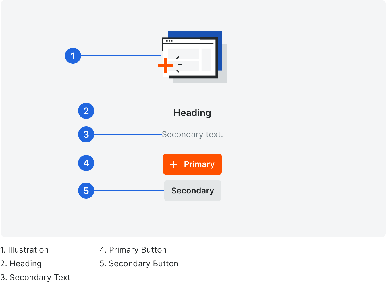
Heading
Headings are title case without punctuation and match the templates provided for that type.
Secondary Text
Because empty states appear all over Procore, we want to make sure that the content is presented in a consistent format, while also making sure that they contain information that is helpful and non-generic. Secondary text is sentence case with punctuation.
Always consider the following when writing content for empty states:
• Where is the user coming from?
• What will they want to do next?
• What do they already know about this page? (most of the time, we should assume they know nothing)
Always consider the following when writing content for empty states:
• Where is the user coming from?
• What will they want to do next?
• What do they already know about this page? (most of the time, we should assume they know nothing)
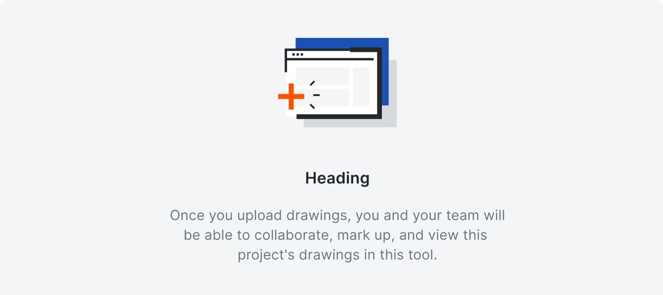
Correct
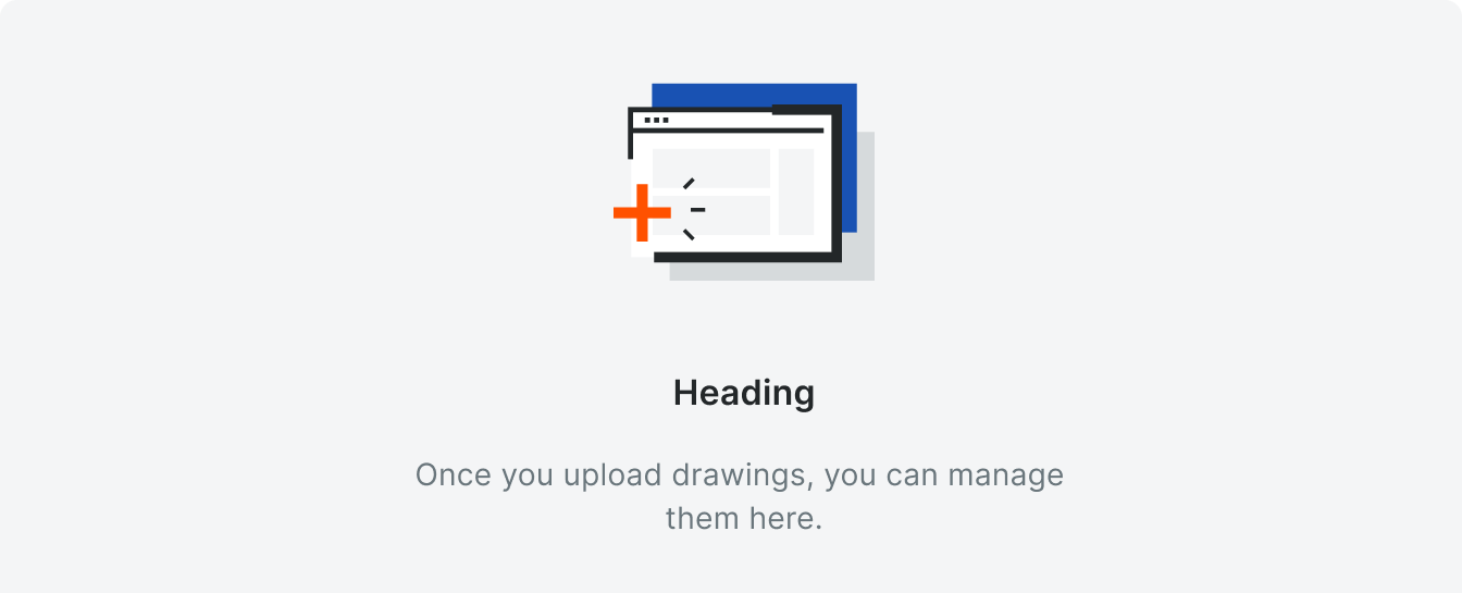
Incorrect
It may may be tempting to write something like, “Once you upload drawings, you can manage them here.” While this is great as a standalone empty state, we need to recognize that users move through many tools as they work through their project. Though “manage” and “collaborate” may
be the easiest choice of actions you can present to users, see if there are more descriptive ways
to tell users what your tool is capable of.
Primary Button
The primary button label matches the primary create button on the page.
See Buttons for more information, including character count limits.
See Buttons for more information, including character count limits.
Types
Create
Users with Create Permissions
We show this empty state to users when they have create permissions on a tool’s list page. The empty state guides them through the step(s) they need to take to begin using the tool.
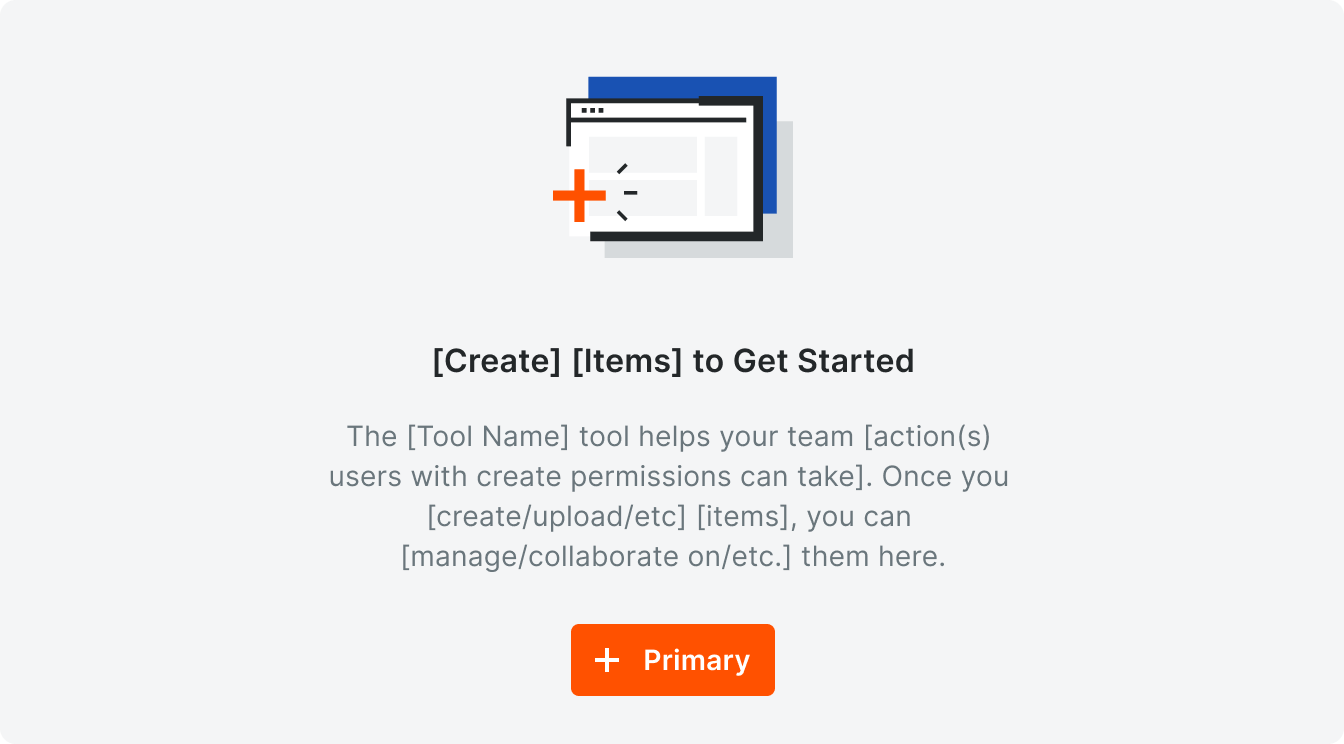
Template

Example
Multiple Setup Steps for Users with Create Permissions
If there are multiple actions users need to take before creating items, use this card layout. Each card describes one step in the process of setting up the tool. Each card must include an illustration, header, body text, and, optionally, a button.
The content for each step should, as much as possible, match the template for the empty state for users with create permissions.
The content for each step should, as much as possible, match the template for the empty state for users with create permissions.
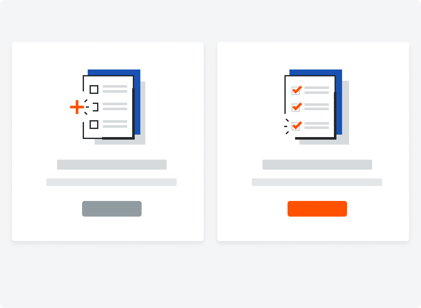
The illustrations can be changed depending on your use case.
Users with Read Only Permissions
We show this empty state to users when they do not have create permissions on a tool’s list page. The empty state tells them about the tool and what they’ll find on the page once their team starts using it.
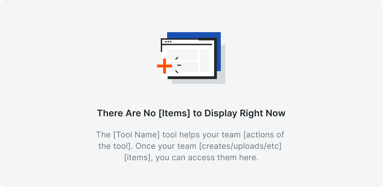
Template
Example
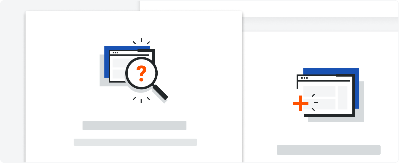
Search/Filter States
We show this empty state when a user has searched for a keyword or has applied filters that do not match anything in the tool.

Template
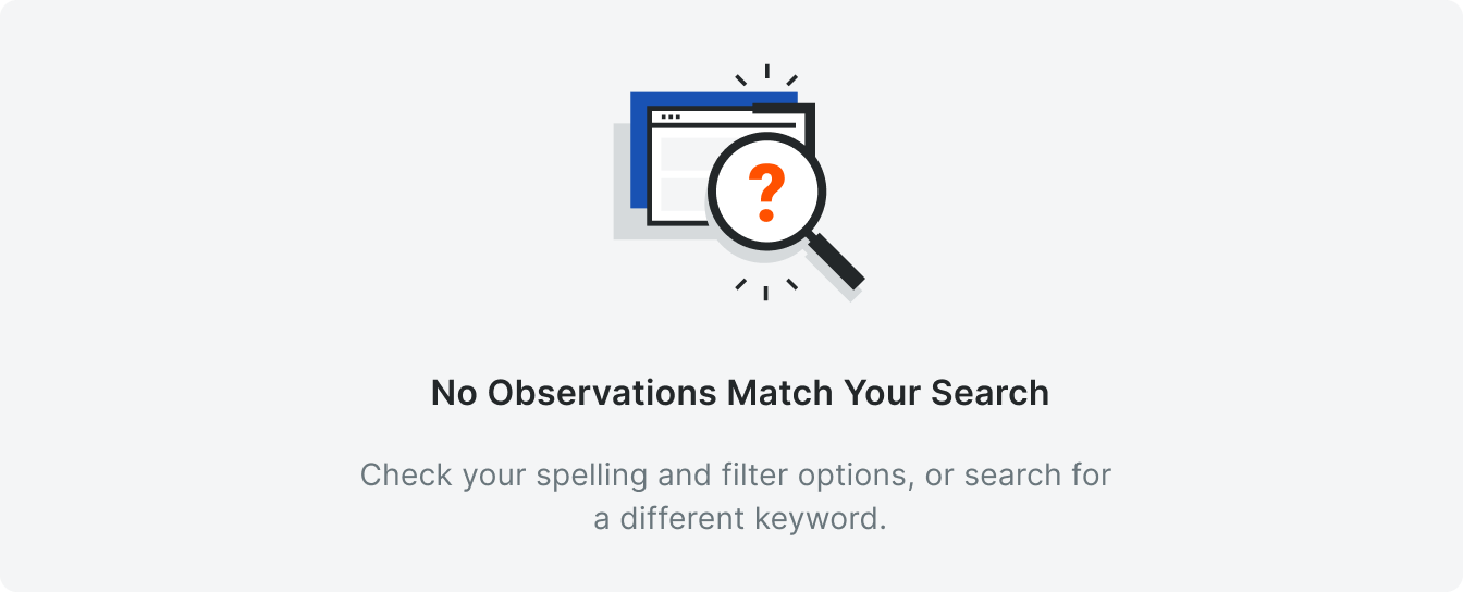
Example
Recycle Bin
We show this empty state when there are no items in the tool’s Recycle Bin.

Template
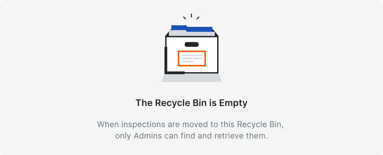
Example
Variations
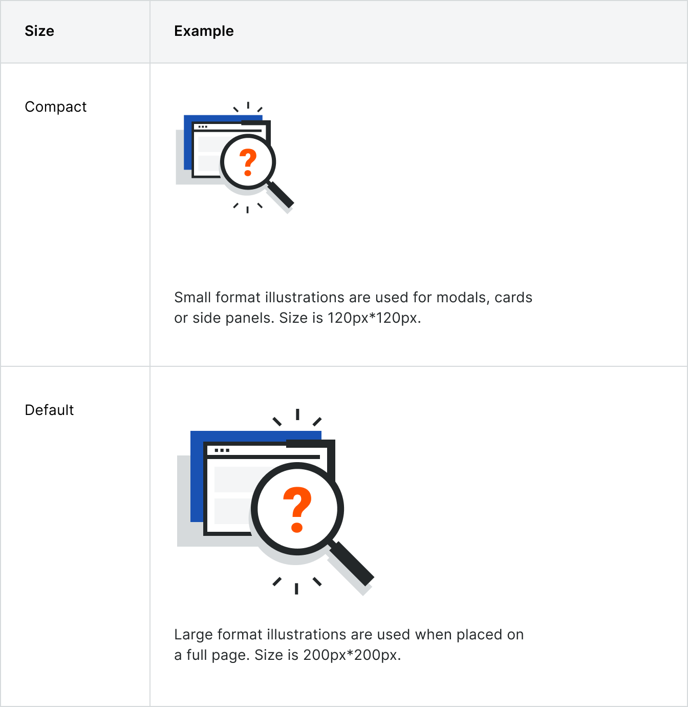
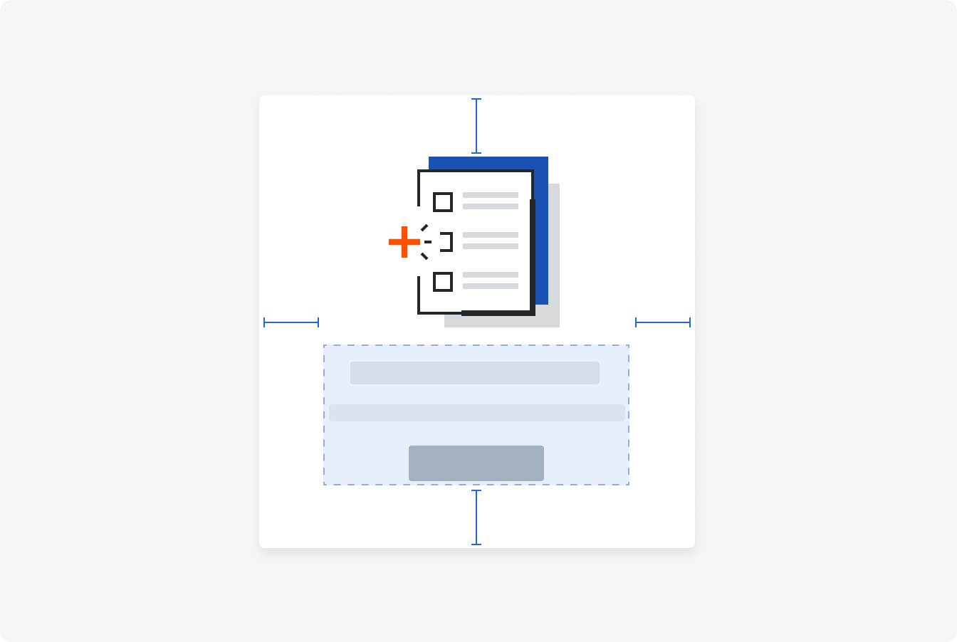
Placement
Illustrations have a max padding of 96px above them. If the padding is less than 96px, the component will be centered horizontally centered. The component is always centered vertically.
Behavior
If an empty state is used in a table, all actions pertaining to the table (excluding Create buttons) should be disabled with a corresponding tooltip.
Use the default size empty state pattern for full page empty states and compact for empty states within a card or a side panel.
Use the default size empty state pattern for full page empty states and compact for empty states within a card or a side panel.
Specifications
Padding

Styling
