


File Select
The file explorer enables users to select permitted files from various document sources in procore to attach to items.
 Demo and Developer Guidelines
Anatomy
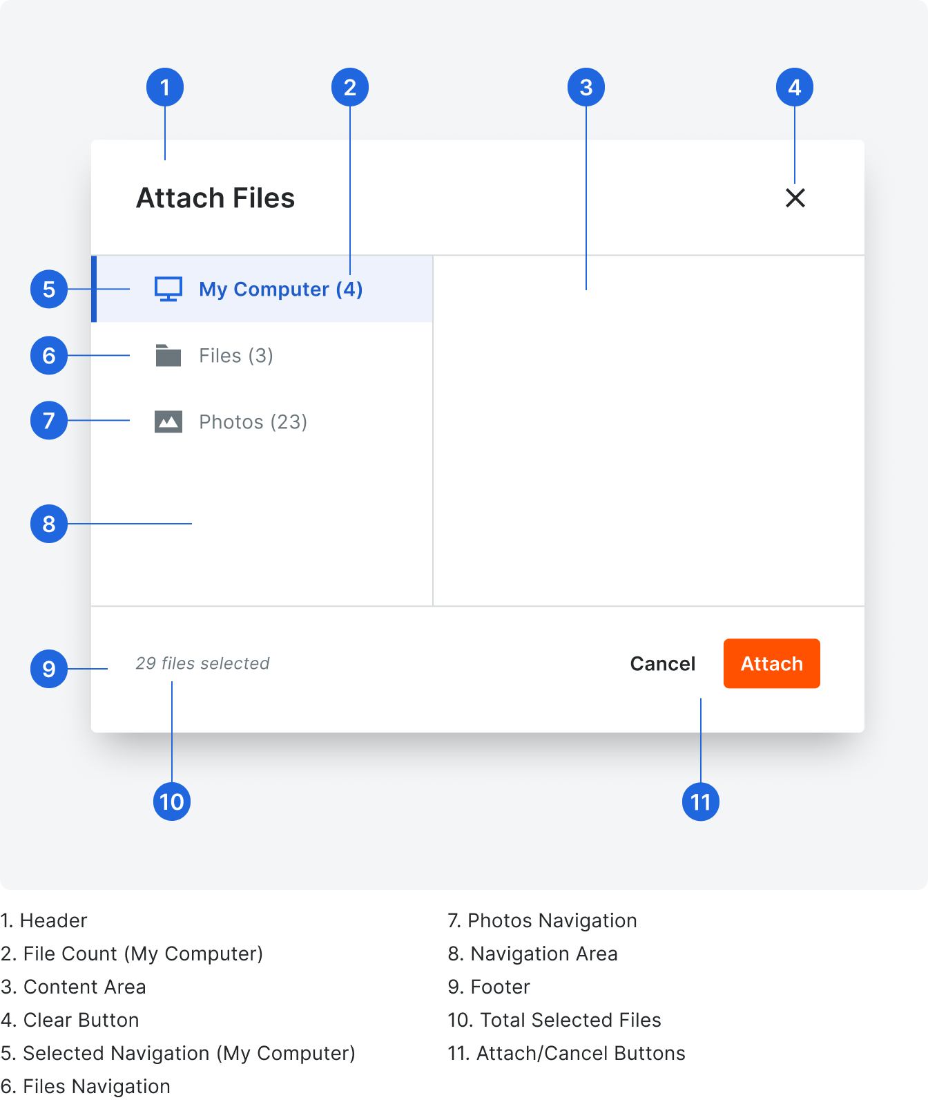
The file explorer is comprised of many sub-components and multiple sections. These sections are the lefthand navigation, content area, and footer.
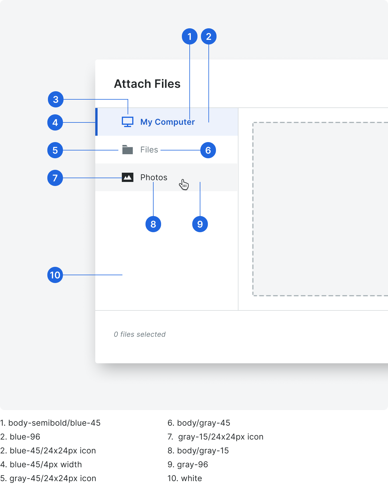
The lefthand navigation can pull from multiple sources of file types (see sources in left nav) and allow the user to attach one or many files across sources. It supports the ability to control the number of maximum files allowed.
File Select supports three different source layouts that are consumable by the end user/tool - a from a user’s hard drive (My Computer), thumbnail grid and a file tree.
Types
Content Area Views
My Computer View
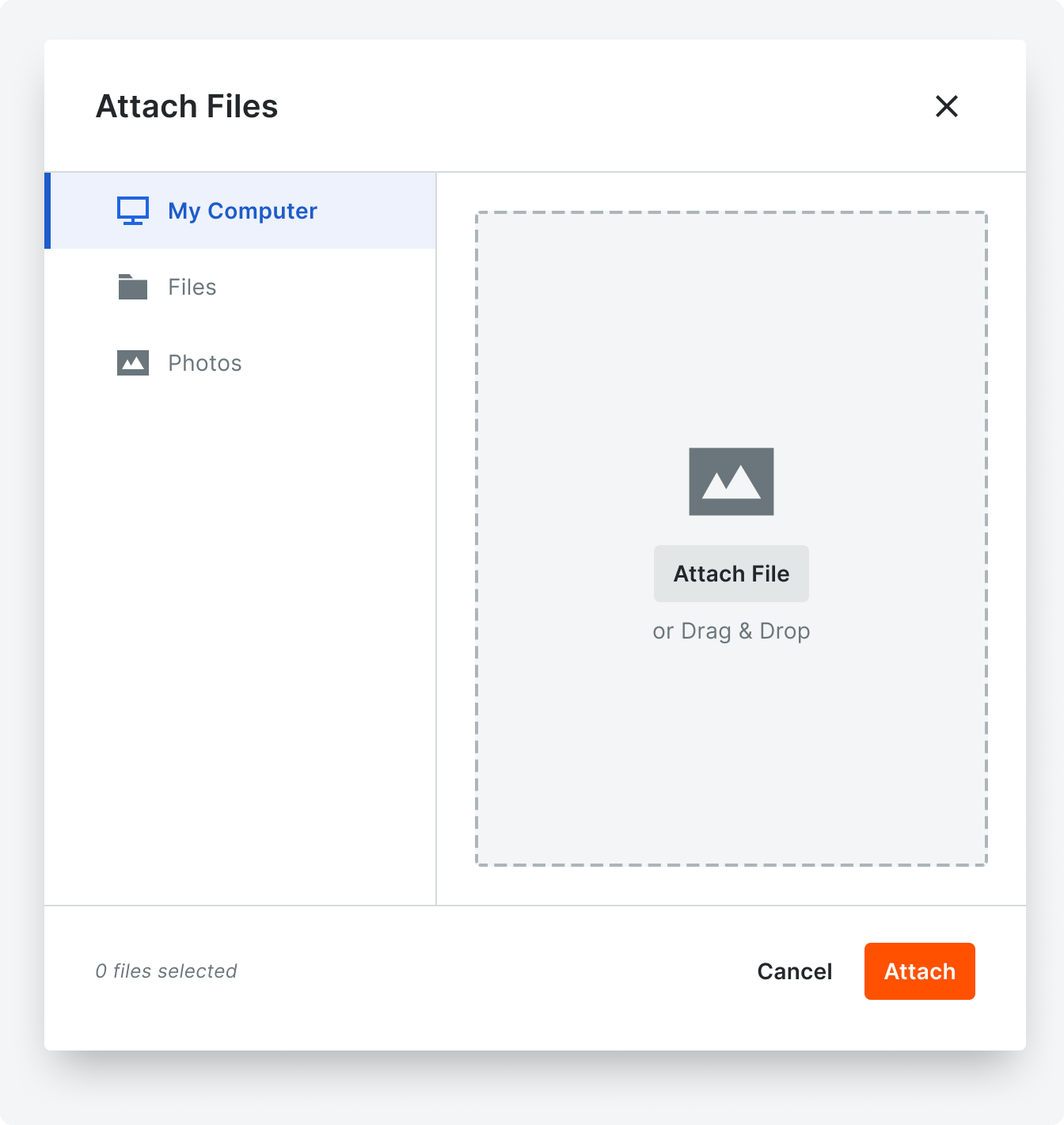
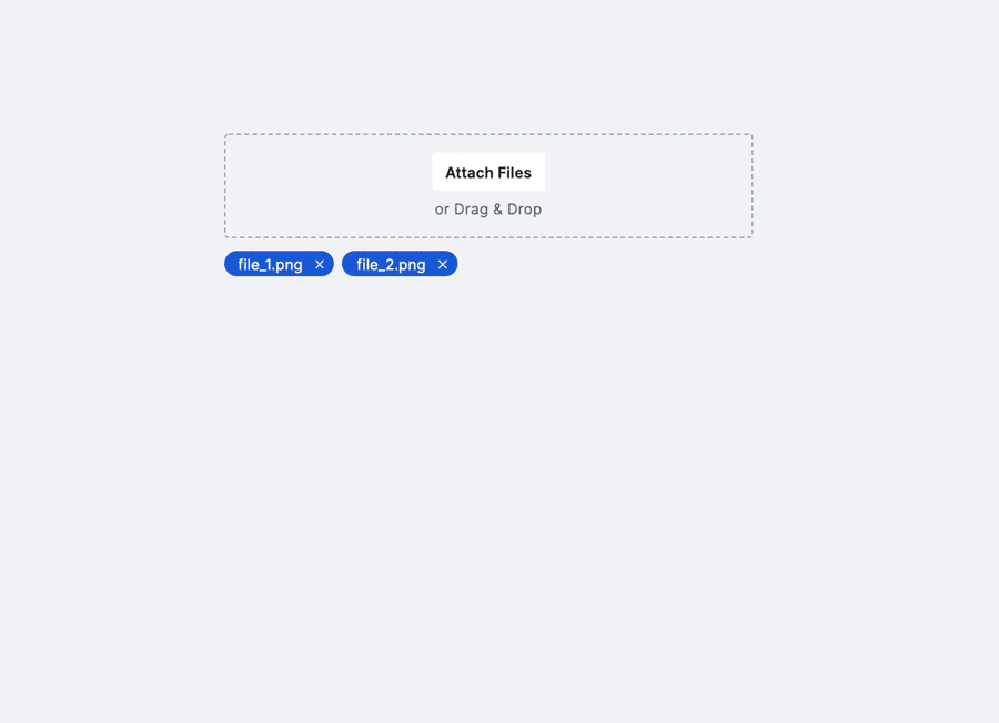
Local storage view allowing users to select and upload files, which displays a dropzone in the content area.
File Upload View

As you attach files from your computer, a list with progress bars display in the content area.
File Tree View
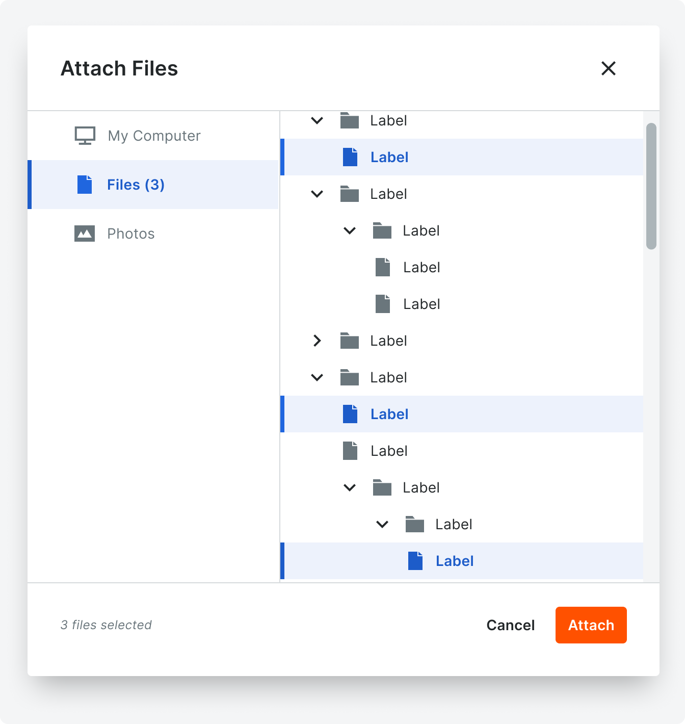
Tree view, allowing users to select and upload files.
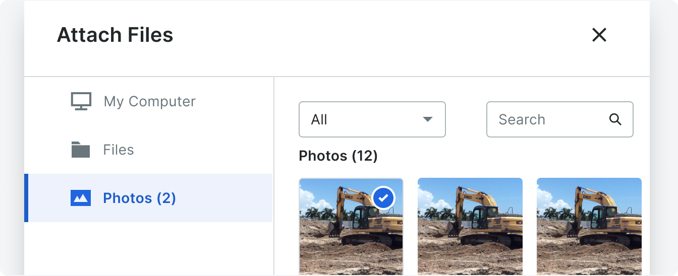
Thumbnail Grid View
This is a 5 column grid using the thumbnail component with the caption prop enabled. Above the grid is an optional header section where multiple filter and search controls can be included. The user clicks on each thumbnail to select that file. Selecting a thumbnail adds that count to the corresponding source nav link.
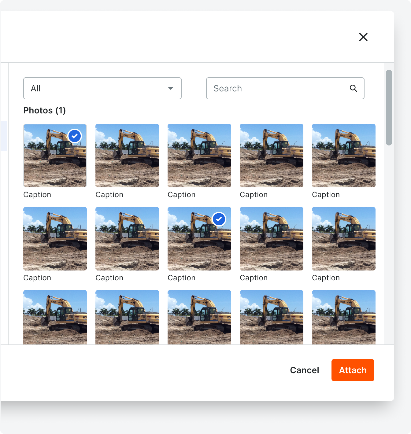
Use the thumbnail grid view to attach Procore objects that benefit from having thumbnails, like photos, drawings, etc.
States
Empty State
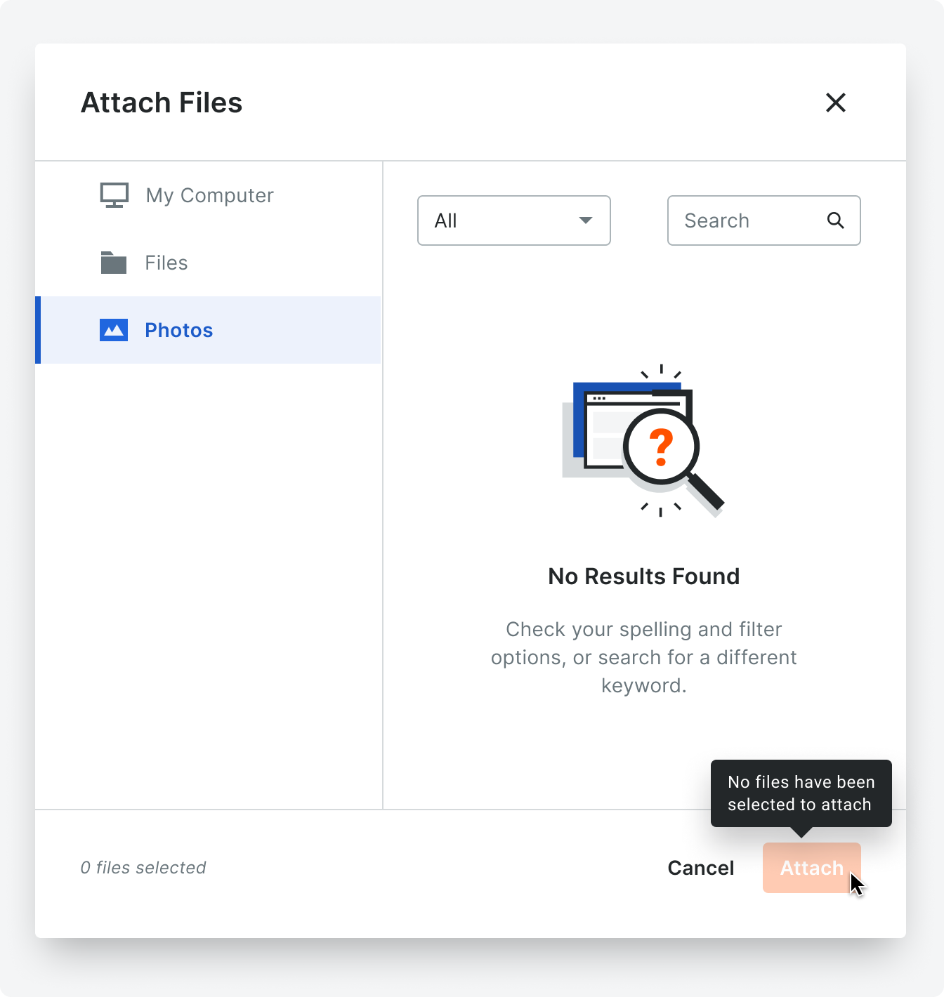
When a filter or search term return no results, the empty state illustration and text should be as shown in the empty state for search and filter example to the right.
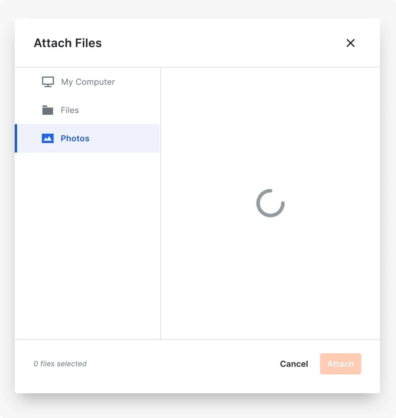
Loading State
When clicking on a nav source, display a spinner within the content area while the selected source loads.
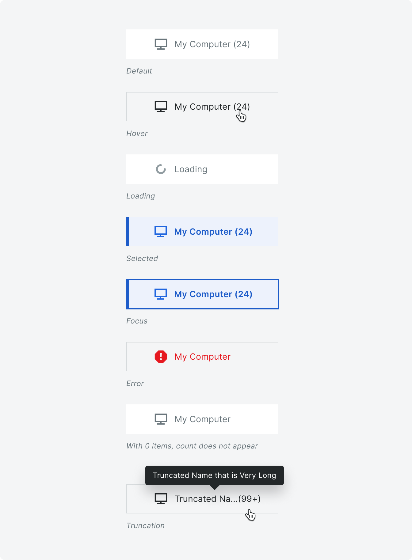
Lefthand Navigation States
The file select left nav contains multiple configurable file sources, and one static source (My Computer).
The left nav accepts multiple sources and will scroll vertically when they get too long.
The number of total files in the selected source displays to the right of the source title within parenthesis - e.g. “My Computer (24)”. This number does not display if there are no files selected for that source. This number truncates to 99+.
Placement
The file select uses the modal component as its containing element. See modal for placement guidelines.
Modals should appear in the center of the screen and placed on a background overlay. Modals do not take up any more then 30-40% of the viewable area.
Modals should appear in the center of the screen and placed on a background overlay. Modals do not take up any more then 30-40% of the viewable area.

Behavior
After attaching, either in the dropzone on the file select component, or removing attached files from the file select component, reopening the file explorer should show always show the currently selected files on the file select as selected.
If no files are selected, the “attach” button should be disabled. Once a file is selected, the primary orange button will appear.
If no files are selected, the “attach” button should be disabled. Once a file is selected, the primary orange button will appear.
Specifications
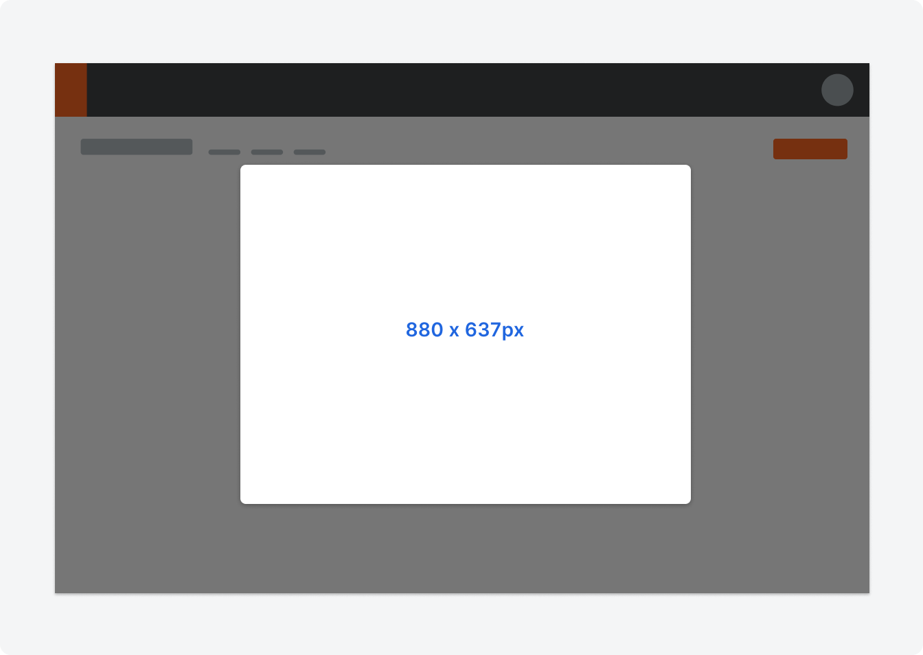
The default and recommended size for file selects is 880 x 637px.
Padding
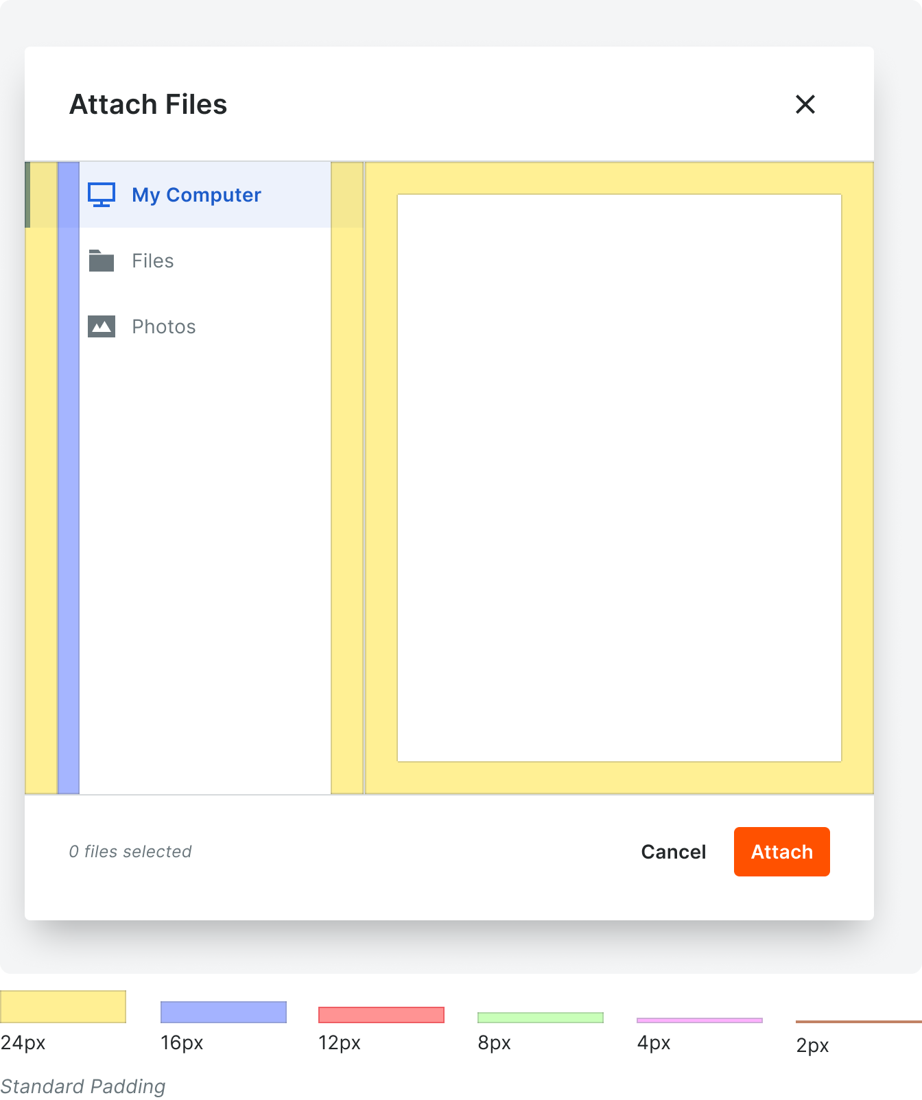
Color & Typography