


Tiered Select
We use tiered selects to allow users to choose a single parent or child option that is nested within a tiered list. For example, choosing a location from within a list of tiered locations. We typically see these selects on forms.
Other select components are group select, multi select, and select.
Other select components are group select, multi select, and select.
 Demo and Developer Guidelines
Anatomy
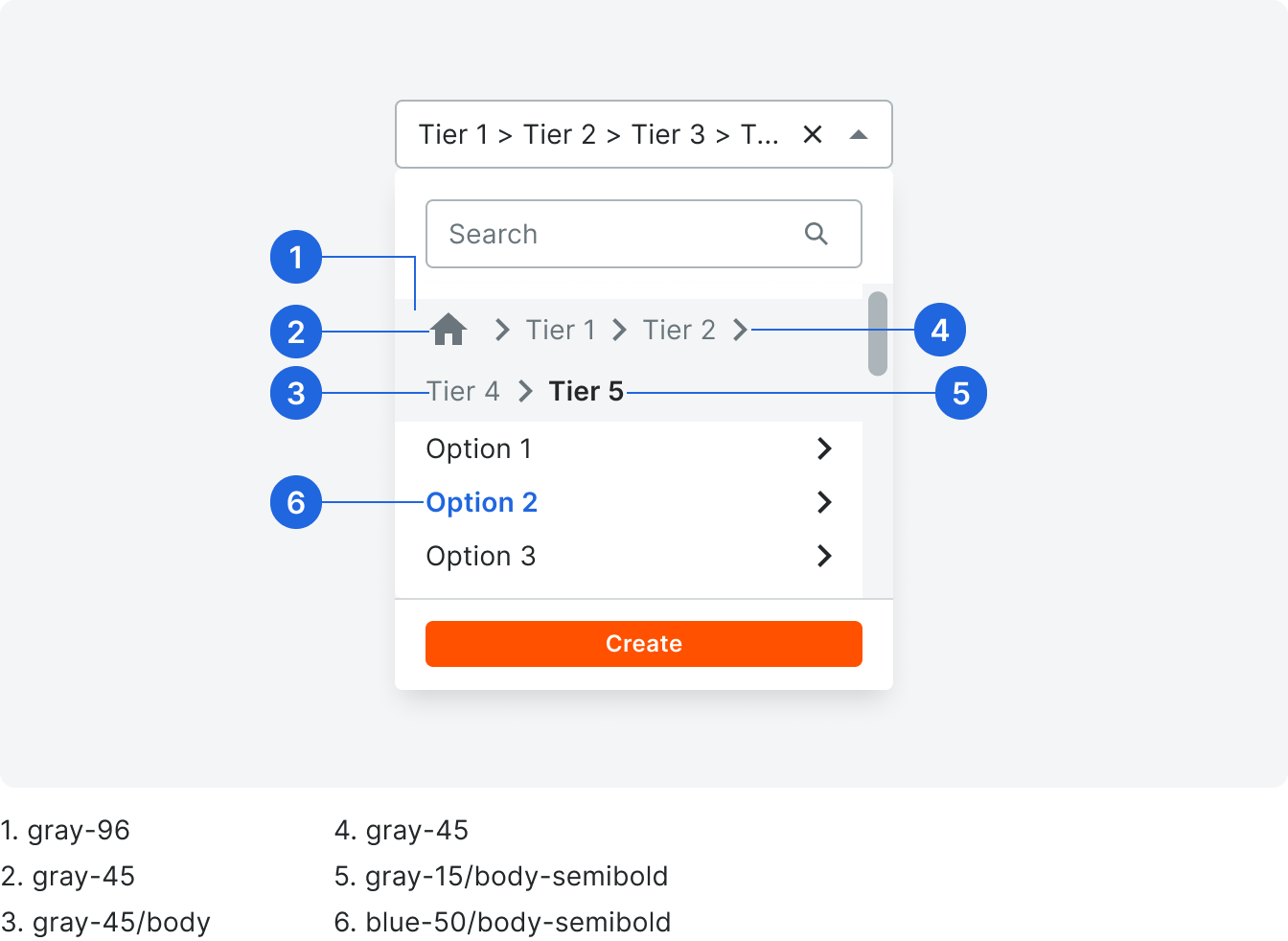
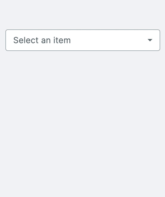
There are multiple variations of select components that can be used. However, all variations include a value, chevron icon, and options list.

Label
Labels are title case without punctuation and contain a single noun or noun phrase (labels do not contain verbs). See the Field Label Glossary for common labels and their use cases.
Character count limit: 25
Character count limit: 25
Path Placeholder/Value
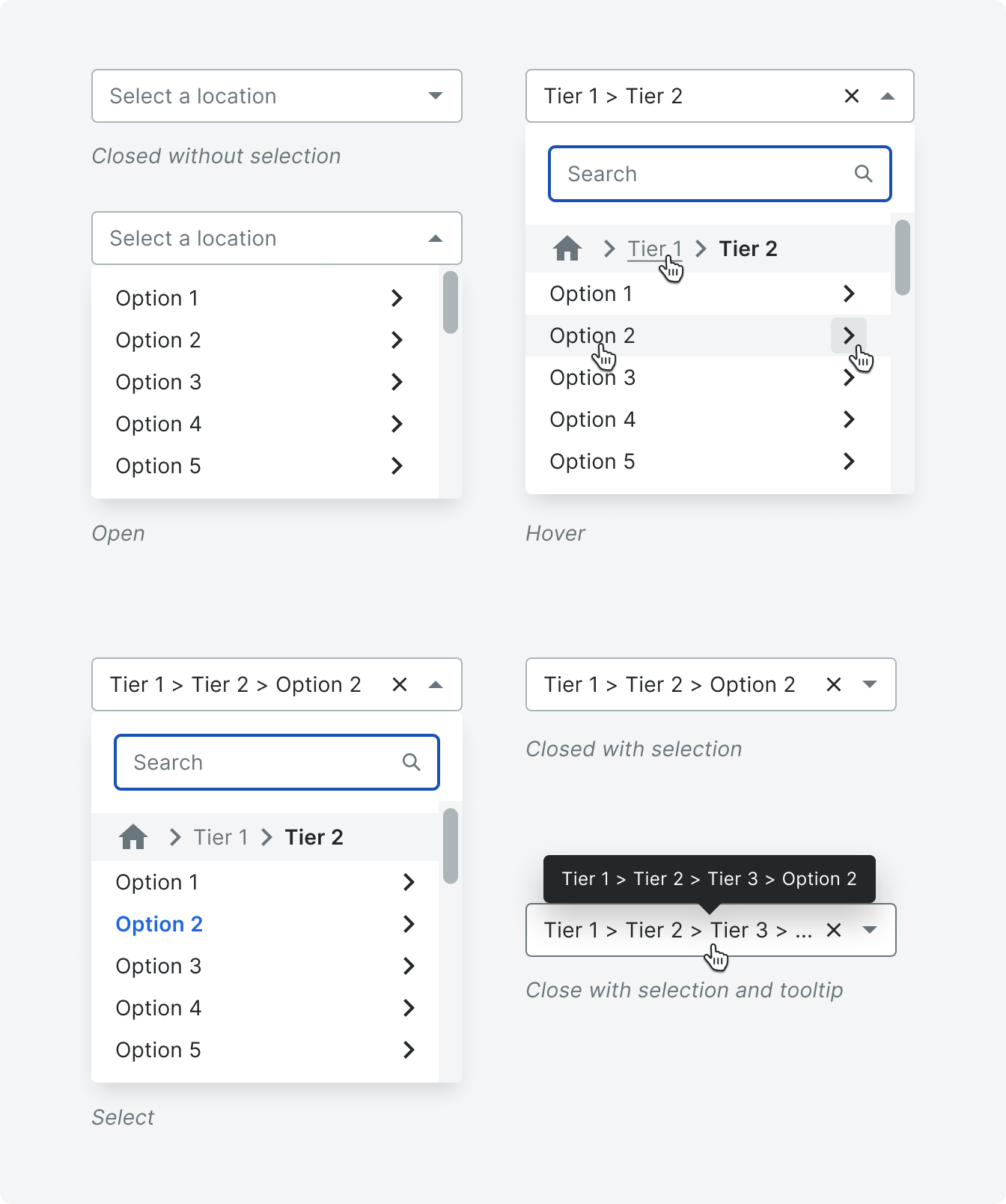
Tiered select placeholder text is title case without punctuation. All select placeholder text says, “Select [item name].” Once a tiered option is selected, it appears in the input.
Tiered Menu
Options are sentence case with punctuation unless it’s a proper noun or a user-inputted option.
Character count limit: 30 (unless it is a proper noun or a user-inputted option)
Character count limit: 30 (unless it is a proper noun or a user-inputted option)
Breadcrumb
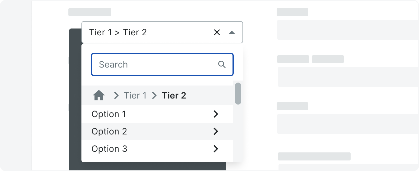
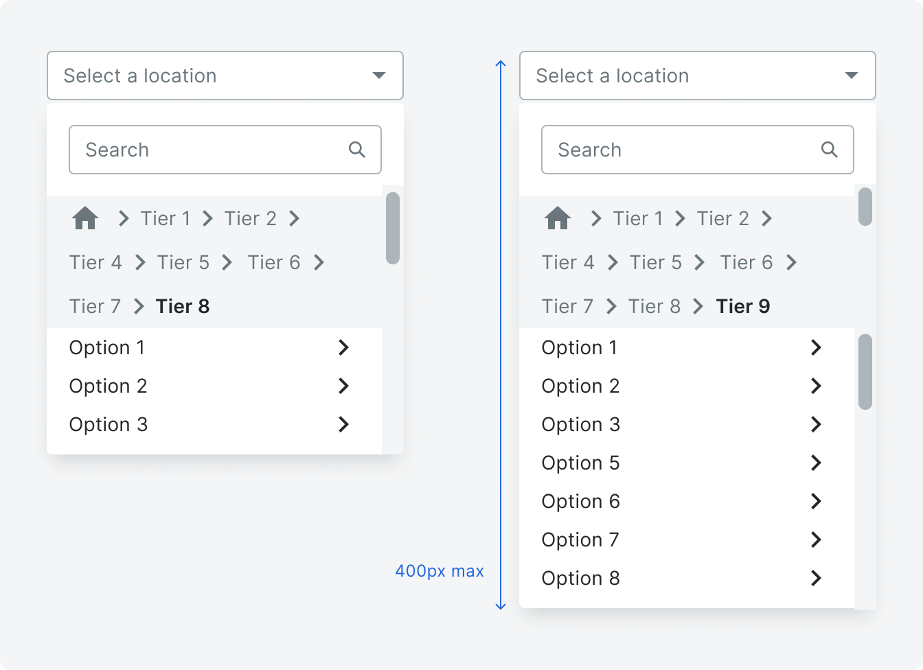
Breadcrumbs appear once the user drills down into the second tier. Breadcrumbs do not truncate, they will wrap up to three lines and then scroll. Breadcrumb text will wrap with a hyphen to the next row as needed.
Types
Selectable/Unselectable Tiers
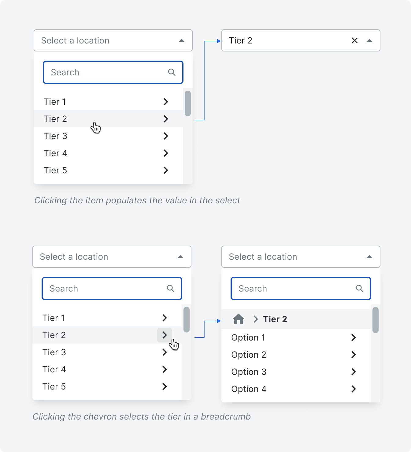
Within the menu, the option rows with text and icon can be clickable. To select an item, users will click the option text. To drill down to the next tier, users will click the icon.
States
You can find details for the select input states on the select page.
Variations
With Footer
The footer is used if actions are needed. For instance, to allow the user to create a new item.

Full Path Display
In this variant, the full tier path is displayed in the input after the final selection
is made.

“Leaf” Only Display
In this variant, only the final selection of the path will be visible in the input.

Behavior
Menu
When the user first opens the menu, options for the first tier are displayed. Clicking the chevron drills down to the second tier. As the user clicks the chevrons, the child tiers are displayed one at a time in the menu. The selected option will display in the input with along with the tiers. Upon selection the menu will close.
If the menu opens with a value present, the menu should open to the selected tier.
If the menu opens with a value present, the menu should open to the selected tier.
Breadcrumb
If the Home icon is clicked, the breadcrumb area disappears and the initial option list displays without any breadcrumbs.
You can click, but not tab, to crumbs. The arrow keys left and right can be used to navigate left and right through the tiers.
You can click, but not tab, to crumbs. The arrow keys left and right can be used to navigate left and right through the tiers.

Scrolling
The list options scroll when the max height of the menu, including the breadcrumb area, exceeds 400px. The breadcrumb area scrolls if the crumbs wrap to more than 4 lines.
If a value has already been selected and the breadcrumbs are long enough to require scrolling, the menu will open with the breadcrumbs scrolled to the selected value.
In both the breadcrumb area and list option menu, the scroll bar pushes the content to the left; the menu does not change width when a scrollbar is present.
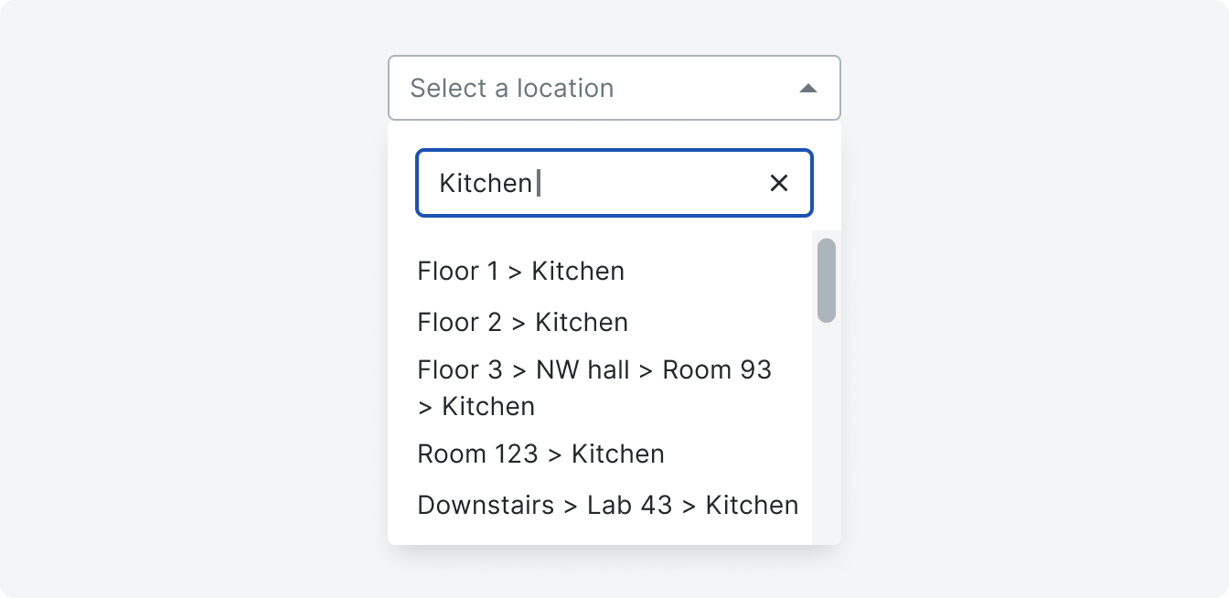
Search
Once a user enters text in the search, the menu flattens the tiers into a single string separated by right facing carets (>) so that all items within the search parameters are visible. Once flattened, menu items wrap.
Left and right nav arrows will move the cursor within the search bar, not to navigate tiers.
Left and right nav arrows will move the cursor within the search bar, not to navigate tiers.
Empty State
Tiered Selects can have Empty States when a project has no options, when a tier has no options, or when a search has no results.

Quick Create
A quick create button can be enabled or disabled in a footer. When create is clicked, a new menu with an input and confirmation actions replace the tiered menu. The input will automatically be in focus.
Users can also tab to the footer button. After the last focusable footer element is tabbed away from, the menu should close and the select should be in focus.
Clicking ‘Create’ will added the new option to the tier currently selected. Once a new item is created, the menu drills down to the new tier. Cancel returns to the initial menu and tier.

Keyboard Accessibility
The arrow keys left and right can be used to navigate left and right through the tiers and down will scroll through the options. Enter will select the item.
Specifications
Padding
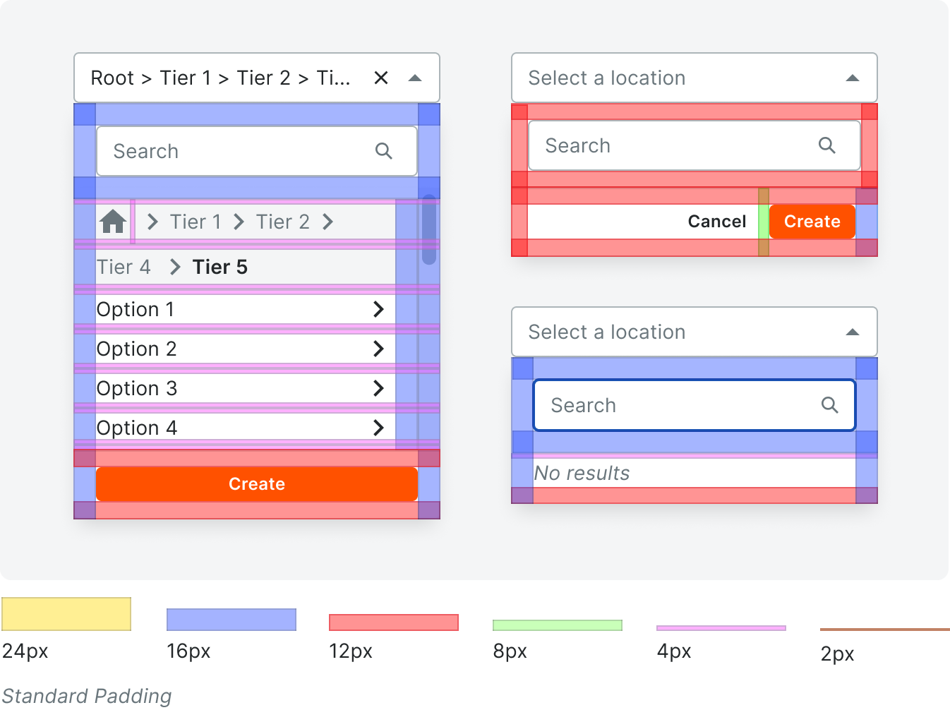
Standard Padding
Styling