


Tooltip
We use tooltips to display additional descriptive information about an element or item to the user. For example, we could use them to explain a specific term or phrase, to denote the specific format required (e.g. mm/dd/yyy), or to clarify certain information (e.g. why a button is disabled).
They can be displayed either by hovering over an element in the product or by hovering over an icon next to an element.
They can be displayed either by hovering over an element in the product or by hovering over an icon next to an element.
 Demo and Developer Guidelines
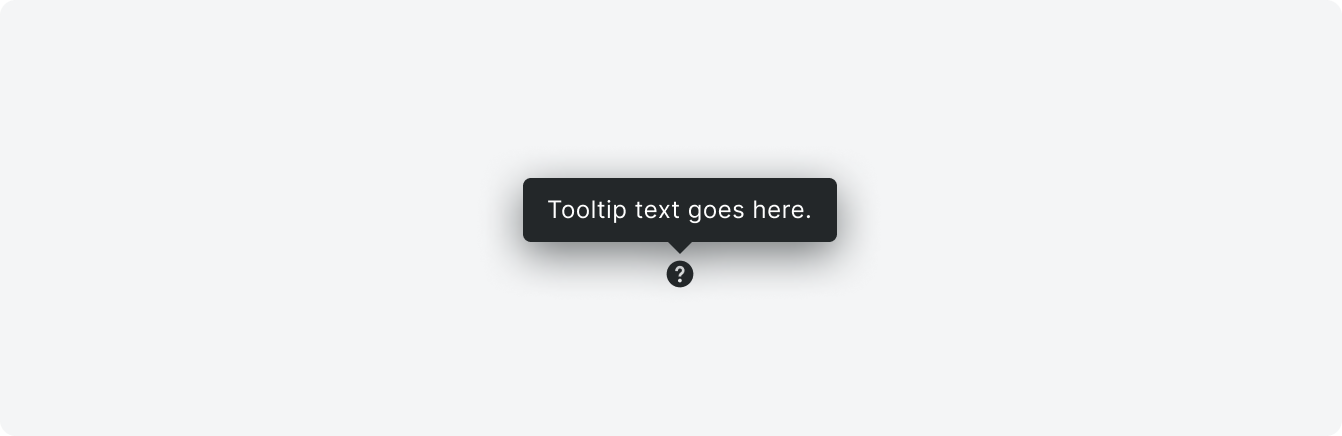
Anatomy
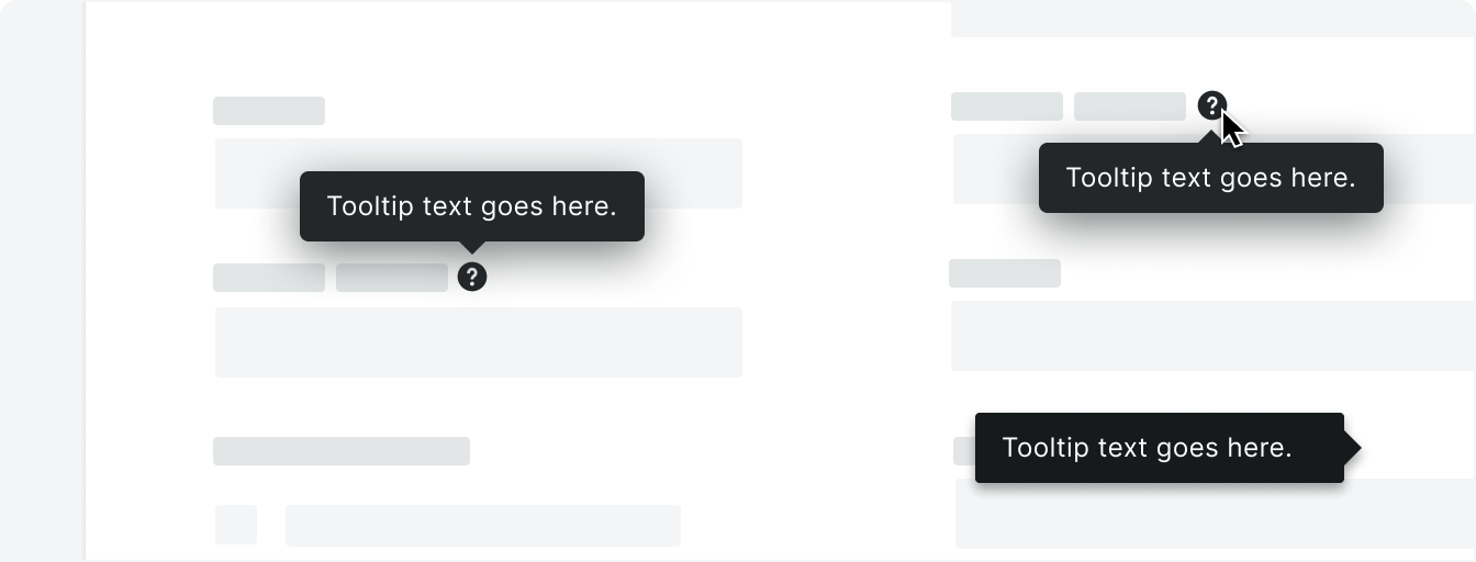
The tooltip can display above, below, to the left, or to the right of the element depending on context and location on the page.

Content
Content in tooltips is concise and sentence case with punctuation. Explain what the user needs to know in as few words as possible.
We do not recommend adding interactive elements (e.g. link or buttons) to a tooltip.
We do not recommend adding interactive elements (e.g. link or buttons) to a tooltip.
Icon/Link
Tooltips appear on hover, but tooltips themselves cannot be hovered over.
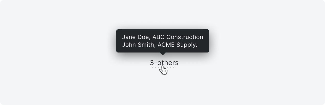
If the element that triggers the tooltip is text, a dotted underline will appear under the text to indicate the interaction.
If the element that triggers the tooltip is text, a dotted underline will appear under the text to indicate the interaction.
Types
Hover over element
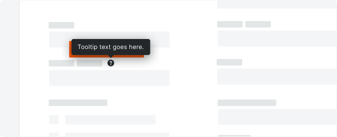
Hover over icon
Variations

Placement
Too many tooltips on a page can overwhelm the user. Be strategic about placing these only on elements that you know users struggle with. As best as you can, aim for 2-4 at most per page. A help icon (24x24px) may be used to draw attention to a tooltip if required.
Tooltips can appear above, below, and to each side of the UI element depending on screen real estate and intent.
Tooltips can appear above, below, and to each side of the UI element depending on screen real estate and intent.
Correct

Incorrect
Behavior
Specifications
Padding
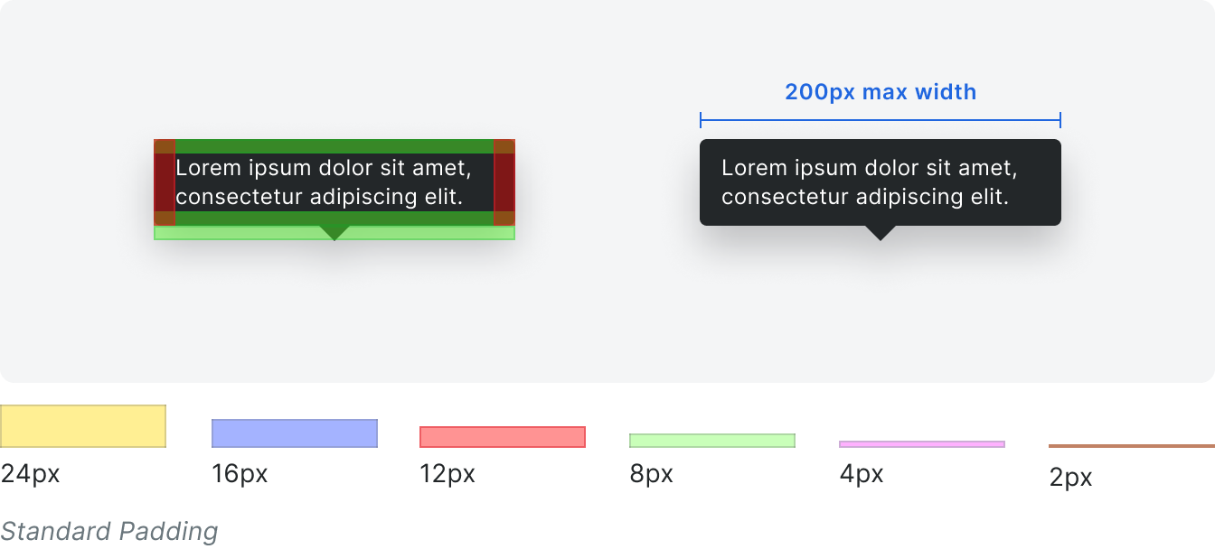
Styling
