


Dropdown
Dropdowns display a list of actions in a menu that opens and closes. We use dropdowns most commonly to trigger an action or to redirect the user to a new page or modal.
 Demo and Developer Guidelines
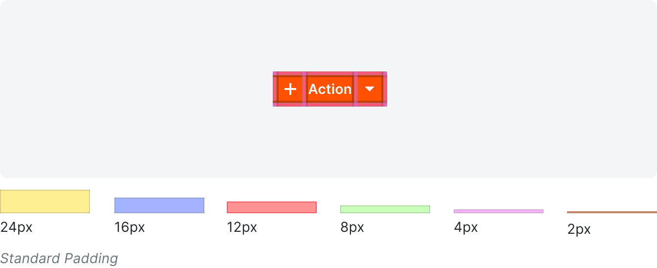
Anatomy
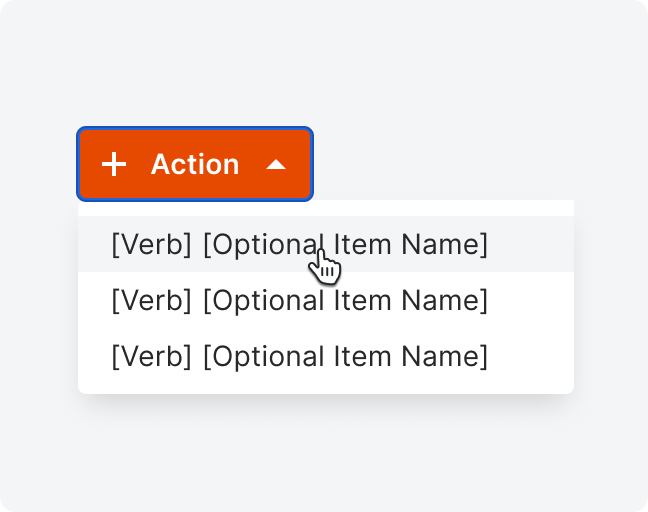
We use dropdowns in the same way we use buttons; the only difference is that a dropdown has multiple nested actions a user can choose from. For all dropdowns except the overflow dropdown, the button itself includes a chevron icon to indicate that there is a menu the can be expanded.

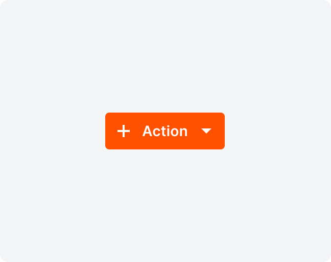
Action Icon
Only use an icon on list pages for the primary action on the page. Do not use an icon in form dropdowns.
Label
Dropdown labels are title case. They clearly define what happens when a user selects the dropdown with a present tense, singular verb that appears in the Button Glossary.
Option labels consist of a single singular noun unless otherwise stated.
If the character count exceeds the count limit, the text should truncate and a tooltip should be utilized on hover.
Option labels consist of a single singular noun unless otherwise stated.
If the character count exceeds the count limit, the text should truncate and a tooltip should be utilized on hover.
Grouping in Menu
The menu triggered by the dropdown can use grouping options as uses in the group select component.
Types
Primary
Primary dropdowns are reserved for when you have multiple main items you can create from a page. There can only be one primary dropdown per page.
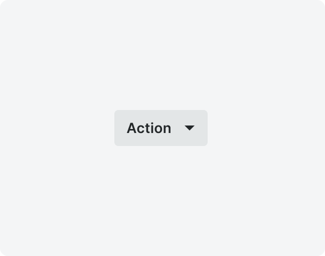
Default
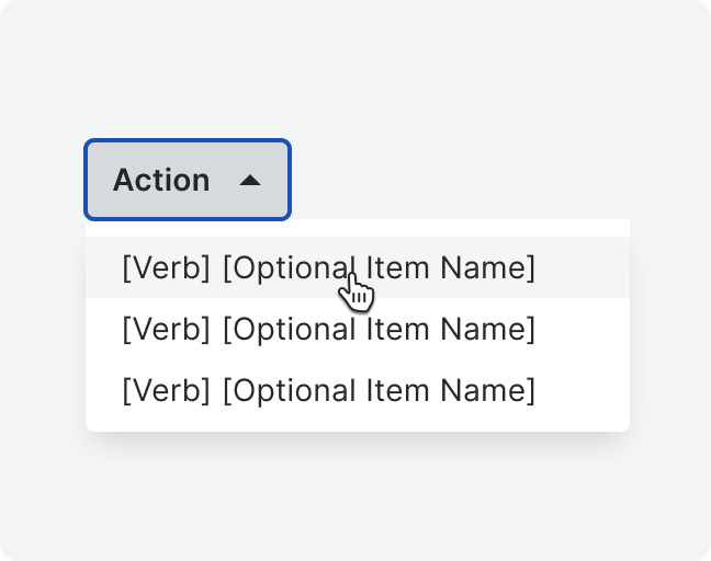
Active
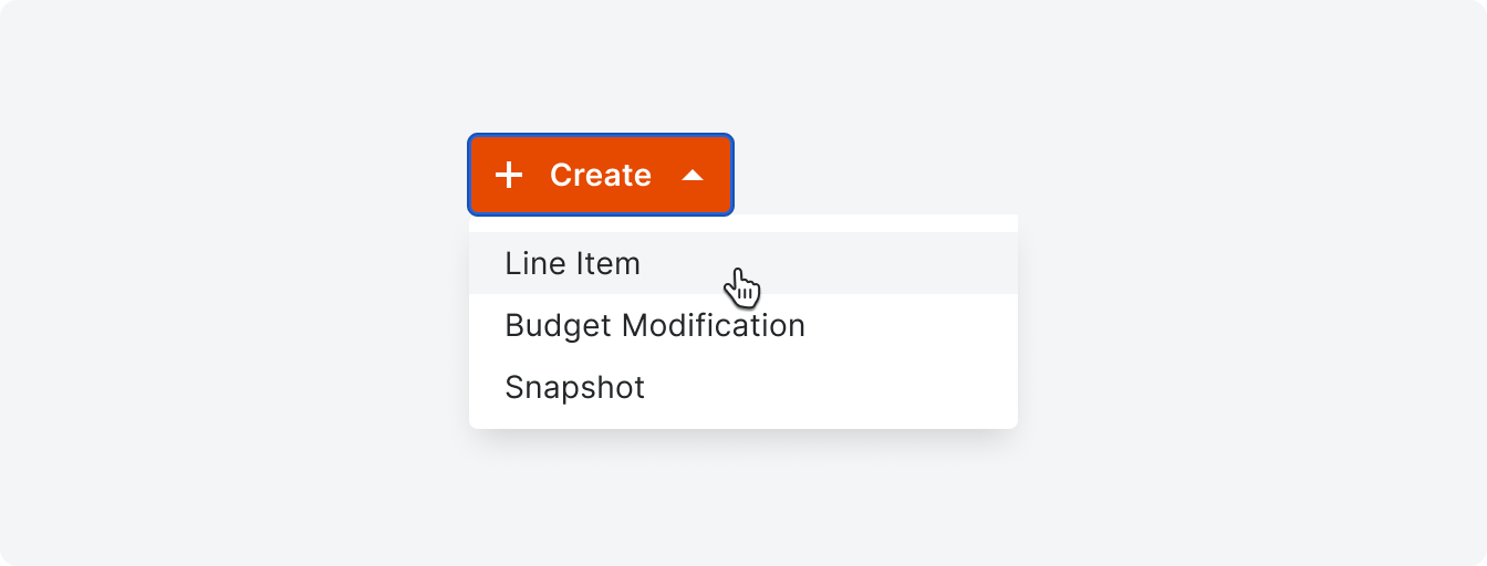
Example
Secondary
Secondary dropdowns can appear on any page in Procore. They display a list of similar, non-primary actions that users can take with the same verb. There are some cases when a secondary dropdown menu can present a list of items not associated with a verb. For example, Reports > Report Name.
Labels for this dropdown consist of one singular, present-tense verb that appears in the Button Glossary. In the menu, only list the names of the items that you can take that action upon.
Labels for this dropdown consist of one singular, present-tense verb that appears in the Button Glossary. In the menu, only list the names of the items that you can take that action upon.
Default
Active
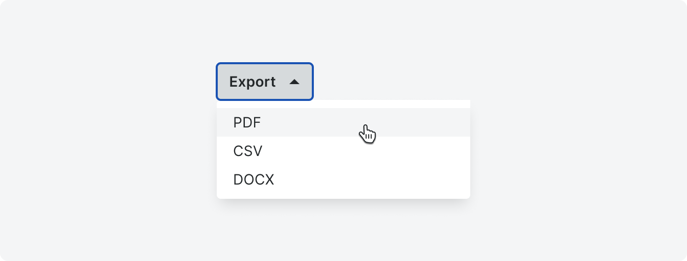
Example
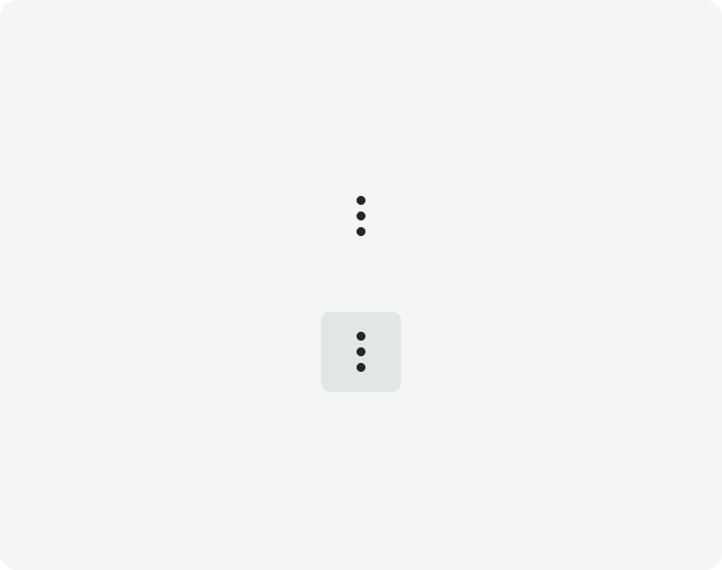
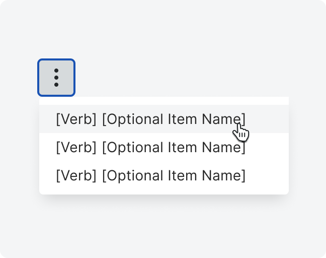
Overflow
The overflow dropdown is used to provide selectible actions in an area with limited space. We use these primarily in forms, tables, and banners.
Option lables under the overflow dropdown consist of a combination of a singular, present tense verb found in the Button Glossary, the name of the item, or a label that directs the user to a reference link (often under a Learn More label).
Option lables under the overflow dropdown consist of a combination of a singular, present tense verb found in the Button Glossary, the name of the item, or a label that directs the user to a reference link (often under a Learn More label).
Default
Active

Example
States
Specifications