


Panel
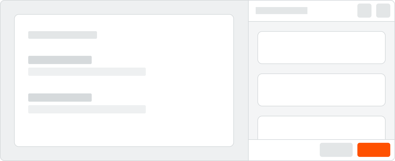
Panels help users complete tasks or view additional information alongside the main content of a page.
Panels are often initiated by clicking on an item somewhere on the main page, and they often contain additional information or options specific to that item.
Panels are often initiated by clicking on an item somewhere on the main page, and they often contain additional information or options specific to that item.
 Demo and Developer Guidelines
Anatomy

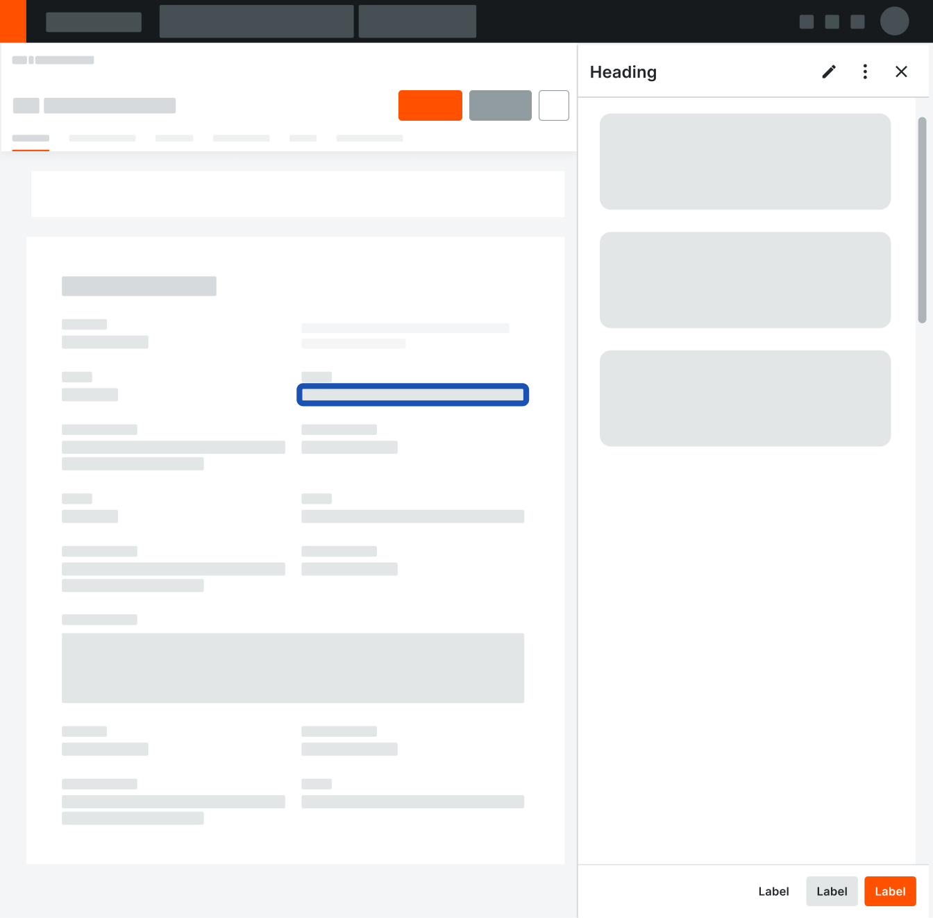
Contextual Back Button
When drilling down into an item within the panel, a user can toggle a tertiary Back button. Clicking this allows the user to return back to the panel root.
Heading
For long headings that truncate, a tooltip will show on hover.
Headings are title case without punctuation.
Headings are title case without punctuation.
Header Actions
User can specify multiple actions in the header. After 3 buttons, additional actions are rolled into an overflow menu.
Body
Panel body areas can contain rich media, images, icons, buttons, and more, and their layout can be adjusted for the use case.
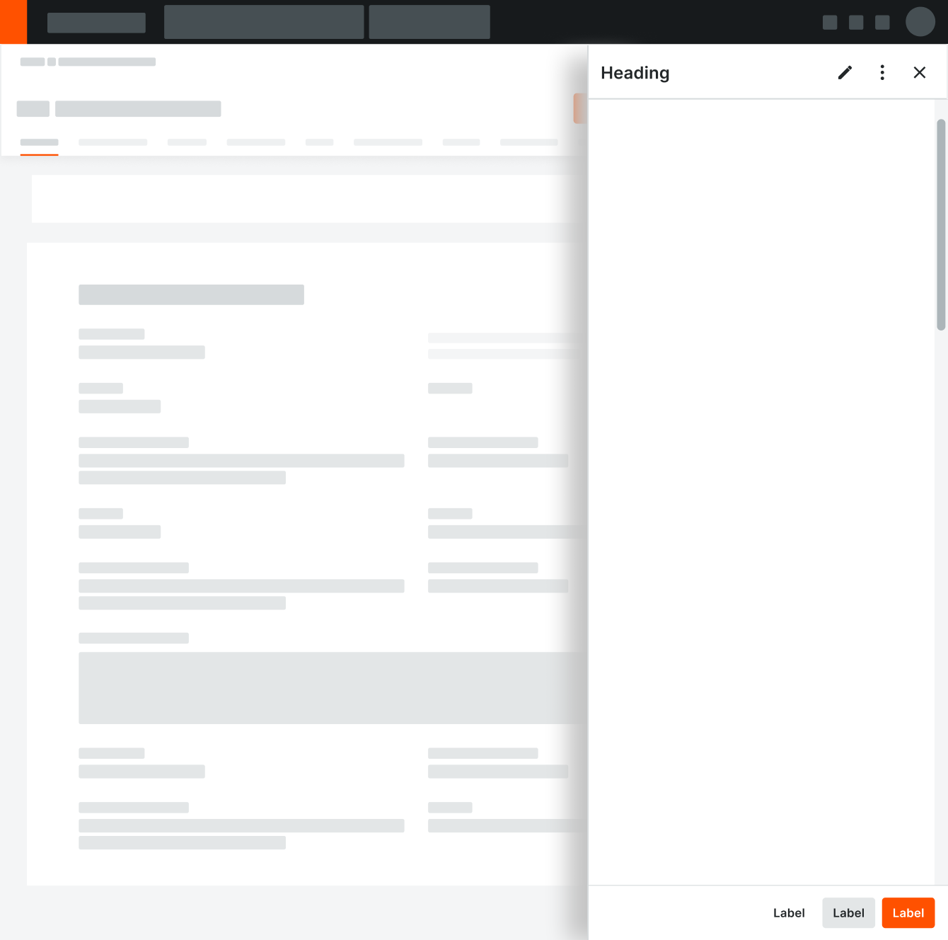
The content area has a minimum right margin of 24px to account for a scrollbar.
The content area has a minimum right margin of 24px to account for a scrollbar.
Footer
Add a footer to house actions that apply to all content in the panel (e.g. Save a form or close the panel). Buttons are right aligned, and only one primary button is used at a time. There can be multiple secondary and tertiary buttons.
Behavior
When to Use a Panel
A common use case for a panel is to show additional or supplemental information about an item (e.g. general information about a linked item, comments added to the item, or a list of changes / related activity).

Correct
Please avoid scenarios that cause double footers (where a footer is in the panel and the main content area).
When Not to Use a Panel
We do not use panels for global or generic actions that affect the entire page. Panels should most always be initiated or tied to a user clicking on something, like a table row, card, or button. Panels work best when they have one specific purpose or workflow.
Generic actions are housed in the heading of the main page.
Generic actions are housed in the heading of the main page.

Incorrect
Placement
Panels align with the global navigation at the top of the page and stretch to the bottom. As the page scrolls, they stay in a fixed position.
Panels can be added to a page as a permanent section or a temporary interaction.
1. For panels that are added to the page as a permanent section, remove the Close button and the shadow on the panel.
2. For panels that are a temporary part of the layout, the main content area will shift to account for the width of the panel.
Do not overlay a panel on top of a page. If this interaction is needed, use a modal.
Correct
Incorrect
Do not overlay a panel on top of a page.
Specifications
Padding
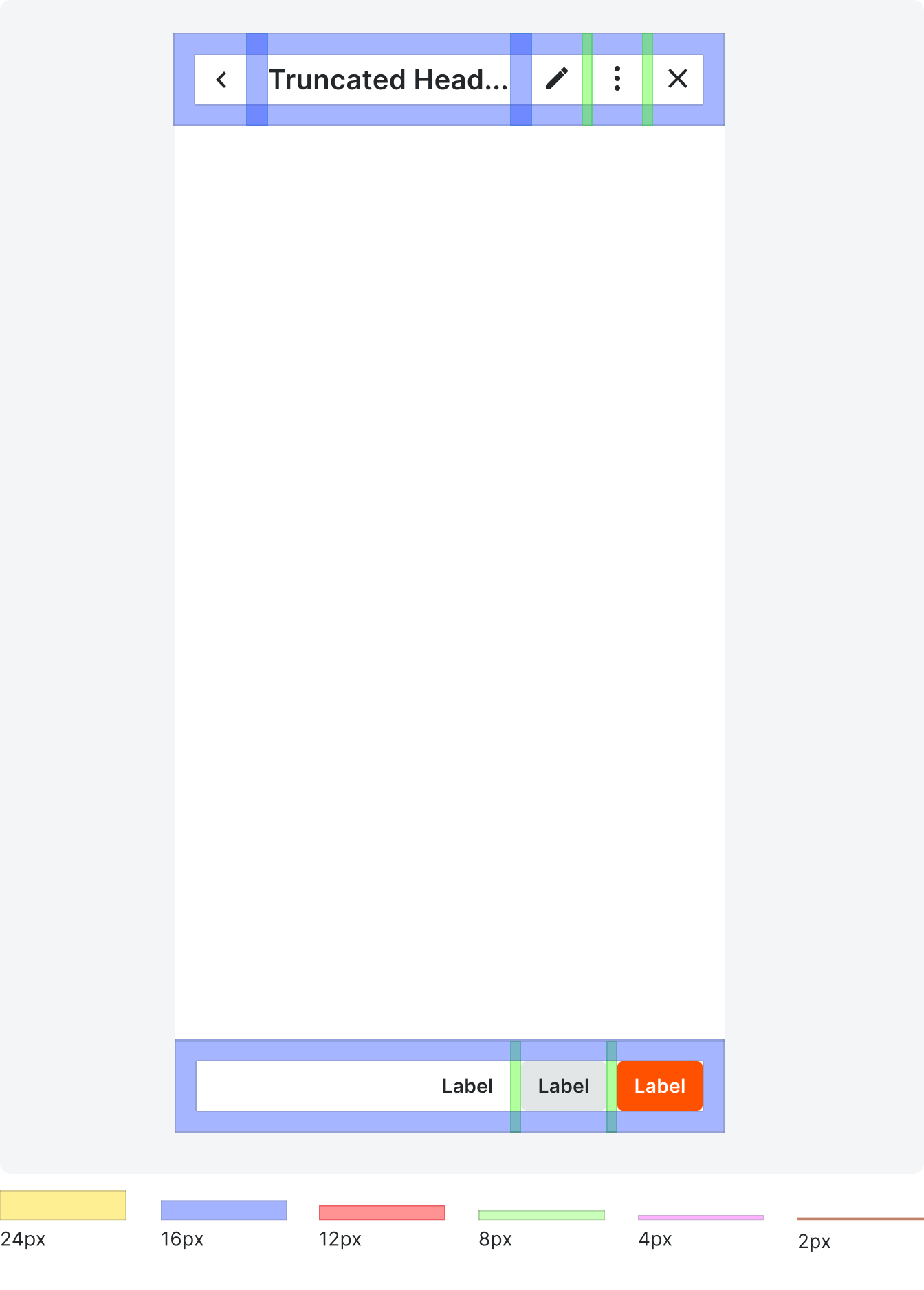
Typography
