


Popover
We use popovers to display more of an item’s information or details. This may be used to show additional fields in an item’s form that aren’t shown by default in the UI. Oftentimes, there will be a visual queue to indicate that more information is available.
Do not use popovers to display large amounts of information, perform data entry, or use as a replacement for an overflow, menu, or modal.
If you want to show descriptive / educational information about an item, use a tooltip.
Do not use popovers to display large amounts of information, perform data entry, or use as a replacement for an overflow, menu, or modal.
If you want to show descriptive / educational information about an item, use a tooltip.
 Demo and Developer Guidelines
Anatomy
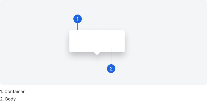
Body
You can put most anything you need in the popover body to fit your use case, but popovers should be designed to be scannable and concise. Decide what information is needed most in the popover, and leave the rest of the information on a larger view page.
All components included in the card must follow the best practices for that component. For example, if you include a link, be sure to reference Links. Links in popovers open in a new browser tab.
Typically, all headers are title case without punctuation, and all body or supporting information is sentence case with punctuation.
Typically, all headers are title case without punctuation, and all body or supporting information is sentence case with punctuation.
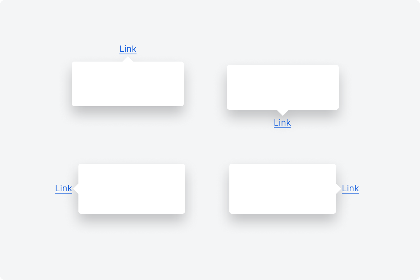
Placement
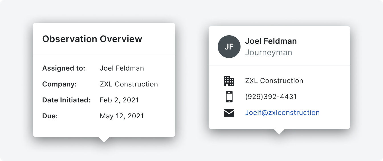
Popovers are always visually attached to UI element in question. It may appear above, below or to either side of the UI element depending on screen real estate and intent.
Behavior
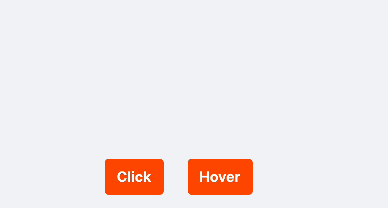
Popovers can appear on either click or hover depending on the use case. Content within popovers may have statefulness but the popover container will not. If the element that triggers the popover is text, the text will have a dotted underline to indicate the interaction.
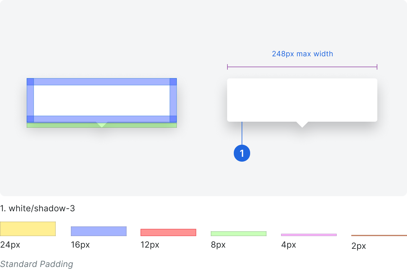
Specifications
Padding & Sizing