


Modal
We use modals to present additional actions, information, or forms on pages where a user’s experience would benefit from remaining on the same page. They can include graphics, inputs, buttons, and other elements as needed to produce the workflow or action needed.
Complicated layouts and navigation patterns within modals should be avoided.
Complicated layouts and navigation patterns within modals should be avoided.
 Demo and Developer Guidelines
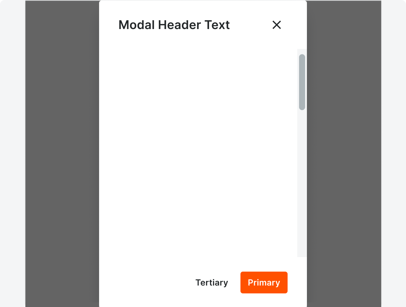
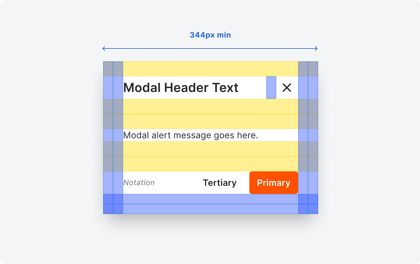
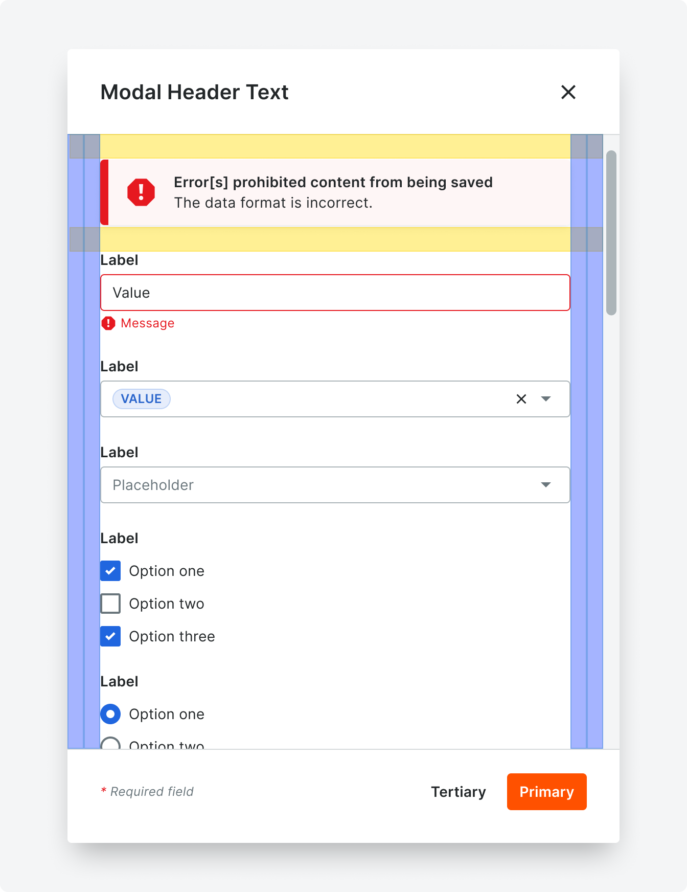
Anatomy
Because use cases vary, character count limits are not provided for this component. Be sure to plan your content with translation in mind.
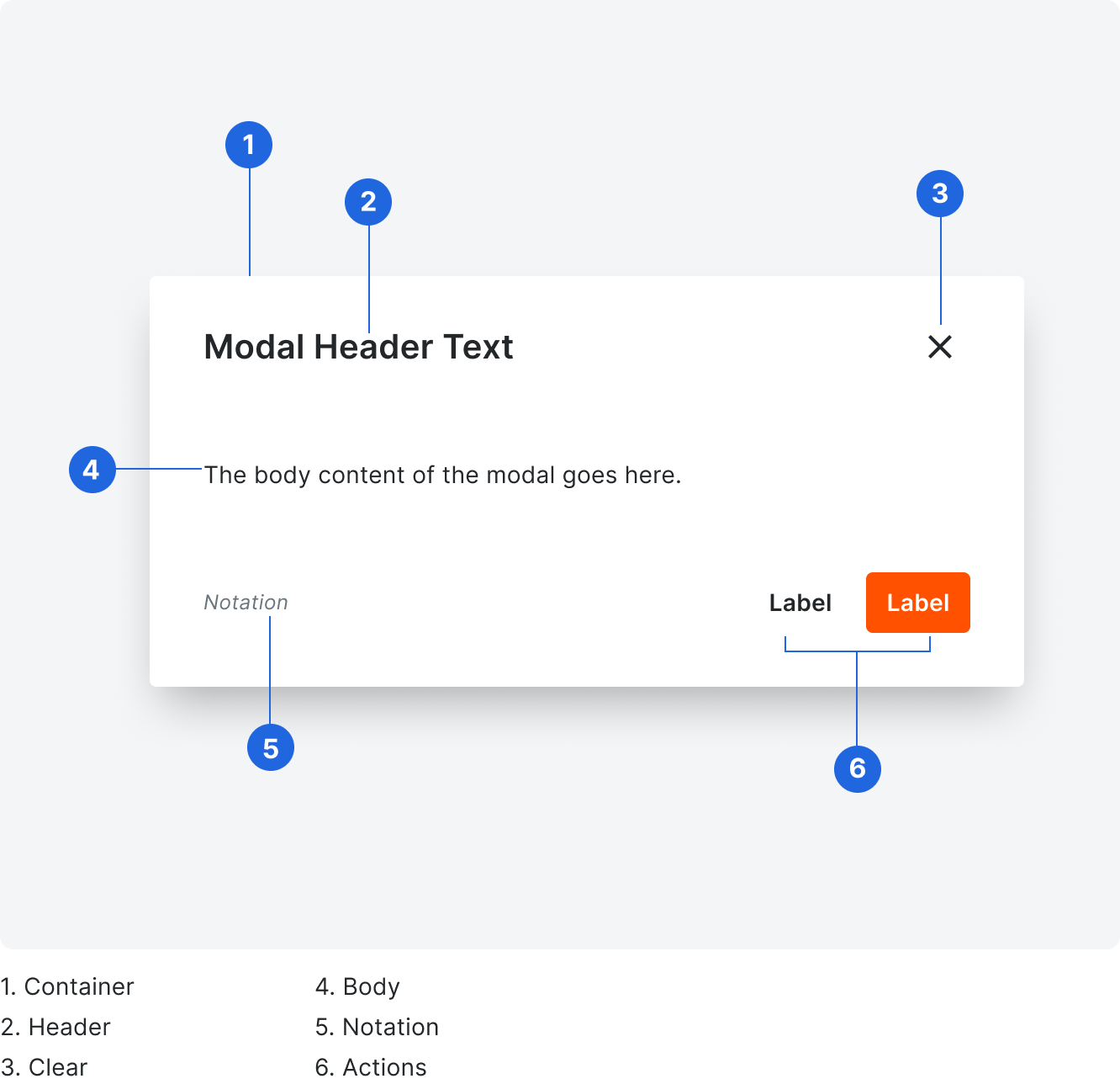
Container
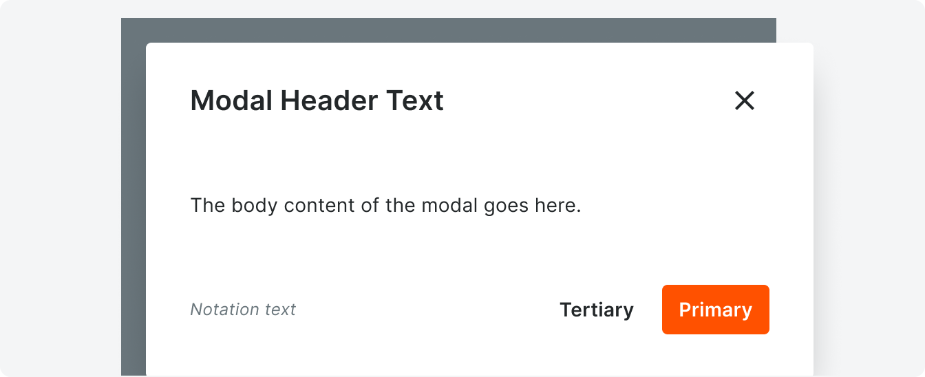
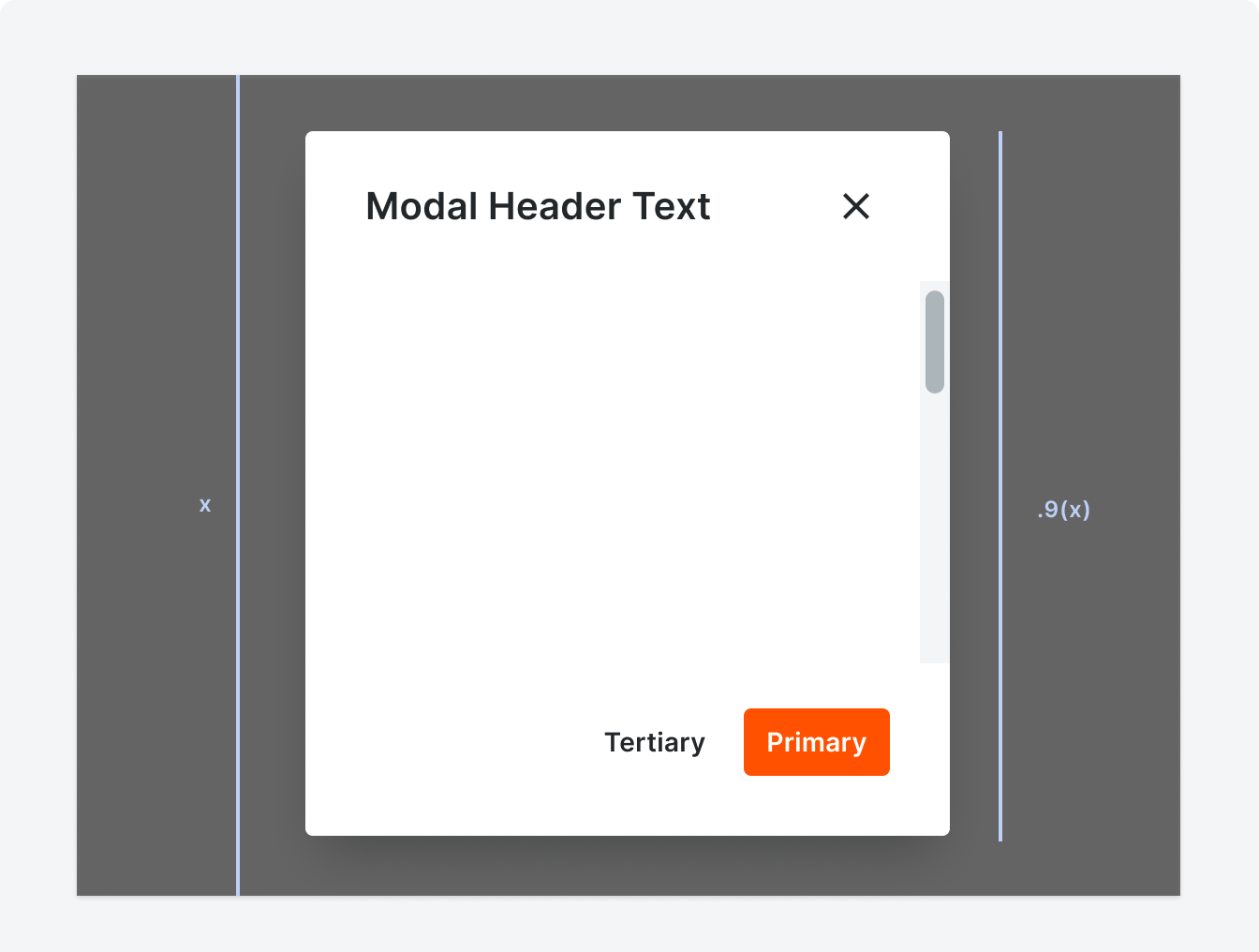
Modals stretch to fit their content content, and modals should not exceed a height of 90% of the view port. If a user is working on a smaller screen, a vertical scrollbar will appear so the user can interact with all content. Modal content can scroll if it exceeds the maximum height.
Correct
Incorrect
Modals should not take up the full height of the viewport.
Clear Icon
All modals include a clear action. This can take the form of a button, an icon, by clicking outside of the modal, or a combination of those.
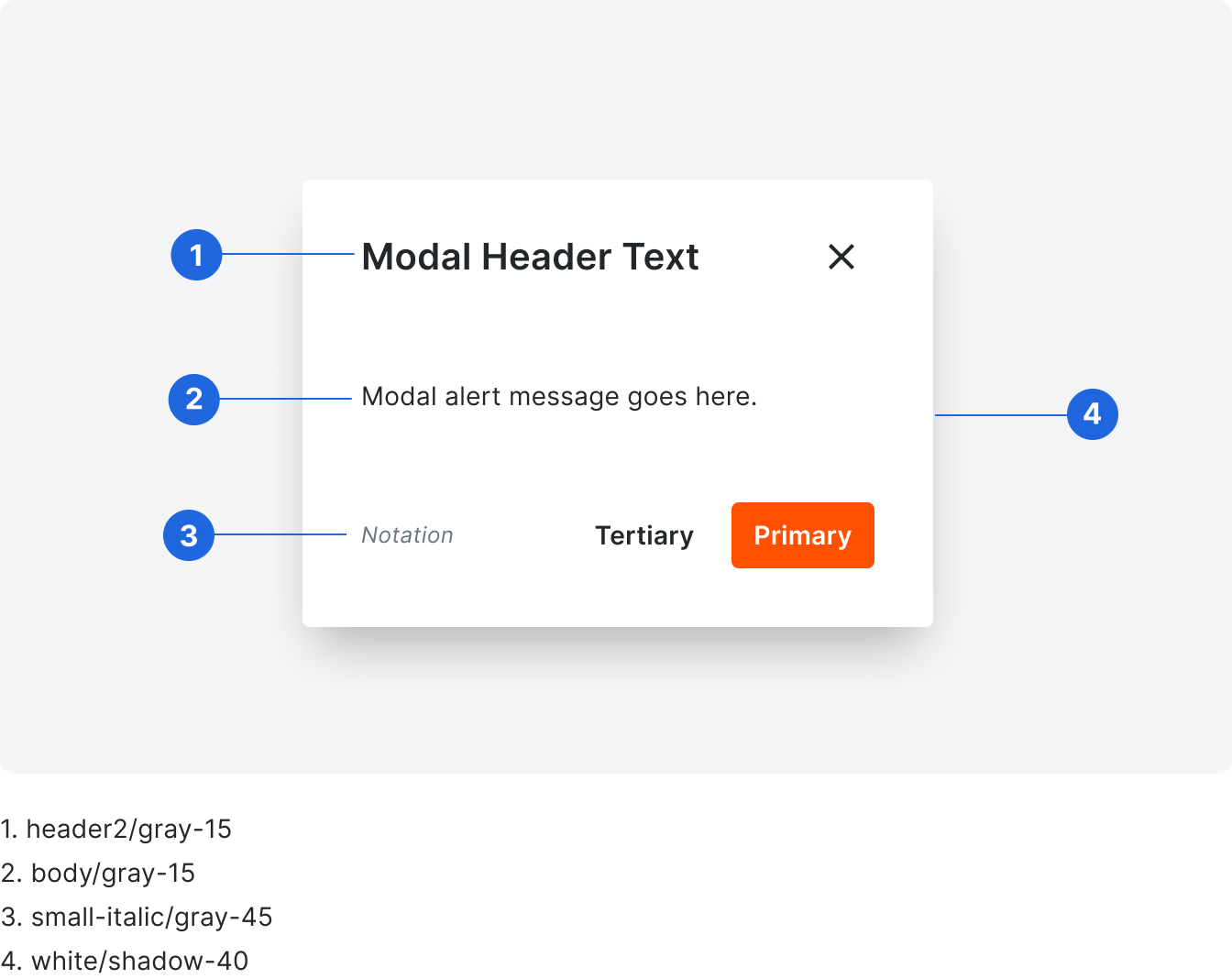
Header
Describe the action taking place in the modal starting with a verb. Headers are title case without punctuation and should not exceed one line.
Body
Body is sentence case with punctuation. If you are including other components in the body of your modal, be sure to follow the guidelines for each component.
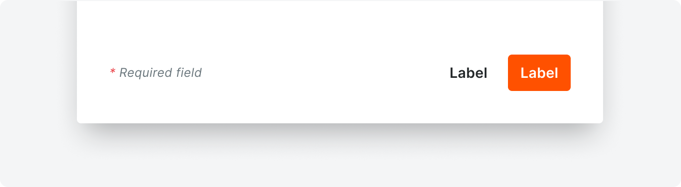
Notation
The notation is sentence case with punctuation. A common notation seen throughout Procore is the “Required field” callout.
Types
Standard Modal
Standard modals are used to perform small tasks or to present information that is supplemental to a page.

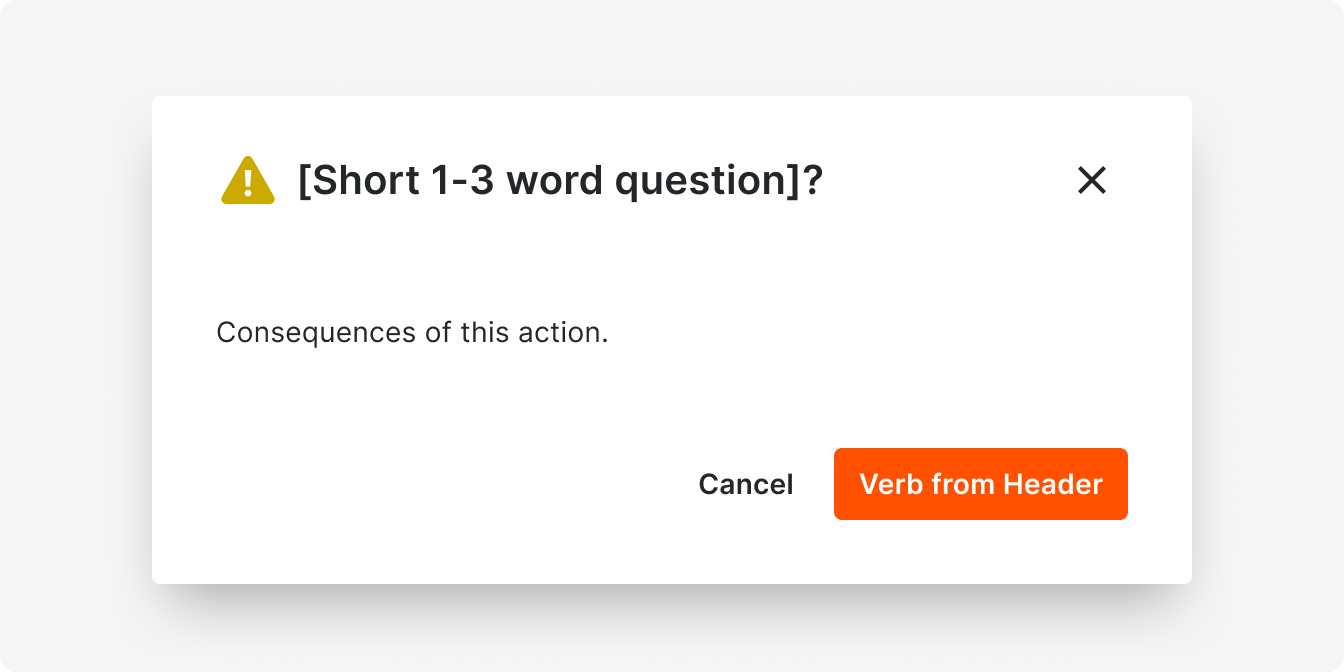
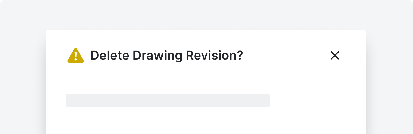
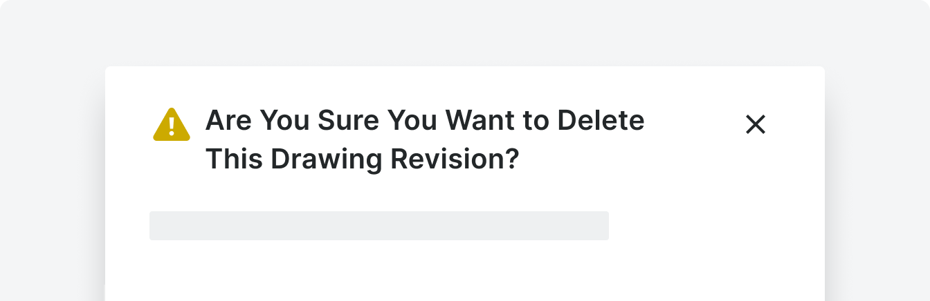
Confirmation Modal
Confirmations modals ask a user if they want to proceed with an action that is considered high risk (e.g. destructive or non-reversible actions).
Template
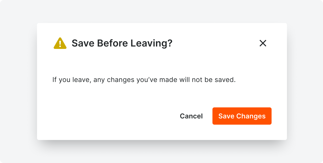
Example
The headers of confirmation modals ask a question starting with a verb. They are often 2-3 words total.
Correct
Incorrect
Limit headers to one verb and one nouns to get to the point with as few words as possible.
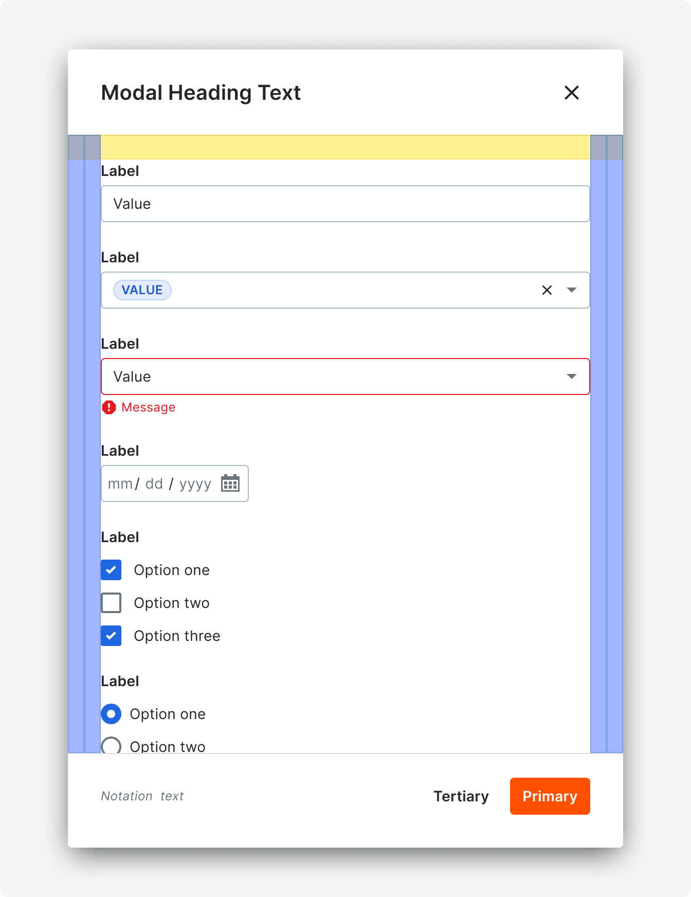
Form Modal
Form modals allow users to create new attributes or items across Procore when the context of a page is still needed under the create form. Form modals can contain checkboxes, inputs, links, multi selects, pill selects, radio buttons, selects, switches, text areas, and text editors.
Please reference the relevant documentation when using these components in modals.
Please reference the relevant documentation when using these components in modals.

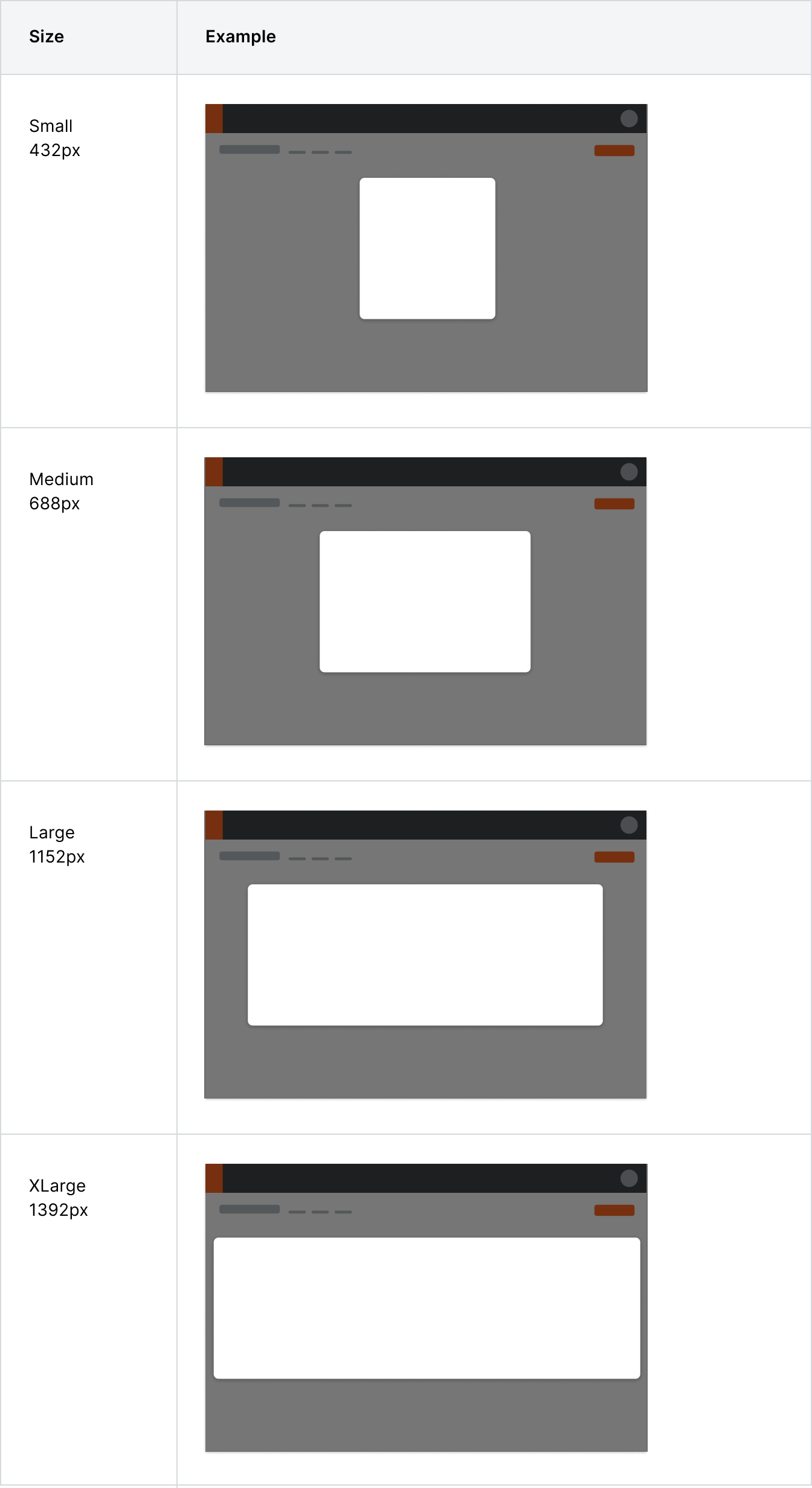
Variations
Modals offer different widths to accommodate all types of content.
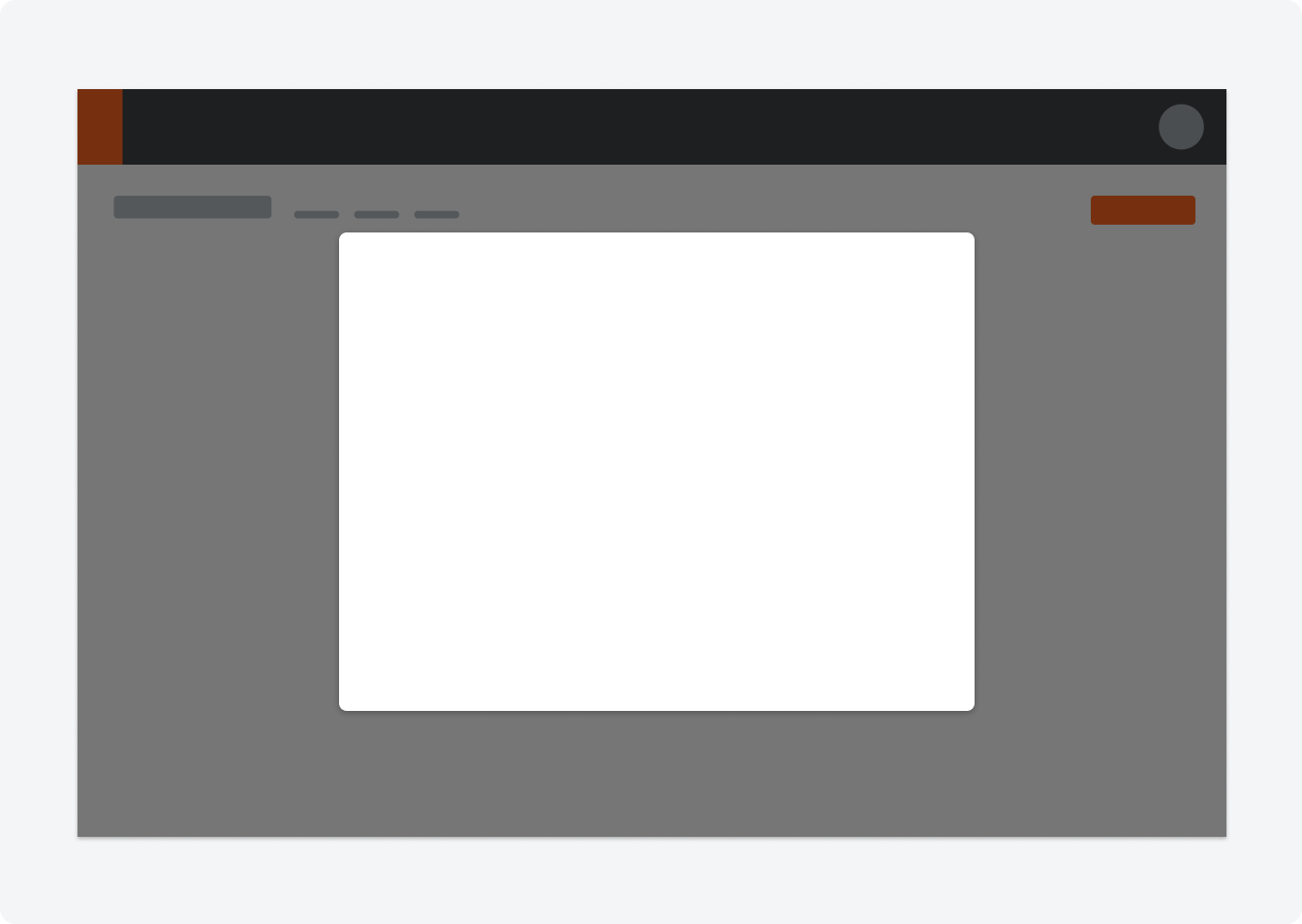
Placement
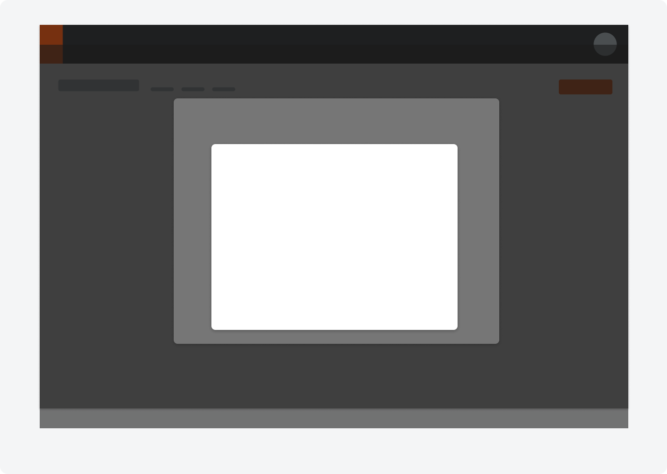
Modals should appear in the center of the screen and placed on a background overlay. Modals do not take up any more then 30-40% of the viewable area.
Modal on Modal
If there is a circumstance where a modal is triggered within a modal, the new modal (and scrim) will sit directly on top of the original one. A common use case for this is when a file attacher link is located in a modal, and clicking the link will trigger the file attacher modal to appear.
Behavior
Specifications
Padding

Styling