


Iconography
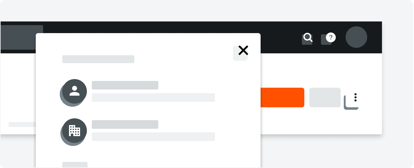
Icons are used to express actions, an item’s state, and even to categorize data. All icons created and added to the system must be clear, intuitive, and consistent. They should be used sparingly and in a way that is consistent with their original intent.
System Set
Style
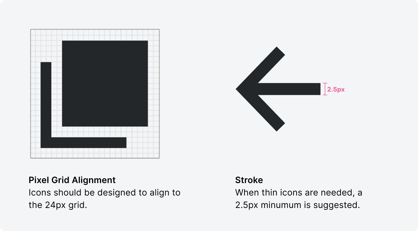
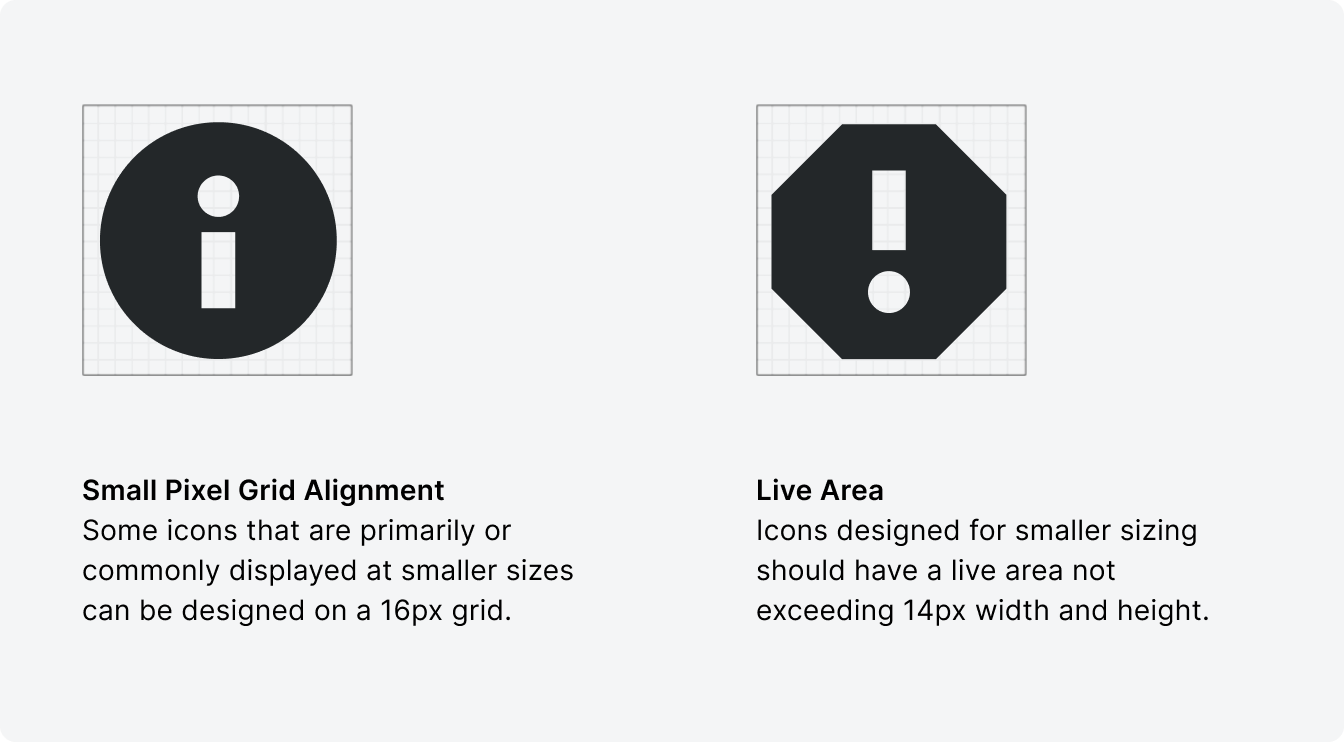
When creating an icon it is important to understand the grid and styling decisions made to unify that icon within a family of icons. Use a 24px grid when designing for standard icons. A 16px grid can be used to design icons that are primarily or commonly displayed at smaller sizes.
Filled vs. Outlined
Our icons predominantly consist of filled icons because they offer ideal contrast to the heavy content throughout our product.

Correct
Incorrect
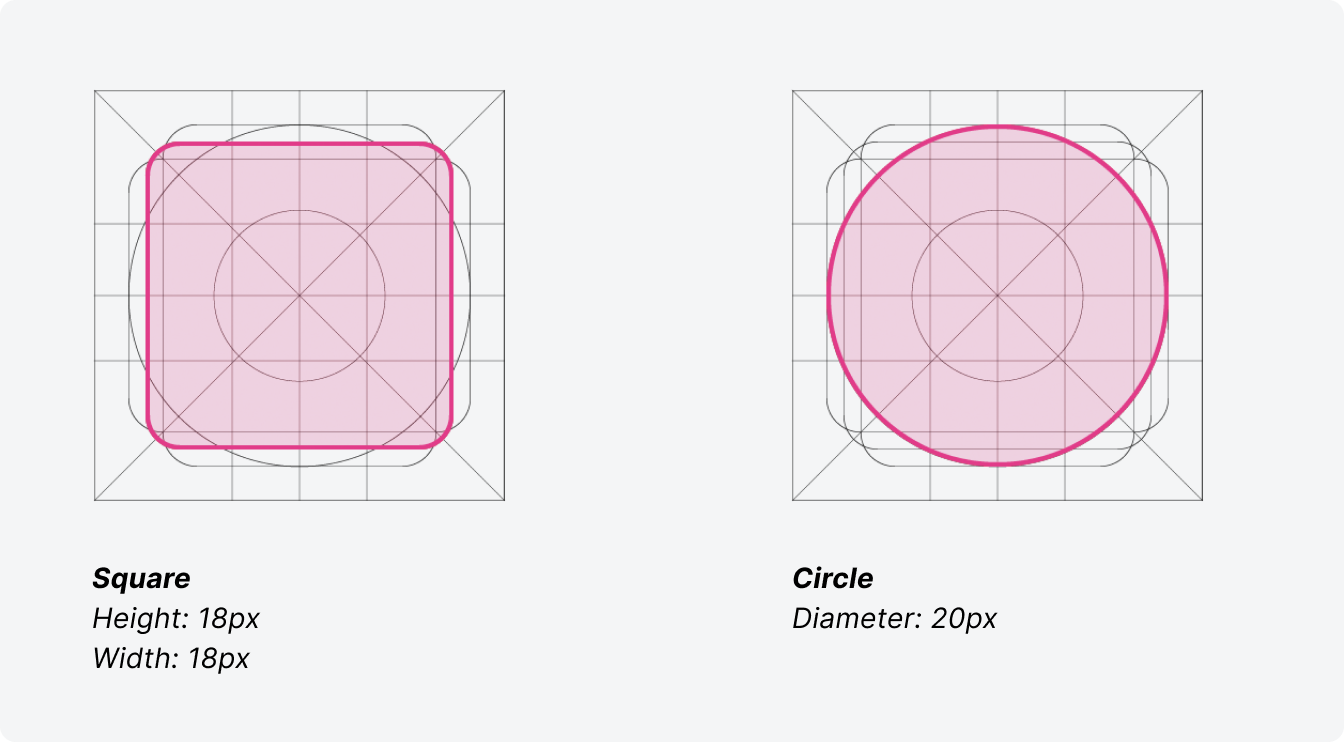
Radius
Our icons should be crisp and punchy. When creating new icons, use a radius on corners only when needed.
Naming
When possible, icons are named after the physical object they represent. For example, we would call an icon trash instead of delete.
Sizing
The default recommended sizing for icons is 24px x 24px. Icons can also be used at 16px x 16px for small sizing and 32px x 32px for large.

Sizing
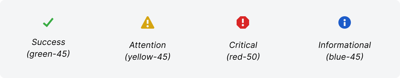
Colored icons can be used for emphasis and to indicate status. Use color sparingly bring attention to items.
Adding New Icons to the System Set
Steps to follow:
1. UX Designer checks the current system set to see if an existing icon can be used
2. If no icon exists in the system that is appropriate, the UX Designer can explore a new icon to be used during the conceptual phase
3. UX Designer works with the Design Systems Team during this process to ensure the new icon meets the established design guidelines
4. Once the new icon design is approved and ready for development, the icon can be requested by the engineering team to be added to CORE for the next release
5. NOTE: If a specialty icon is needed that will not be used system wide, an .svg version can still be used in development, if needed
Icon Search
Thank you! Your submission has been received!
Oops! Something went wrong while submitting the form.
Activity
tool, activity, pulse, wave
AppAssemble
icon, assemble, app, integration
Archive
icon, archive, box
ArrowAltRight
arrow, right, sent, ERP
ArrowAltRightUpLeft
arrow, left, up, rejected, sent back, ERP
ArrowDashDown
icon, arrow, dash, down, activity feed
ArrowDashLeft
icon, arrow, dash, left, activity feed
ArrowDashRight
icon, arrow, right, released, activity feed
ArrowDashUp
icon, arrow, dash, up, elevated, activity feed
ArrowDown
arrow, down
ArrowLeft
arrow, left, back
ArrowRight
icon, arrow, right, forward
ArrowSlantDownLeft
icon, arrow, slant, down, left, diagonal, markup, viewer
ArrowSlantUnited
icon, arrow, double, slant, united, markup, viewer
ArrowUp
arrow, up
ArrowUpShare
icon, share, arrow, up, ios
ArrowheadMarquee
icon, arrow, arrowhead, marquee, markup, drawings, viewer
ArrowsConverge
icon, arrows, coordination issues, tool, markup, viewer, converge
ArrowsCycleClockwise
arrows, refresh, cycle, flip, sync
ArrowsSync
icon, arrows, synced, status
Ban
blocked, rejected, status, not allowed
Bell
bell, notifications, alarm
Binoculars
binoculars, observation, observe, watch
Blueprint
blueprint, drawing, floor plan
Book
book, specifications
BookCurrencyUSAList
icon, book, currency, dollar, usa, money, financial
BookInfo
i, instructions, tool, book, info
BookPerson
directory, tool, book, person, user
BookRibbon
icon, book, ribbon, bookmark, saved view
Building
building, company, contact, business
Calculator
calculator, calculate, financial
Calendar
calendar, date
Camera
camera, photo, image, picture
CaretDown
caret, down, dropdown
CaretLeft
caret, left, menu tier
CaretRight
caret, right, menu tier
CaretsIn
carets, in, contract, collapse row
CaretsInHorizontalWithLine
icon, carets, line, collapse, vertical
CaretsInVertical
icon, carets, in, collapse, vertical
CaretsInVerticalWithLine
icon, carets, in, line, contract, horizontal
CaretsOut
carets, out, expand row
CaretsOutHorizontalWithLine
icon, carets, line, expand, vertical
CaretsOutVertical
icon, carets, out, expand, vertical
CaretsOutVerticalWithLine
icon, carets, line, out, expand
ChartBar
chart, bar, report, graph
ChartLine
icon, chart, line, report, graph
Check
check, checkmark, approved, success, activity, banner
CheckNodes
icon, itp, tool, check, nodes
ChevronDown
chevron, down, expanded
ChevronLeft
chevron, left, previous, back
ChevronRight
chevron, right, next, collapsed
Circle
icon, circle, ellipse, record
CircleNodes
meetings, tool, circle, nodes
CircleStroked
icon, circle, stroked, outlined, markup, viewer
CirclesOpacity
icon, circles, opacity, transparency, markup, viewer
Clear
clear, close, x, exit, delete
ClipboardBulletedChecks
icon, clipboard, bullets, check, tasks
ClipboardCheck
inspections, clipboard, check, tool
ClipboardPushpin
icon, clipboard, pushpin, punchlist, tool
Clock
clock, icon, time
ClockBricks
icon, time, materials, T&M, tool
CloudMarkup
icon, cloud, markup, viewer, drawing
Cog
cog, gear, settings
Comment
comment, speech bubble, message, feedback
CommentPeople
icon, comments, people, correspondence, messages
Comments
comments, messages, speech bubbles
Compass
icon, compass, architecture, drawing, tool, viewer
Computer
computer, desktop, monitor, screen
ConcentricCircles
icon, open, status, activity feed, circles
Cone
icon, cone, safety, tool
Connect
icon, connect, connected, connection, connectability
Crosshair
icon, compare, crosshair, registration
Cube
cube, model, 3D, tool
CurrencyListUSA
icon, currency, dollar, financial, bidding, tool, money
CurrencyUSA
currency, dollar, financial, money, dollar sign, usa, america
Download
download, cloud, arrow
Duplicate
duplicate, copy, clone, lessons
Earth
earth, world, globe
Education
education, graduation cap, lesson, learning
EllipsisHorizontal
ellipsis, overflow, horizontal, more, dots
EllipsisVertical
overflow, ellipsis, vertical, more, dots
Envelope
email, envelope, mail
EnvelopeOpen
icon, envelope, email, mail, open
Error
error, alert, status, exclamation, octagon
Excavator
equipment, machine, earth mover, construction, tool
ExpandSidebar
icon, expand sidebar, expand, arrow, right
Export
export, arrow, right
ExternalLink
external link, launch, open, arrow
Eye
eye, on, visible, show, view
EyeOff
eye, off, invisible, hide
File
file, page, document
FileArrowDownRight
icon, file, arrow, down, right, change orders, tool
FileChartBar
icon, financial, report, tool, graph, chart, bar
FileChartLine
icon, financials, budget, report graph, line, chart
FileClock
icon, time sheet, file, clock, tool
FileCurrencyUSA
icon, financial, direct cost, tool
FileCurrencyUSABullets
icon, Invoicing, invoice, tool, file, page, currency, money, financial, usa, dollar, money, bullets
FileCurrencyUSAPencil
icon, file, page, estimate, estimating, estimates, tool, Currency, USA, dollar, pencil, edit
FileEye
icon, file, eye, view, viewer, launch
FileList
file, document, detail, list
FileListBulleted
icon, file, document, detail, list, bulleted
FileLock
icon, file, document, lock, locked, restricted
FilePlus
icon, file, document, add, create
FileQuestionMark
file, question mark, rfi, tool
FileSearch
icon, file, search, magnifying glass, activity feed, review
FileSigned
prime contract, signature, tool, file, signed
Filter
filter, funnel, refine
Fire
icon, fire, flame, hot
Flowchart
icon, flowchart, diagram
Folder
folder, documents
FolderQuestionMark
rfq, tool, folder, question mark
Fullscreen
fullscreen, expand, maximize, arrows
FullscreenExit
exit, fullscreen, contract, minimize, arrows
Gauge
gauge, speedometer, dashboard
GlobalNetwork
global, network, globe
GridStroked
icon, grid, viewer, measure, drawing, markup
Grip
grip, grab, drag
Handshake
icon, tool, commitments, deal, hands
Help
help, questionmark
Highlighter
icon, highlighter, markup, viewer
Home
home, house
Image
image, photo, picture
ImageStack
icon, images, photos, pictures, stack, markup, viewer
Import
import, arrow, left
Info
info, i, information
Key
key, permissions
Keyboard
icon, keyboard, key commands, shortcuts
Knife
icon, custom, tool, swiss army, knife
Lasso
icon, lasso, rope, select, markup, viewer
LightBulb
icon, light bulb, submit new idea
Lightning
lightning, bolt, auto calculate, flash
Line1px
icon, line, tool, 1px, thin, markup, viewer
Line2px
icon, line, tool, 2px, thin, medium, markup, viewer
Line3px
icon, line, tool, 3px, medium, thick, markup, viewer
Line4px
icon, line, tool, 4px, medium, thick, markup, viewer
Line5px
icon, line, tool, 5px, thick, markup, viewer
LineFreehand
icon, line, tool, freehand, squiggle, markup, viewer
Link
link, linked, chain
LinkCircled
icon, markup, viewer, link, circle
LinkOff
icon, link, unlink, remove, off, chain
LinkSquared
icon, markup, viewer, link, square
List
list, hamburger, menu
ListArrowDownRight
icon, list, arrow, down, right, folder view, switch view
ListBulleted
list, bulleted
ListGrouped
list, grouped, bulleted
ListSearch
icon, list, review, search, magnifying glass
Location
location, poi
Lock
lock, permissions
Megaphone
megaphone, announcement
Minus
subtract, increment, undefined, remove, negative
NodesPolyline
icon, nodes, polyline, drawing, markup, viewer, vector
NodesShare
icon, share, android, nodes
NotepadList
daily log, tool, notepad, list
NotepadPencil
icon, pencil, notepad, log, tool
NotepadPeople
icon, notepad, log, tool, manpower, workforce, daily log
Number
number, pound, hashtag, hash
PaperAirplane
icon, send, transmittals, paper airplane, tool
Paperclip
paperclip, attach, attachment
Payments
payments, financials, money
Pencil
pencil, edit
PencilErase
icon, change order, erase, tool
PencilMarkup
icon, pencil, markup, viewer, sketch, squiggle, tool
PencilRuler
pencil, ruler, planning, design
PencilSignature
pencil, sign, signature
People
people, persons, users, group
PeopleGroup
icon, people, users, group, crew, tool
Person
person, user, people
PersonMinus
icon, user, remove, minus, person
PersonPlus
icon, user, person, add, plus
Phone
phone, contact, call
PhoneMobile
icon, phone, mobile, contact, call
PlaceholderIcon
placeholder, procore, c, logo
Plug
plug, plug-in, marketplace
Plus
plus, add, create, new
Presentation
presentation, education, tutorial
Pushpin
pin, pushpin, thumb tack
PushpinOff
icon, pin, pushpin, off, thumb tack
QrCode
qr, code
Reply
reply, arrow, up, left
Ribbon
icon, ribbon, bookmark, saved view
RibbonOff
icon, ribbon, bookmark, saved view, off
RibbonPerson
icon, ribbon, super user, admin, tool
Rocket
icon, rocket, launch, takeoff, tool
RotateClockwise
rotate, clockwise, arrow, right
RotateCounterClockwise
rotate, counter clockwise, arrow, left
Ruler
icon, ruler, measure, drawing, viewer
Search
search, magnifying glass
ShieldStar
icon, admin, official response, tool
Siren
icon, incidents, siren, tool, alarm
Sliders
sliders, config, configure, settings
Snapshot
snapshot, plus, target, viewfinder
Square
icon, stop, square, solid
SquareStackLink
icon, squares, stack, link, related items
SquareStackedDashed
icon, copy, compare, cut, squares, stack, dashed
SquareStroked
icon, square, stroked, outline, viewer, drawing, markup
Stamp
icon, submittals, tool, stamp
Star
star, favorite, review, rating
Stopwatch
icon, clock, my time, tool, timer
Table
icon, table, columns, rows
Text
text, font, letters, type, typography
TextBox
text, box, activity feed, letter, type, typography
ThumbDown
icon, thumb, down, dislike
ThumbUp
thumb, up, like
Toolbox
toolbox, tools
Trash
trash, can, delete, remove
TriangleRight
icon, play, triangle, right
Unlock
unlock, permissions
Upload
upload, arrow, up, cloud
Video
video, play, media
ViewCards
view, cards
ViewColumns
view, columns
ViewGrid
view, grid, thumbnails
ViewGrouping
view, groups, grouping
ViewRows
view, rows
ViewThumbnails
icon, view, grid, thumbnails
Warning
warning, alert, exclamation, triangle
Wifi
wifi, on, internet, network connection
WifiOff
wifi, off, internet, network connection
Workflow
icon, work, flows, workflow, diagram
Wrench
wrench, maintenance
WrenchHammer
icon, construction, custom, tool
ZoomMinus
icon, magnifying glass, minus, zoom out
ZoomPlus
icon, magnifying glass, plus, zoom in