


Writing Accessibly
Product writing must take into account how everyone accesses information, including anyone with impaired vision or other disabilities using screen readers as well as those with slow network connections. Procore’s design system has alt text and ARIA label guidelines on each component. In addition, here are some helpful guidelines to keep in mind.
Alt Text
Alt text is short for text alternative and basically means that any information on the page that is not in text form must have a text equivalent so that all users can receive this information. Typically users will engage with alt text through a screen reader that assists by reading any alt text out loud to users. Here are some things to keep in mind as you consider writing alt text descriptions for screen readers and other assistive devices:
Use alt text to describe images or icons that aren’t just for decorative purposes.
Keep images that only have a decorative purpose to a minimum.
Never use images of text.
Always make sure any important or critical user information is written in plain text on the page, not just communicated through an image with alt text.
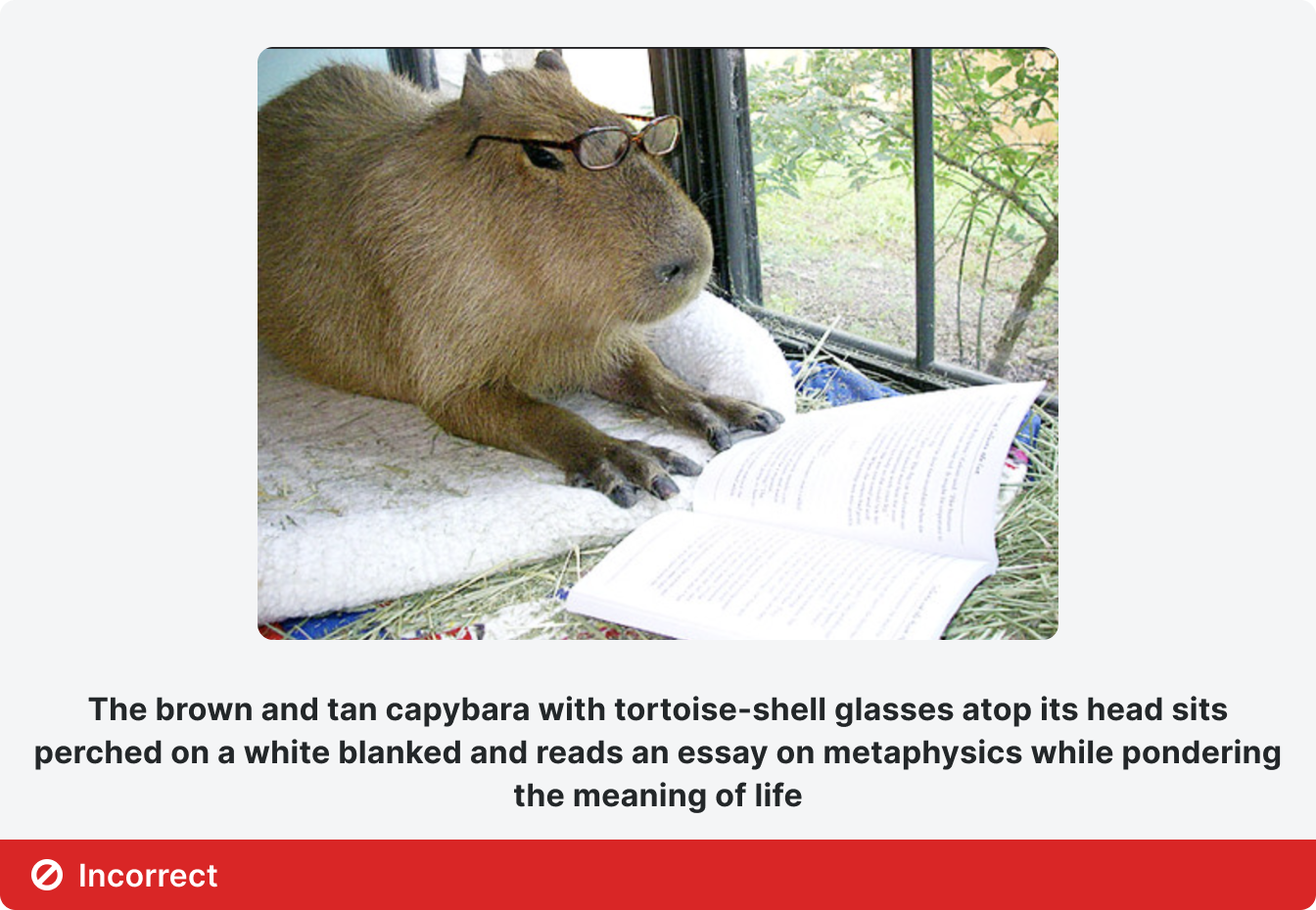
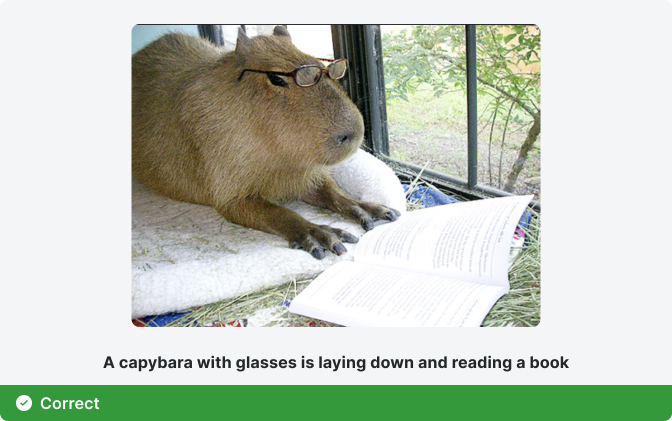
Keep your alt text short but descriptive. Try to balance the amount of detail, like in the example below.
Use alt text to describe images or icons that aren’t just for decorative purposes.
Keep images that only have a decorative purpose to a minimum.
Never use images of text.
Always make sure any important or critical user information is written in plain text on the page, not just communicated through an image with alt text.
Keep your alt text short but descriptive. Try to balance the amount of detail, like in the example below.

ARIA Labels
ARIA labels are important in product writing because they help provide those using assistive technologies with additional context beyond standard HTML labels. ARIA labels can be very useful for explaining what a specific button or icon does. Keep in mind that adding aria-label to your code will cause a screen reader to read whatever is in the label, in addition to whatever is already in the HTML code. This means:
Don’t add a word to your ARIA label that is the same as the element (for example adding the ARIA label “button” to an HTML element that is already categorized as a “button.”
Don’t add more than one or two words as an ARIA label or your description might be too lengthy and confuse users.
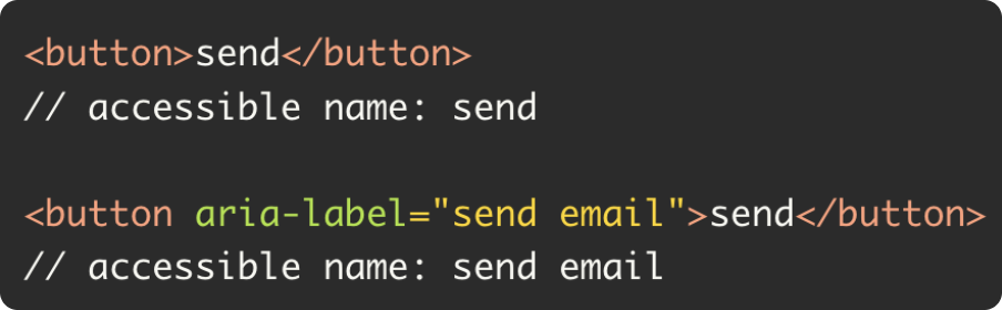
Below is an example of what a Button element looks like with only HTML vs HTML plus ARIA labeling. The accessible name is what someone using a screen reader will hear when they interact with the element.
Don’t add a word to your ARIA label that is the same as the element (for example adding the ARIA label “button” to an HTML element that is already categorized as a “button.”
Don’t add more than one or two words as an ARIA label or your description might be too lengthy and confuse users.
Below is an example of what a Button element looks like with only HTML vs HTML plus ARIA labeling. The accessible name is what someone using a screen reader will hear when they interact with the element.
And below is an example of good and bad ARIA labeling for a button.
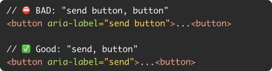
Since the HTML code already identifies the element as a button, you don’t want to add the word button to your ARIA label here or the screen reader will read the word “button” twice.
Other Considerations for Text
When considering the copy that users will interact with on a product screen, it’s important to make it clear for all users. Clearly and visibly labeling page elements that contain key information is important. Here are some things to keep in mind:
Visible text: Use visible text for labels, buttons, and links. Be descriptive so users know what to expect when navigating.
Directions: Avoid directional language, since words like “above” or “to the left” are meaningless for visually impaired users and sometimes smartphone users.
Text for Links: Avoid using a URL as link text – it’s hard for humans and for screen readers. Instead, use short 2-3 word text that describes the information that’s being linked.
Information Architecture
Information Architecture, or the planning of how your information is built and structured, helps create products that are easy to navigate for all users. Having a clear IA is particularly important for accessibility. Some questions to focus on as you look at the information architecture of a site include:
Are pages structured in a logical and clear fashion?
If you tab through the elements on a page with your keyboard, can you understand the order?
Are page menus easy to navigate from left to right and top to bottom?
Are submenus properly nested with no more than 3 layers of navigation?
Are H1, H2, H3 elements used appropriately?
Is there appropriate wayfinding on the page so that users can easily navigate to other sections of the page from the element they’re currently engaged with?