


Tree
The tree allows users to navigate between folder / file directories, and optionally select those files.
 Demo and Developer Guidelines
Anatomy
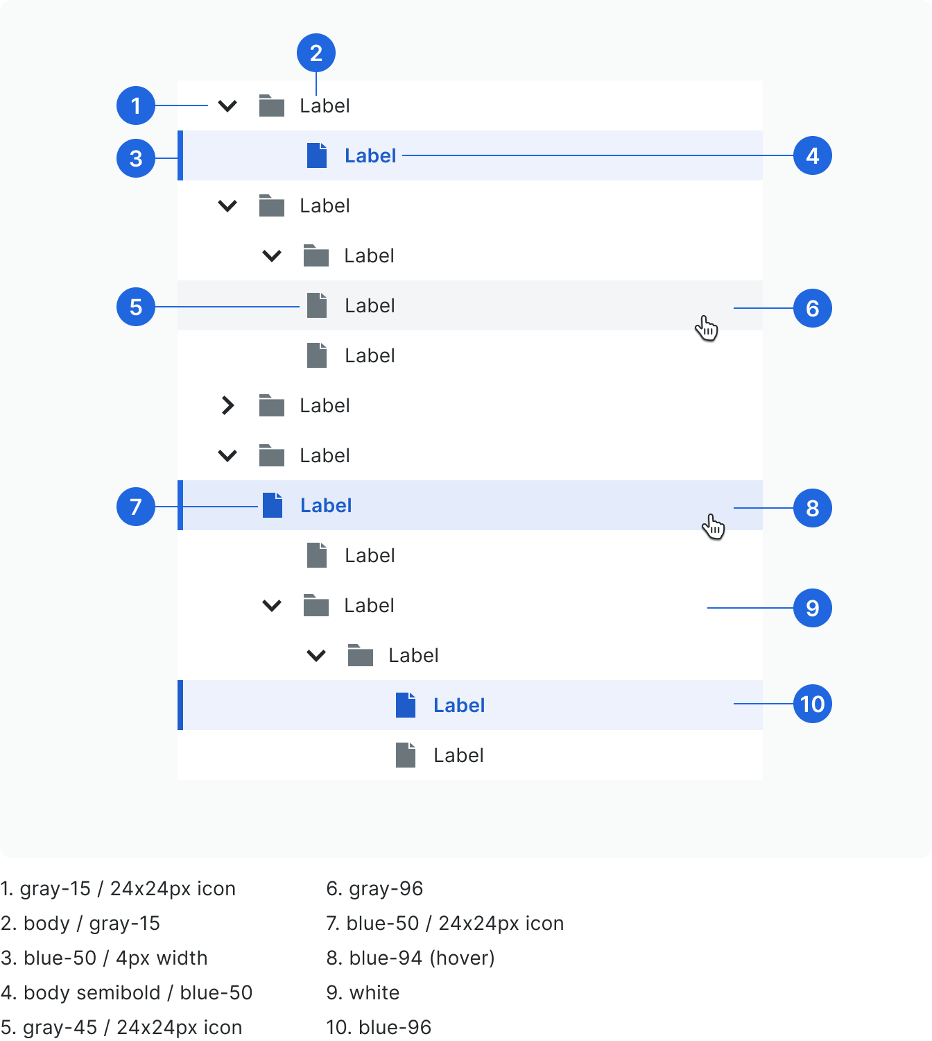
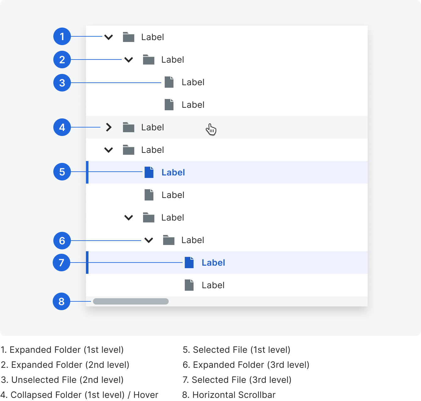
The tree contains a folder / file structure that can be nested to multiple levels. Folders with nested content use the chevron icon and allow the user to expand and collapse its contents. Levels of nesting are indicated by indentation.
Types
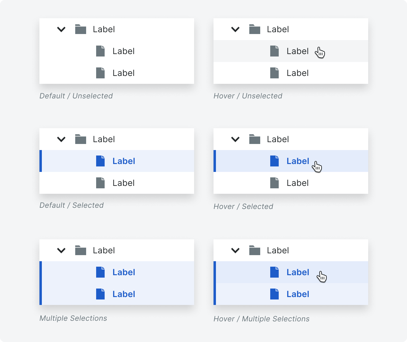
Folder States
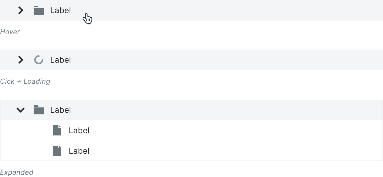
When a folder is clicked, it retains focus and expands to show its nested content. While loading directories, the folder icon swaps for the small spinner.
File States
When a file is clicked, it activates the selected state. Multiple files can be selected at once.
Behavior
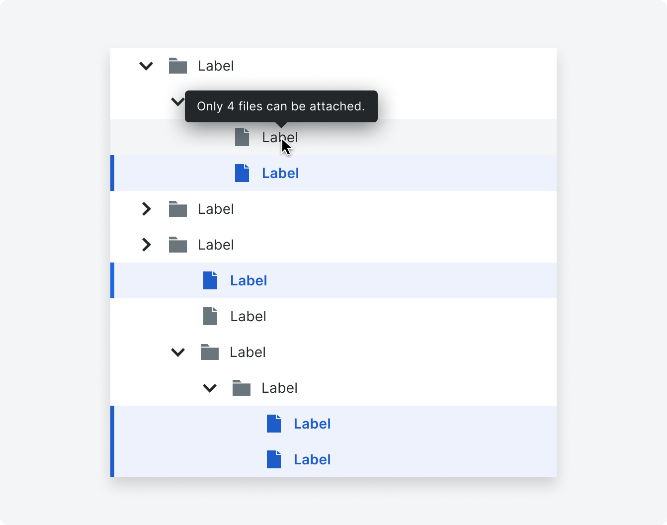
Selection Limits
If there is a limit to the amount of files that can be selected, a user will see a tooltip over a non-selected file when they hover over it (or on keyboard focus). The tooltip will inform the user that the file limit has been reached. The tooltip anchors to the row and the mouse arrow. The tooltip will have a 300ms delay before it appears to ensure the intent of the user.
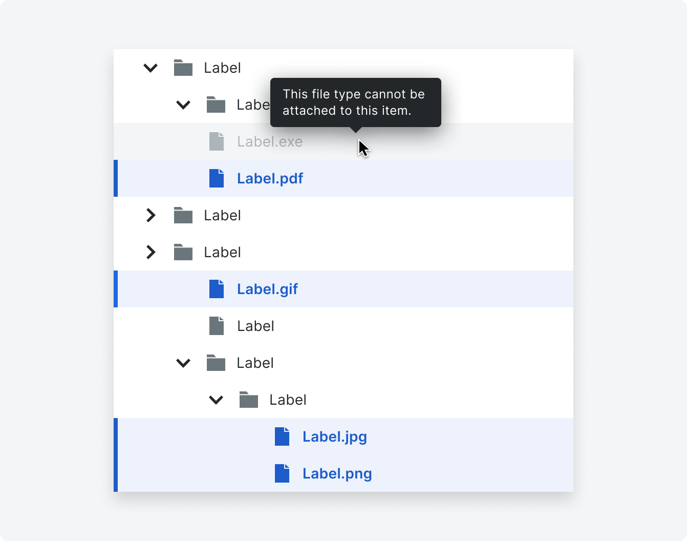
Unsupported File Types
If a user attempts to attach a file type that is not supported, a tooltip will show on hover to alert the user.
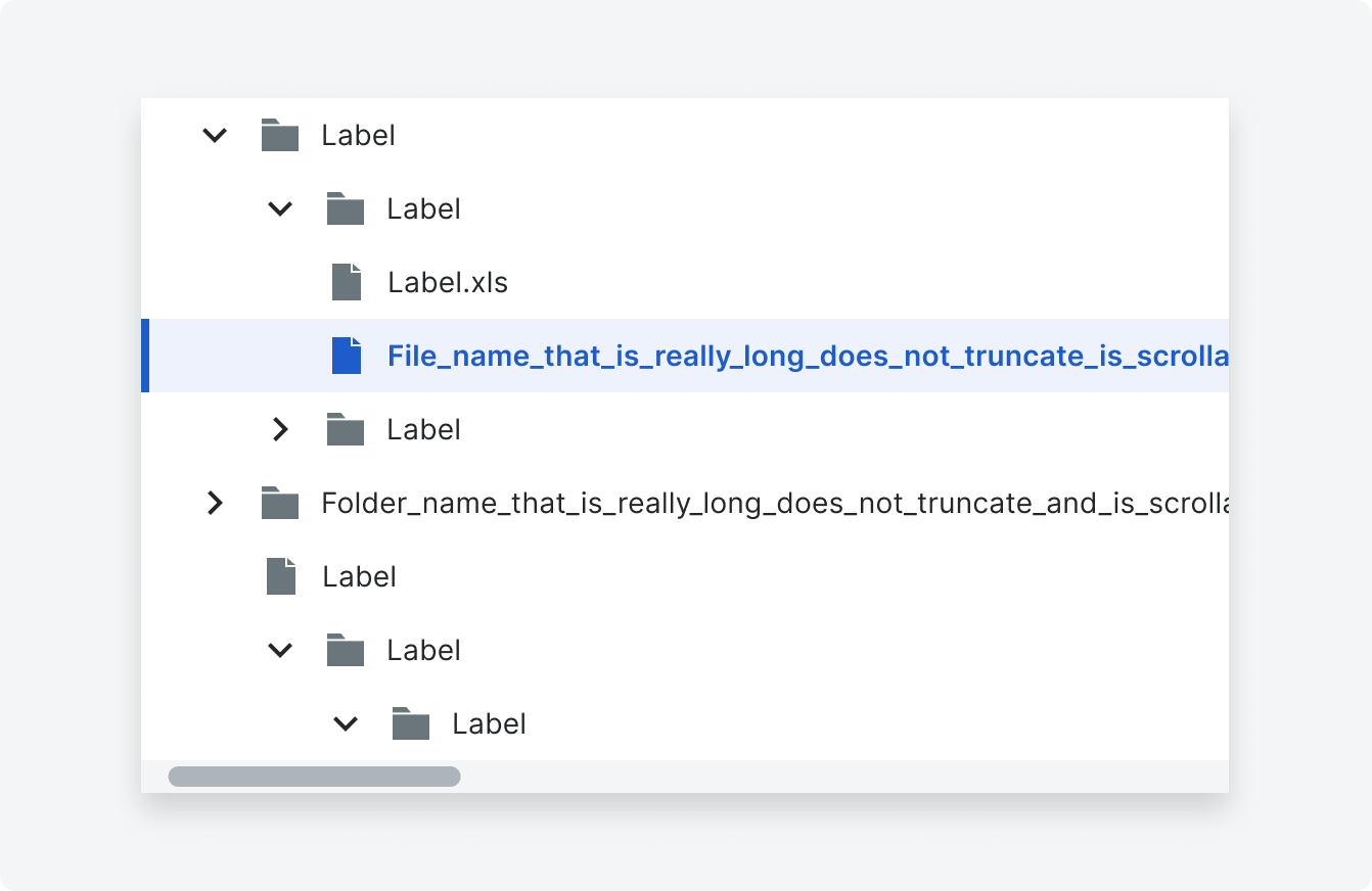
Horizontal Scrolling
There is no fixed width or character limit for files or folders. The file’s full name is displayed without truncation. A user can scroll horizontally to view the entire file name.
Specifications
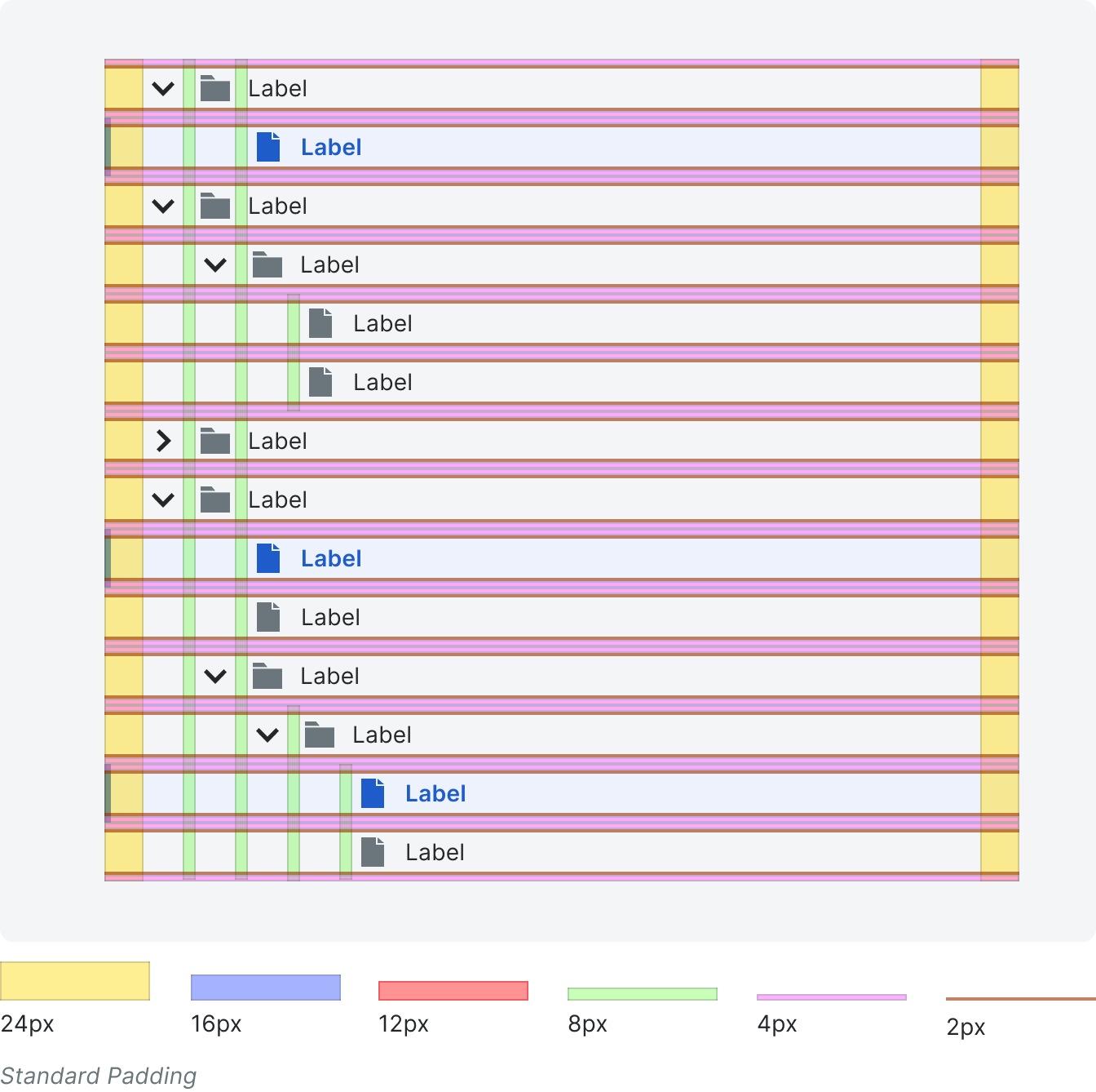
The file tree is responsive and fills the width of its parent container. Each row has a height of 36px.
Padding
Styling