


Banner
We use banners to contextually convey complicated or supplemental information to a user. Depending on the type of banner, we can provide more information about a feature or page the user is on, an action the user needs to perform, or an error the user has encountered.
Procore banners are informative and actionable. Always explain what the user needs to know (and in some cases, why they’re seeing the banner), and provide an actionable next step.
Procore banners are informative and actionable. Always explain what the user needs to know (and in some cases, why they’re seeing the banner), and provide an actionable next step.
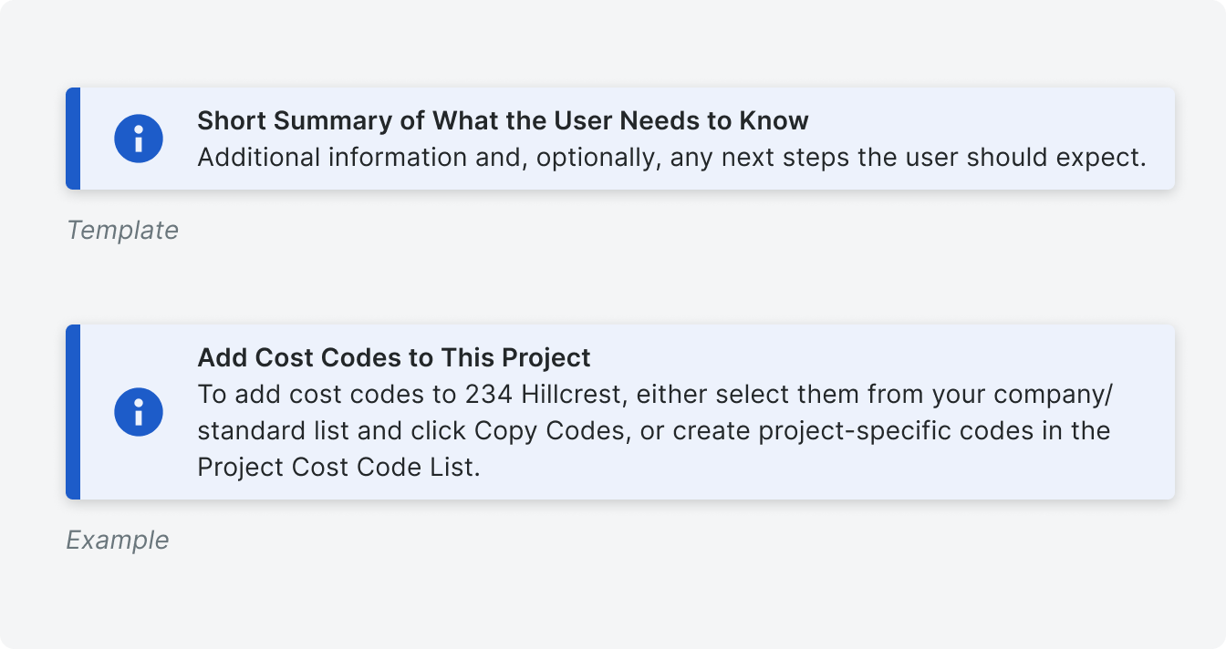
 Demo and Developer Guidelines
Anatomy
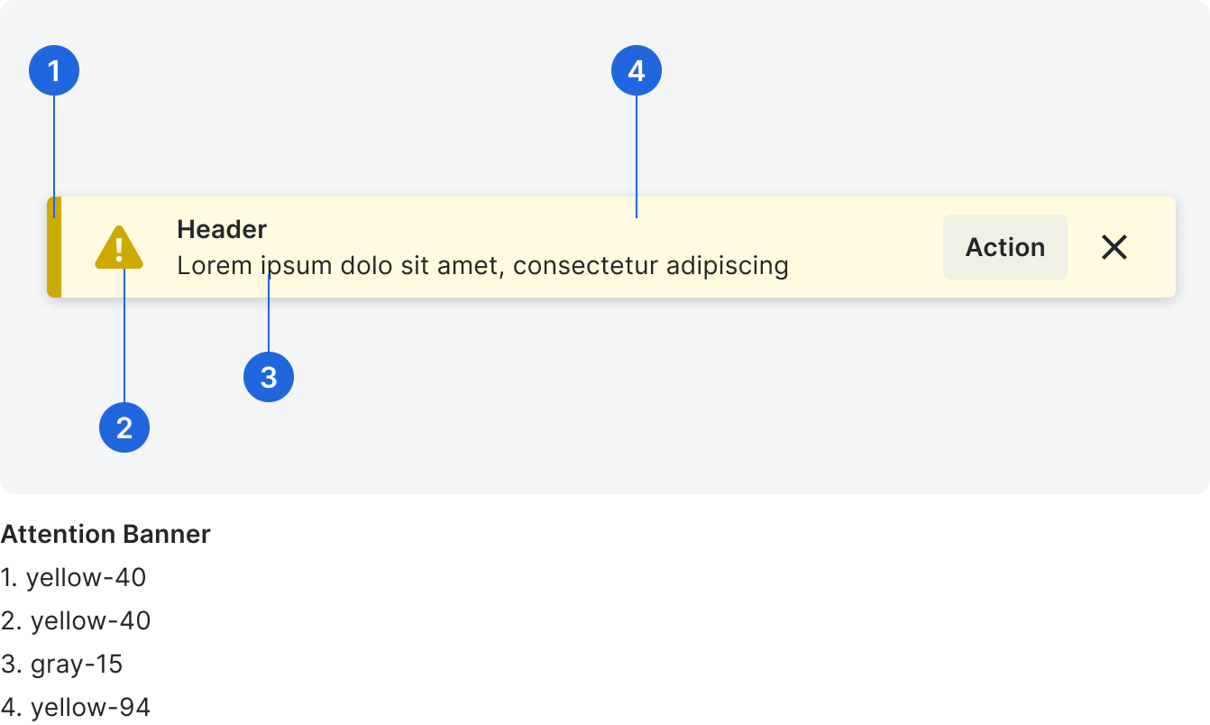
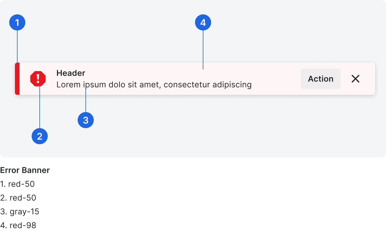
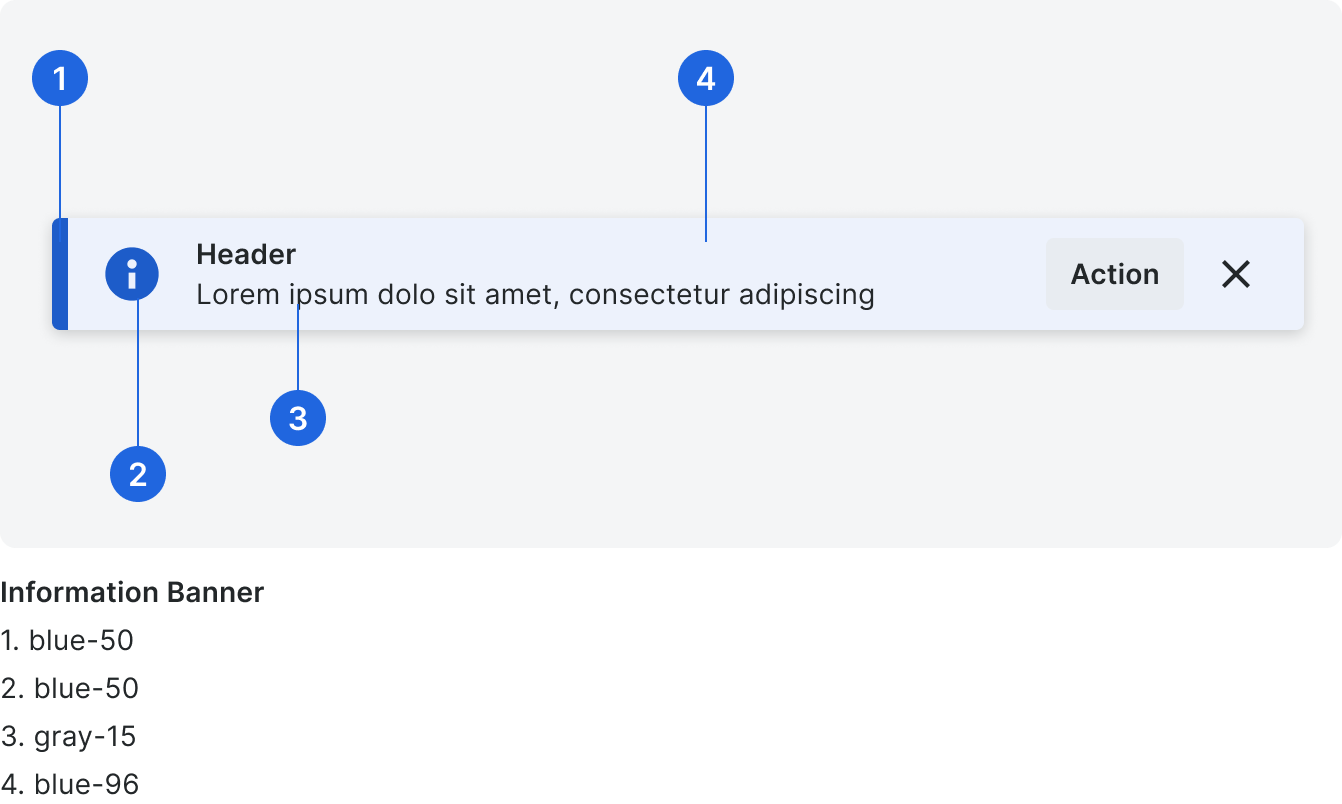
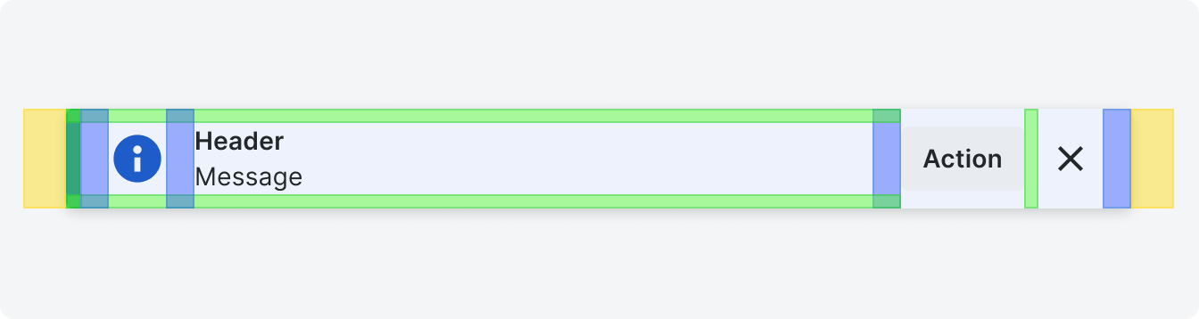
Below is an attention banner, but all banners have 6 major parts. When you use this component, elements like the left bar and icon are predetermined, and you have control over what the banner says and the action the user can take.
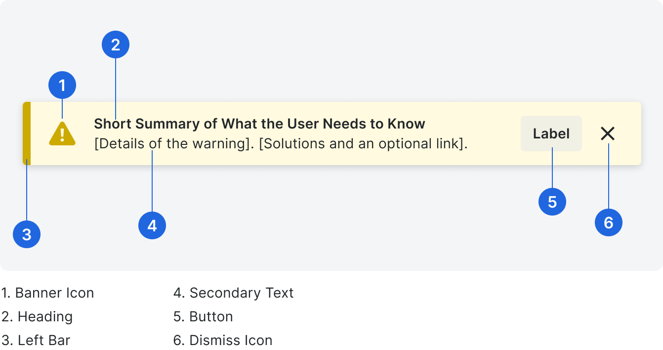
Heading
In the heading, include a short summary of the most important information. If the banner expresses that the user needs to perform an action, the first word in the heading should be a verb. Headings are title case and have no punctuation.
Secondary Text
The secondary text of the banner provides any supplemental information, optionally including a next step the user should take, or something they should expect to happen, given the new information. The secondary text is sentence case and has punctuation.
Tip: If your banner includes a button, don’t tell the user to click the button in the body text (e.g. Click the button to configure these settings). The call to action should speak for itself, and this will make your text more concise.
Tip: If your banner includes a button, don’t tell the user to click the button in the body text (e.g. Click the button to configure these settings). The call to action should speak for itself, and this will make your text more concise.
Correct

Incorrect
Never place blame on a user, and avoid information dead ends.
Button
If needed, include a button that links to either a support article, a page where the user can find more information, or a page where a user can take a next step. The button is title case and has no punctuation.
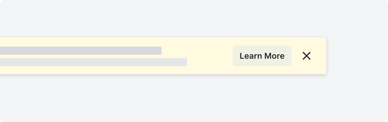
Use Learn More when linking to a support article or reference site.
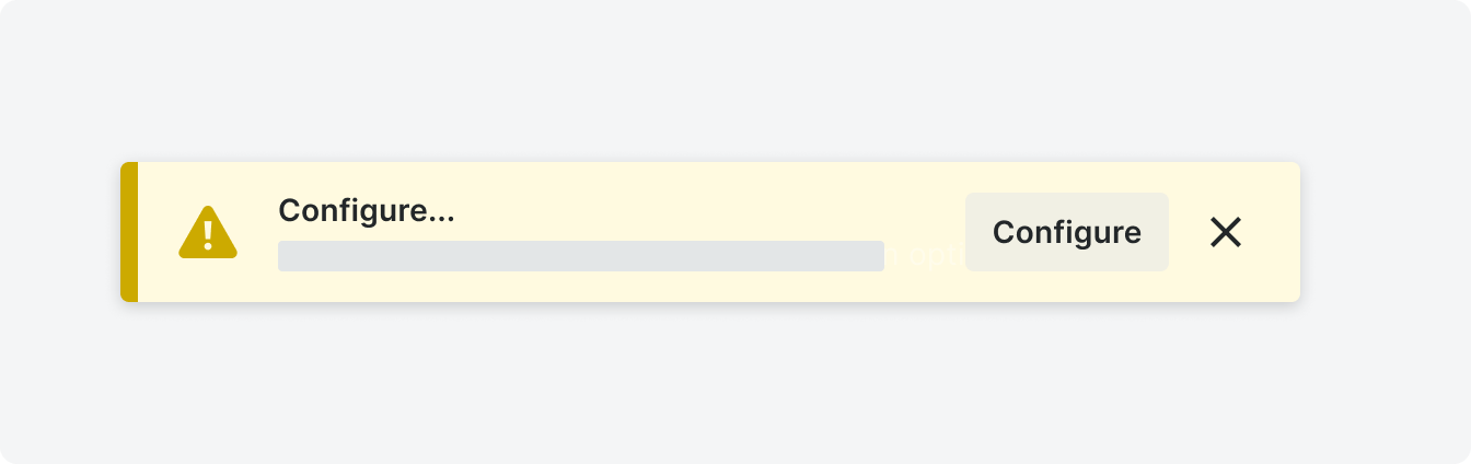
Use the same verb from the banner header to express a call to action.

Use Go to... when linking to a page in Procore (only if there is no verb in the header).
Types
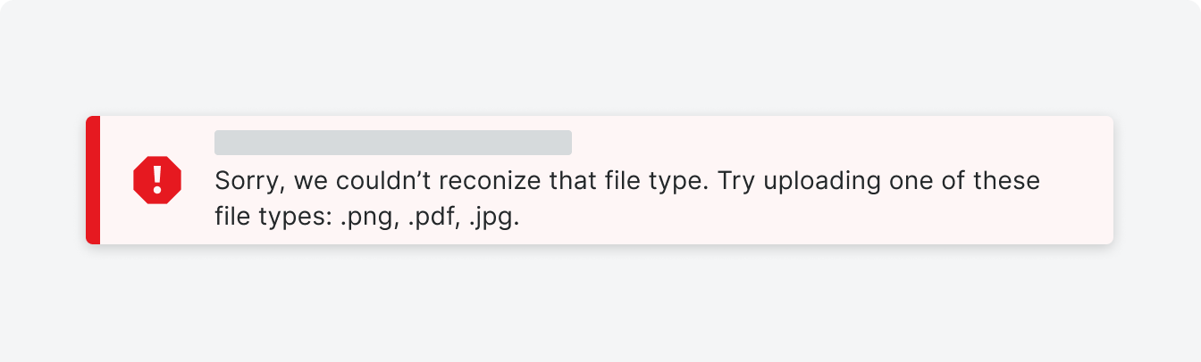
Error
Error banners are used to explain why a process or action isn’t working as expected and what the user can do to resolve the issue.
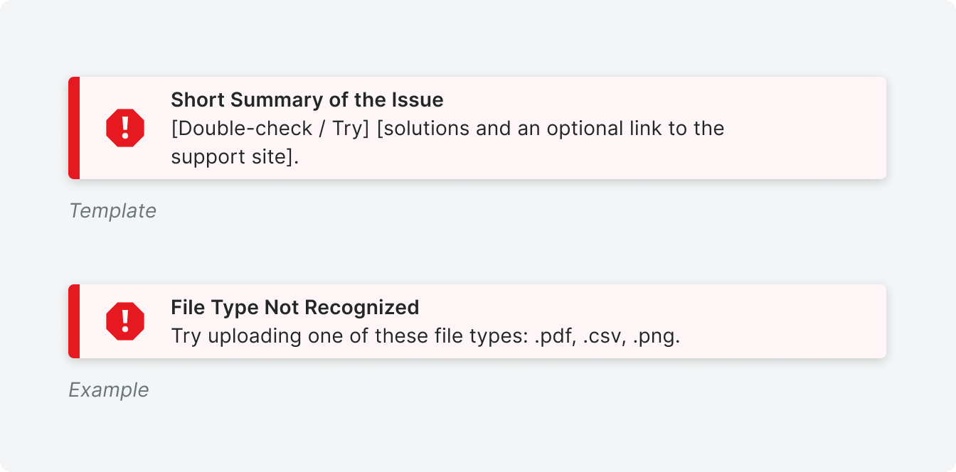
Use this template for most error banners.
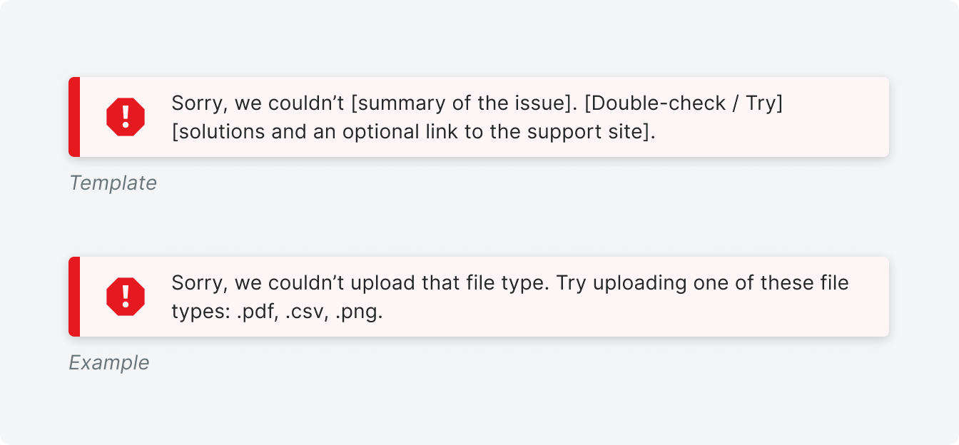
Use this template when a header is not needed or preferred.
Attention
Attention banners are used to inform users that their attention is required on a page or feature. There are two templates we use for this depending on the use case.
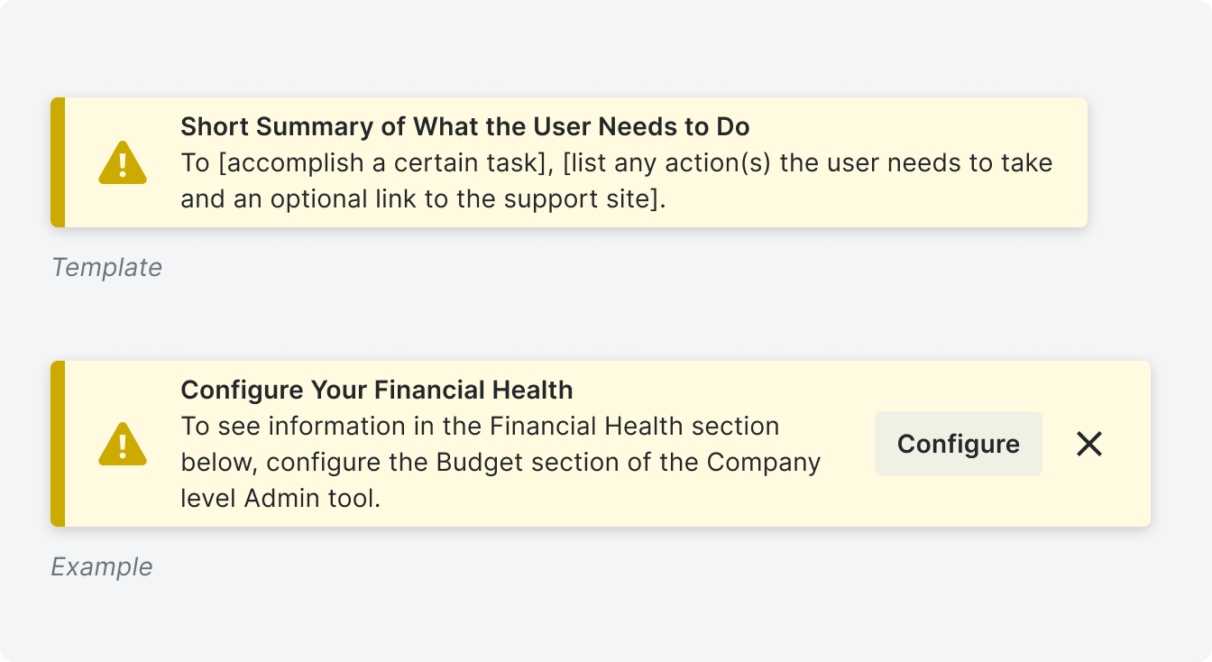
Use the template to inform users of a required action they need to take to move forward in a process or workflow.
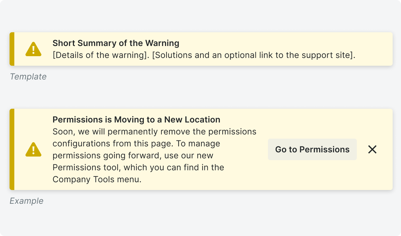
Use the template to preemptively warn users of a potential issue on a page. This should not be used in place of an error banner.
Info
Info banners are used to give users supplemental information about an item or task before, during, or after a process.
Variations
Example
Dismissable
Action
Overflow Actions
Type
Expandable

Use when an action is available to a user.
No Header

Use when a user needs to be able to dismiss banner.

Use when an action is available to a user.

Use when an action is available to a user.

Use when only a short summary is needed.
Dismissable
Banners should only be dismissible if a mandatory action is not required. If a banner
is dismissed, make sure the banner only reappears when/if necessary.
Expandable
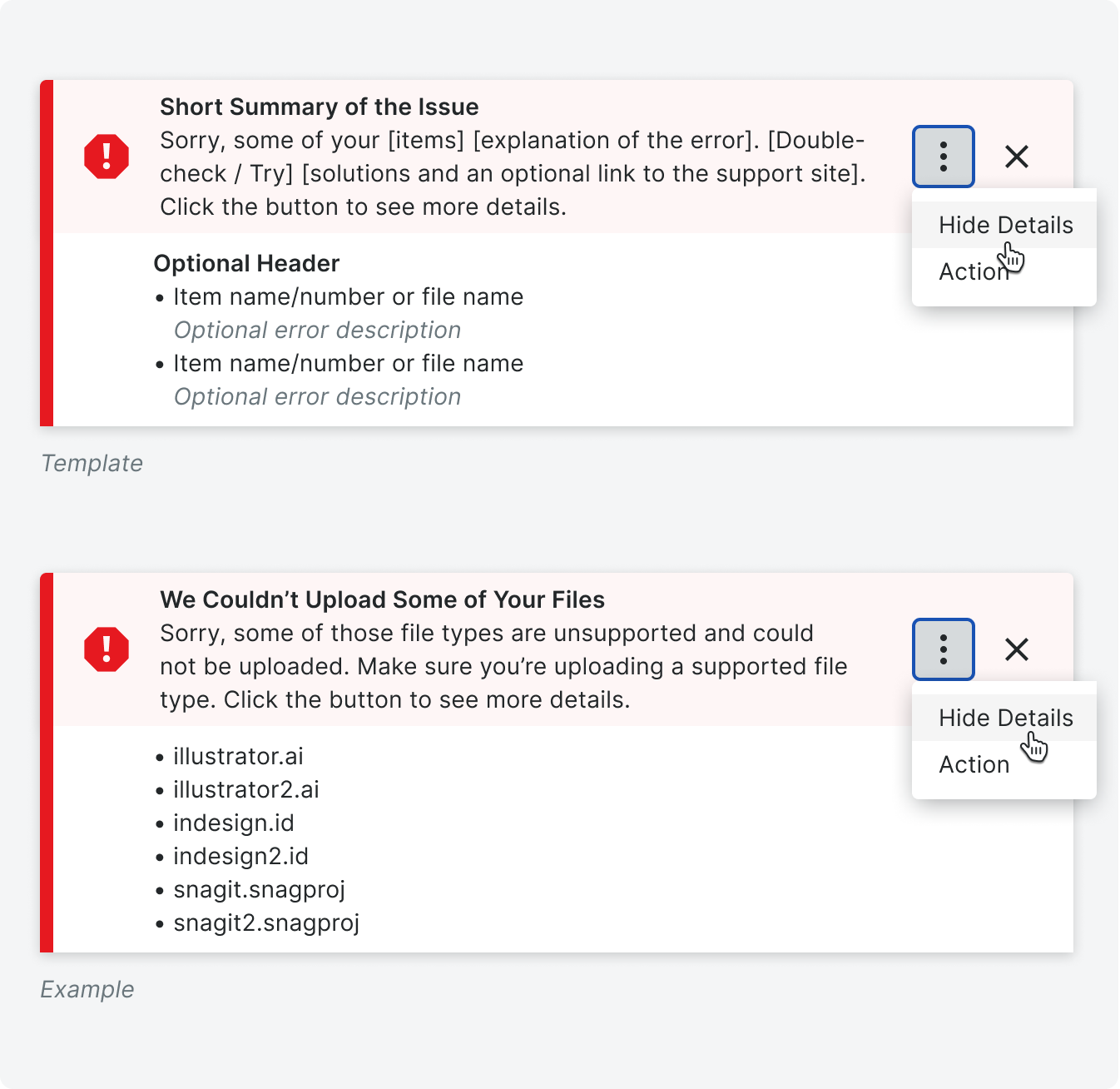
We use expandable banners when there is information that cannot be displayed in a banner. This is most often information that can be displayed in a bulleted list. An expandable banner is most often used on error banners when there are multiple errors that occurred after a user takes an action.
The detail menu is collapsed by default, and when there are no additional actions that need to be taken from the banner, a Show Details / Hide Details button expands and collapses the menu, respectively.
The detail menu is collapsed by default, and when there are no additional actions that need to be taken from the banner, a Show Details / Hide Details button expands and collapses the menu, respectively.

If there is an action the user needs to take in the banner, replace the Show Details button with an overflow menu to house all the actions. Additionally, add a clarifying sentence to the end of the content telling users to, “Click the button to see details.”
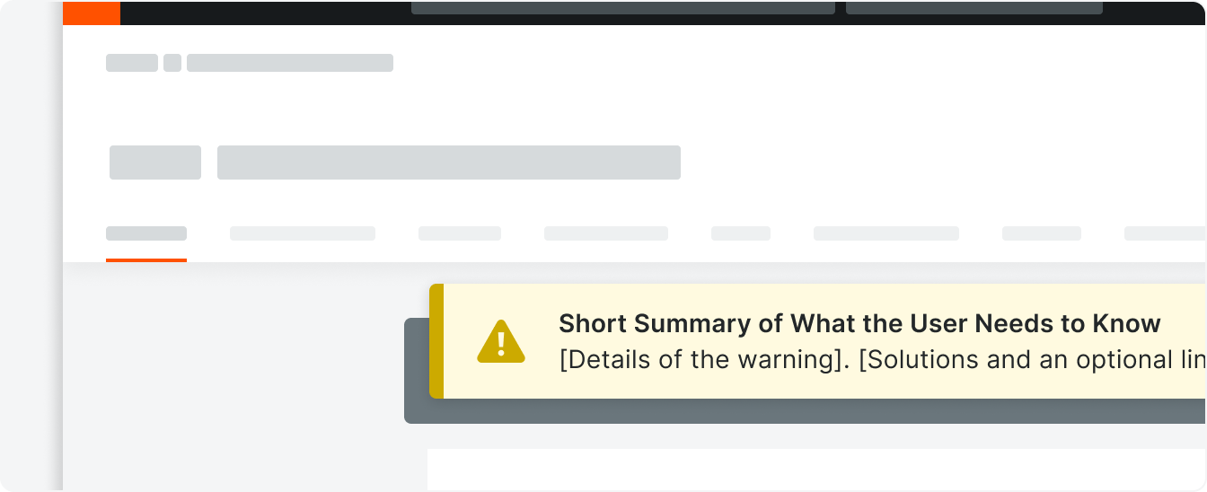
Placement
Banners can live in three different locations on a page depending on the context.
Global level banners display information that is relevant to the entire tool, and they
sit in the page header. This often persists across pages. Object level banners display information that is relevant to the object the user is on, and can be seen across
different tabs. Body level banners display information that is relevant to the page the user is on, and it is placed above the card. Section level banners display information
that is only relevant to one section on the page, and they sit within the card above
each section.
There are scenarios where all levels can be used at once.

Correct
Incorrect
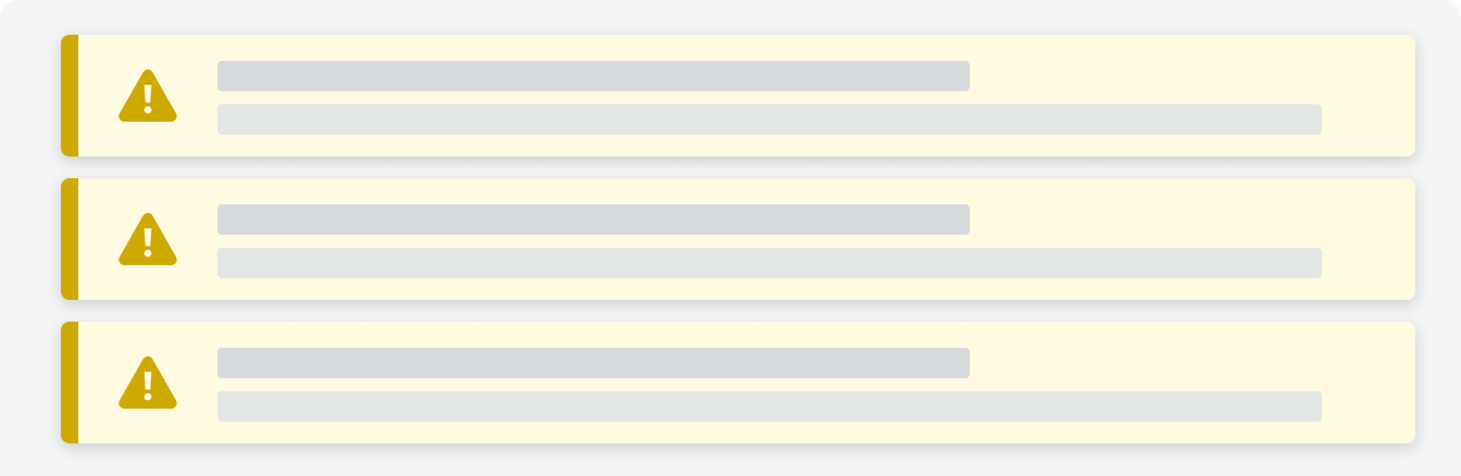
Avoid stacking multiple banners. If multiple related messages need to be displayed, use an expandable banner.
Behavior
.gif)
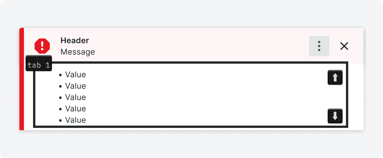
Accessibility
The expanded banner list below can be tabbed to. Using the up/down arrows the user can scroll the list.
Specifications
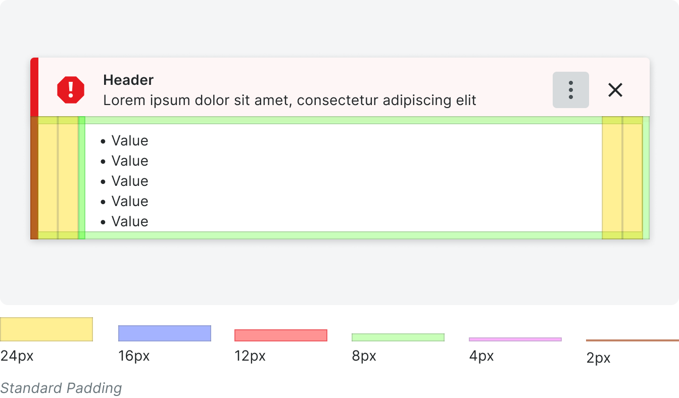
Padding
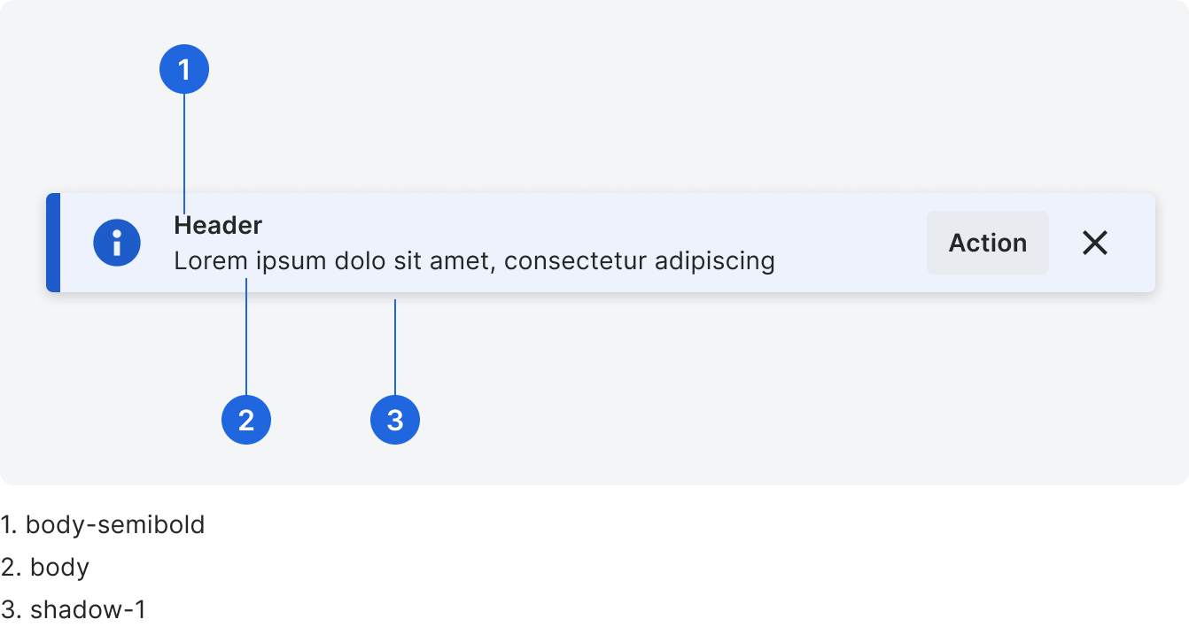
Typography & Shadow
Color