


Intro to Data Table
Tables and lists are the two views used in Procore. Tables are recommended for complex datasets that can be heavily modified. For more information about when to use which dataset, go to our Lists vs. Tables page.
 Demo and Developer Guidelines
Anatomy
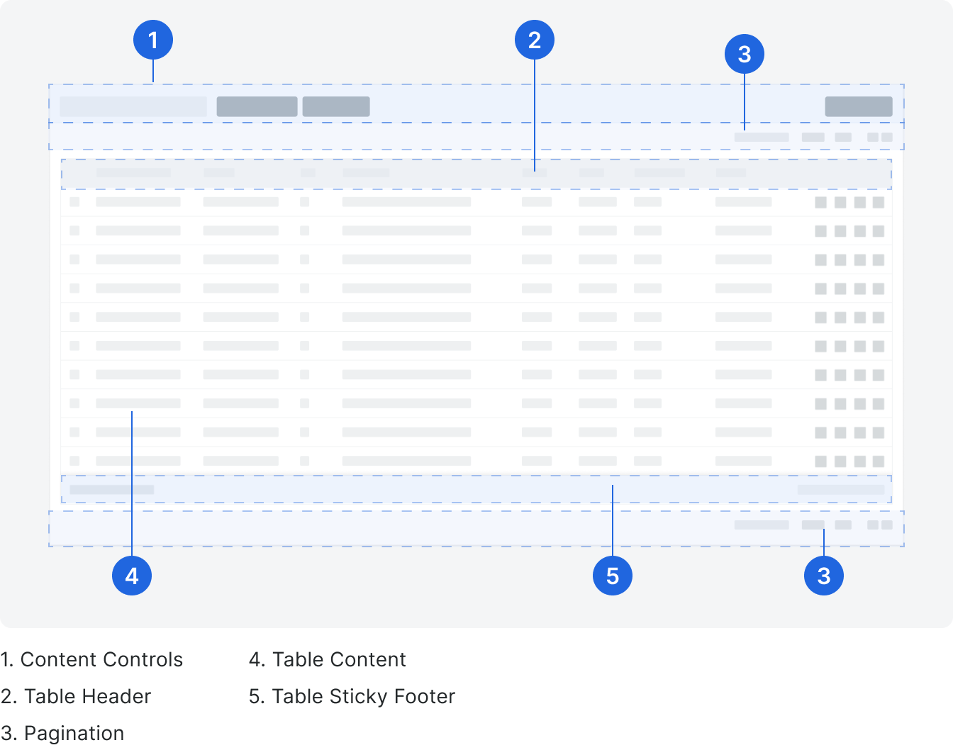
Content Controls
This section contains any actions that relate or modify the data in the table. Some examples of components that are used in this section are a search bars, filter tokens and toggle to open a side panel.
Header
The header displays labels and relevant actions for each column.
Pagination
Pagination is not contained by the table and can be placed above or below the table, or both. After 150 items the table will paginate.
See the pagination component for more information.
See the pagination component for more information.
Table
The table consists of many cells with content that can be left or right aligned.
All table rows will be visible inside of the table, up to the number where the table is set to paginate. Based on the use case, table height configurations can be made based on the need for multiple tables or low row count. If a table uses a panel, the height of the table should have a minimum of 440px.
All table rows will be visible inside of the table, up to the number where the table is set to paginate. Based on the use case, table height configurations can be made based on the need for multiple tables or low row count. If a table uses a panel, the height of the table should have a minimum of 440px.
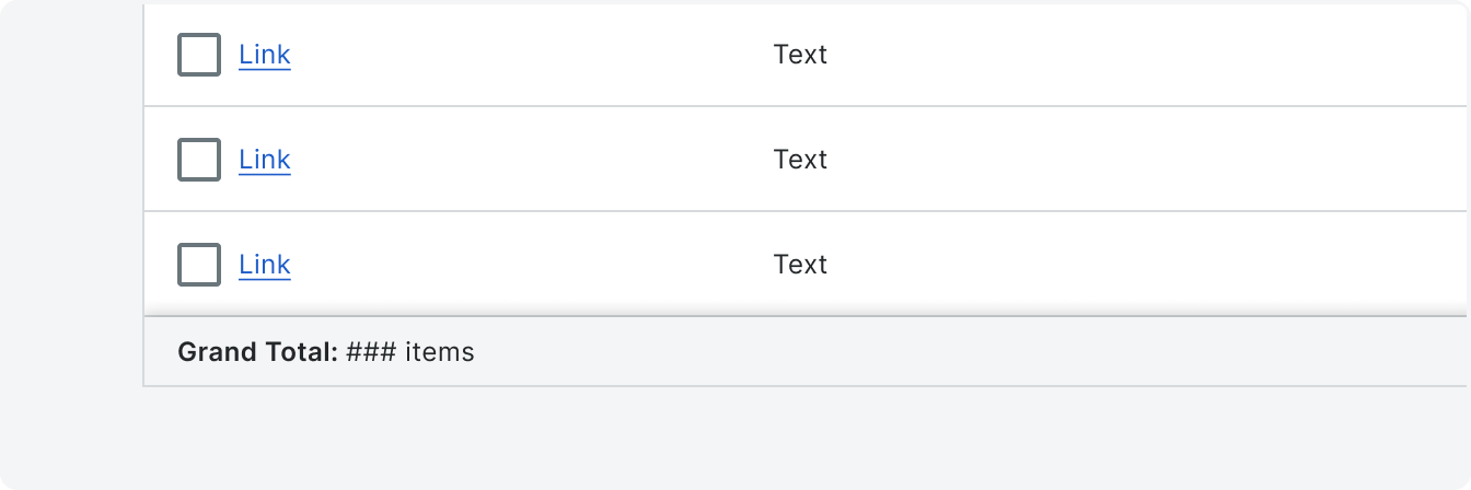
Table Sticky Footer
Tables have a sticky footer any time all the rows in the table are not visible and actions or a total value needs to be displayed. Table sticky footer variants could have other types of calculations.
The sticky footer will always be visible at the bottom of the table.
The sticky footer will always be visible at the bottom of the table.
States
All cells have defined states unless otherwise configured. See Rows and Cells page for more info on specific cell types.
Cell
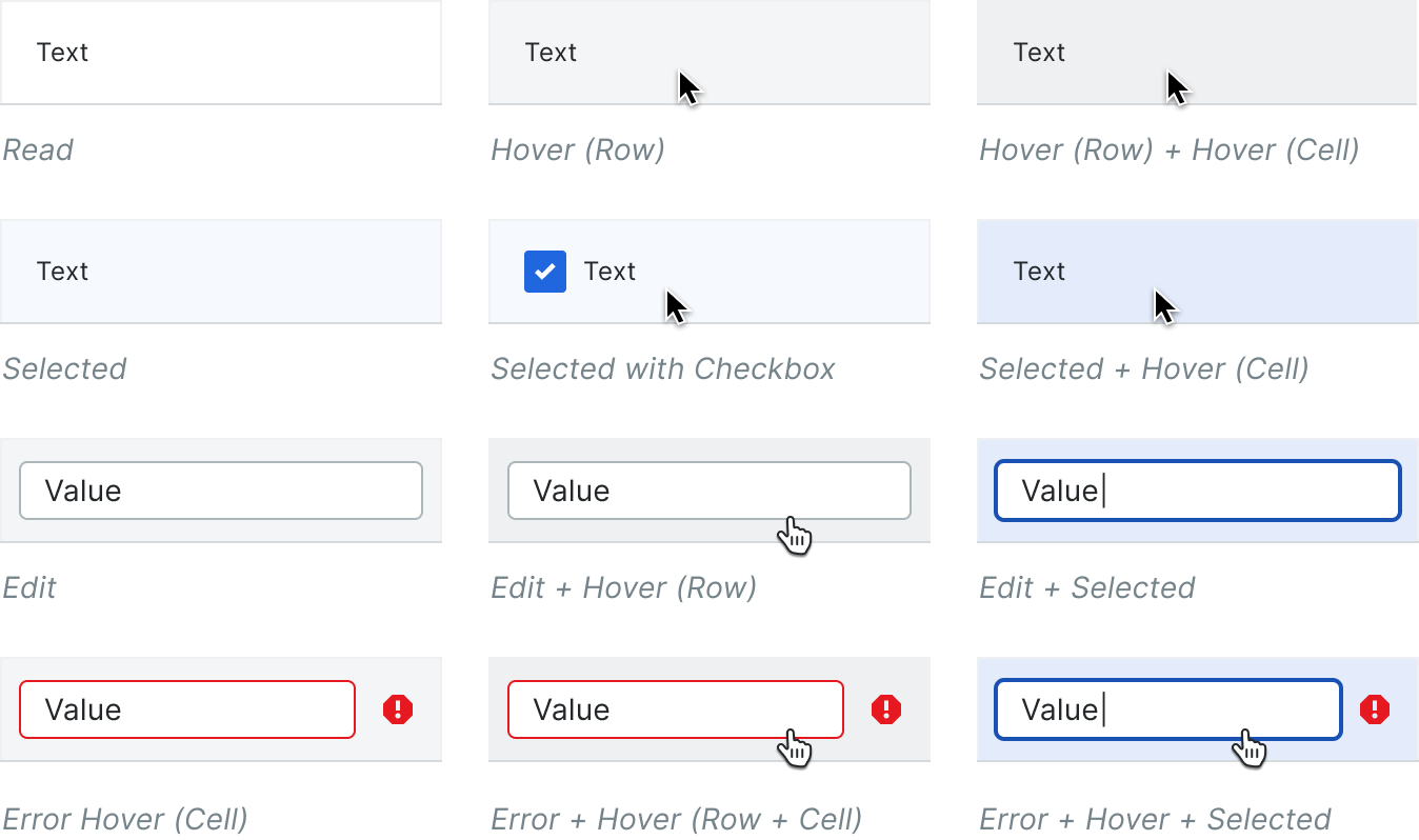
Row
Rows can be made active via row click. A common use case for this would be a row click to trigger a panel.

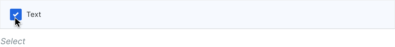
Rows can be selected via checkbox. This puts the row in a selected state, which affects the various cell states.
Empty State
No Content
When a table has no content the empty state compact component should be utilized.
If there is not enough room for the full empty state configuration, the illustration can be removed. For placement info see the empty state page.
When a table has no content the empty state compact component should be utilized.
If there is not enough room for the full empty state configuration, the illustration can be removed. For placement info see the empty state page.
![No content template:
Title: No [Label]s to Display
Body: [Explain what the items in the table are
and how the table will be populated
or how the user can create items that
will appear in the table.]
Button: [Label]
No content example:
Title: No Open Items to Display
Body: Open items will display here
once items created anywhere in
this project are assigned to you
and need your attention.
Button: Create](https://cdn.prod.website-files.com/5f5298baab4c43a7f0640b67/626041999baff8ffeaa66a99_dt_empty1.png)
No Results
See empty state component for more info.
See empty state component for more info.
Loading
Lazy loading can apply to unpaginated and paginated tables that use lazy loading to load additional content. Paginated tables will load data for all rows on a given page.
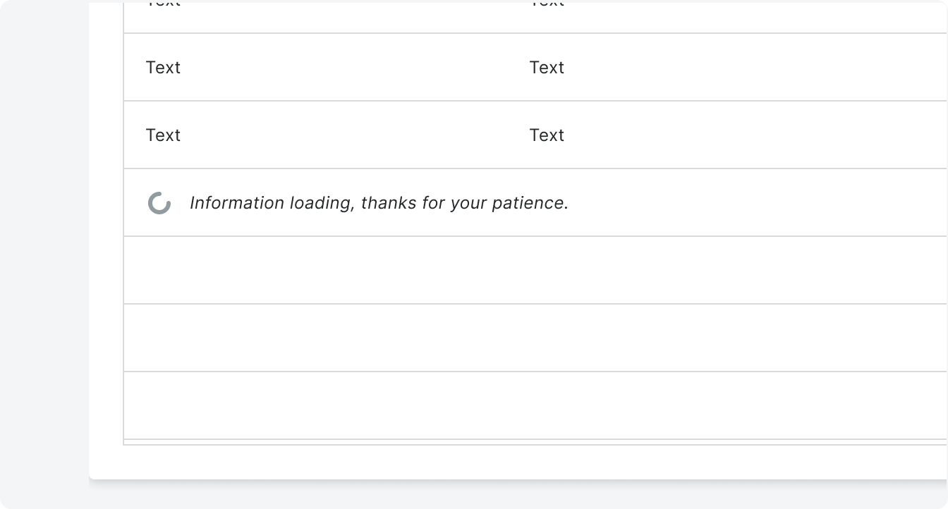
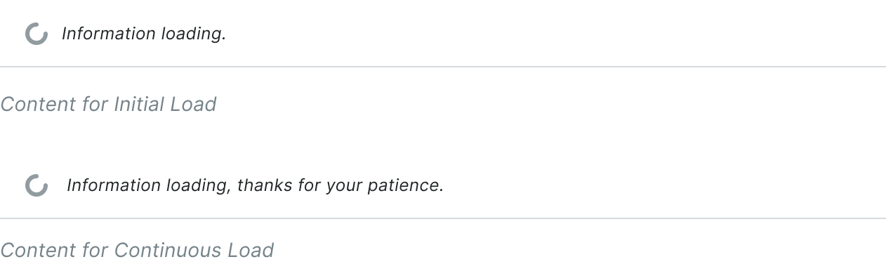
The first time that a Data Table loads, a single row will display a spinner and text, with empty rows below it. Once the user has scrolled beyond the rows displaying data from the initial table load the topmost blank row will display spinner and the user can continue scrolling through the empty rows; scroll position is not locked.
The height of the Data Table inside of the card is fixed; i.e. the Data Table doesn’t initially load as a single-row table and then cause the card to grow in height once all the rows are loaded.
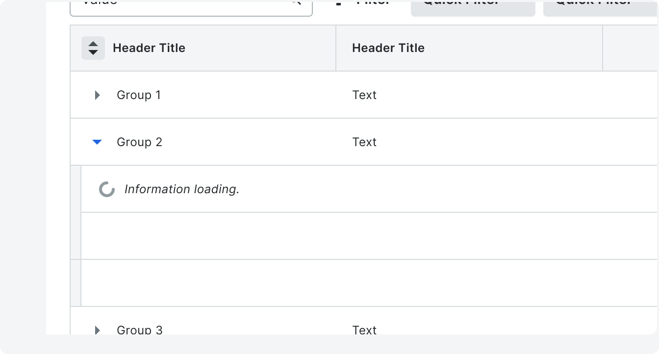
Loading in Groups
When a group is initially opened there will be a single row with a spinner that will respect the indent/tier of that group. Once the user has scrolled beyond the child rows displaying data from the initial group load the topmost empty child row will become a loading row.
The user can continue scrolling through the empty child rows; scroll position is not locked.
When the data has loaded in the group all rows that the group will contain will be visible including any mix of Subgroups and child items. If the group contains subgroups, they will be closed by default. Subgroup data is not loaded until the subgroup is opened.
The new data from the group load will load the same amount of rows w/data as the rows with data from the initial table load.
Columns
Standard columns will have a min width of 120px and can be adjusted manually
as needed.
as needed.
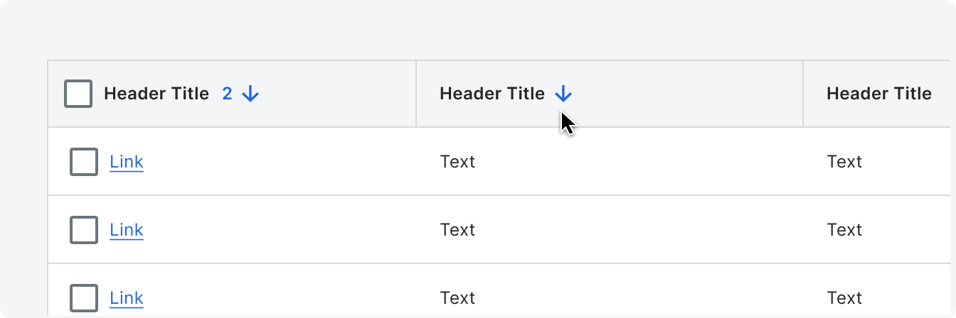
Sort
Clicking in the column header (anywhere that isn’t being used for an action) or selecting a visible sort arrow will toggle between ascending, descending, and unsorted.
Primary sort gets a “1” next to the arrow only when the secondary sort is triggered. The second sort gets a “2.” This can happen for any and all columns and each column can
be toggled through ascending/descending/unsorted independently.
If a sorting column gets toggled to unsorted, the remaining sorted columns renumber if there is only one column being sorted, the number “1” is removed and only the arrow icon is used.
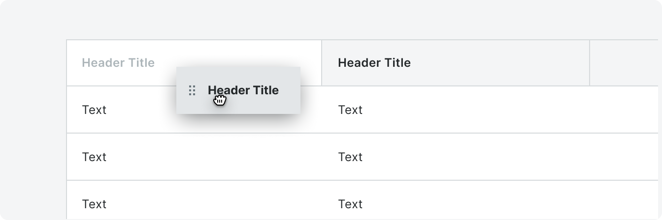
Reordering
A column can be reordered by long clicking the header of the column they want to
move, and then drag the header to a new position. Other columns will reposition while the column is being dragged.
move, and then drag the header to a new position. Other columns will reposition while the column is being dragged.
Column Header Actions
Header actions can be found in the overflow menu which appears on hover. The items within the menu can be configured based on your specific need.
Pinning
Multiple columns can be pinned to the left or right. Once a column is pinned it will reorder itself to the far left or far right depending on the configuration, but can be rearranged among themselves while remaining pinned.
Pinned columns can be unpinned by dragging them out of the pinned section, or by selecting “No Pin” from the column actions menu.
A table that has a name/number column should be be pinned to the leftmost side of the table. Other pinned columns will always be pinned to the right of the name/number column.

Size to Fit/Autosize
By default, the columns will size to evenly distributed widths despite the content. Evenly distributed columns will follow the max and min width of specific columns to ensure content is still legible.
Autosize to fit will size columns to comfortably accommodate the width of the longest value in the column.
Reset Table
“Reset Table” removes pinning, undoes reordering and removes grouping. If a user selects “Reset Table” a modal will appear to confirm the action.
“Reset Table” removes pinning, undoes reordering and removes grouping. If a user selects “Reset Table” a modal will appear to confirm the action.
Rows
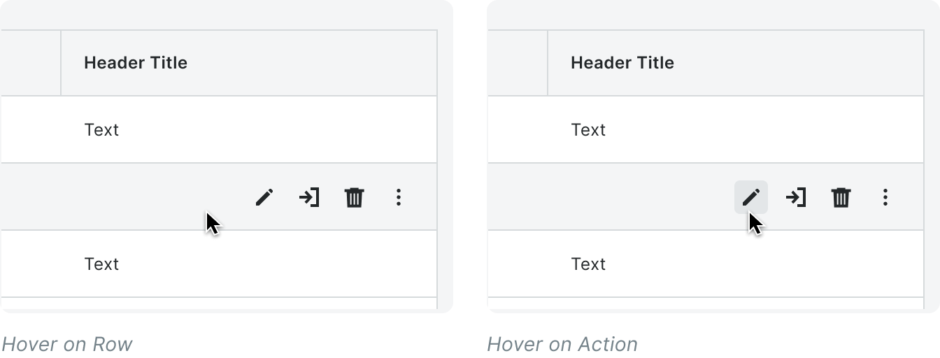
Actions
Row actions will appear on hover and can have up to 3 icons plus an overflow will be surfaced. Any additional actions will be placed within the overflow.
The row actions cover the rightmost cells in a row. If the rightmost column in a table is visible, the row actions display in the blank column so as not to cover the content in the final column.
The row actions cover the rightmost cells in a row. If the rightmost column in a table is visible, the row actions display in the blank column so as not to cover the content in the final column.
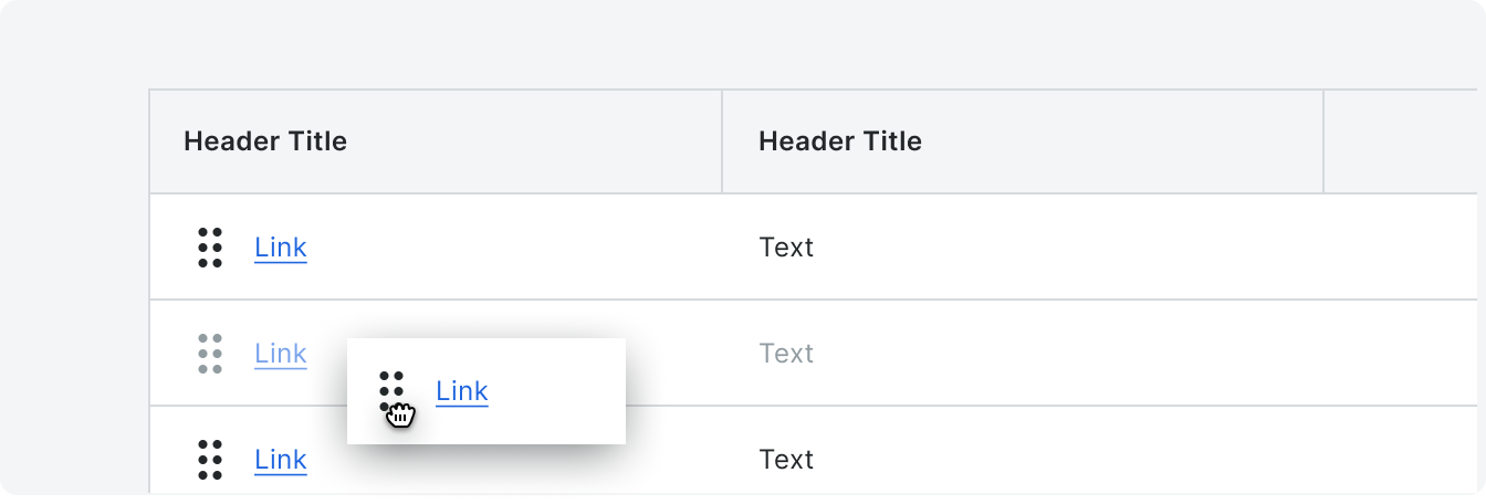
Drag and Drop
When the drag and drop icon is hovered on, the cursor changes to an open hand and the rest of the cell and row displays the appropriate hover state (the example below non-selectable, non-inline editable cells.)
While being repositioned, the row values go to a disabled state and the draggable “chip” elevates above the table.
Reorderable rows can only be used when there is no active column sorting. A Grabbable Area icon will be displayed in the cell of any value that can be used to reorder the rows.
While being repositioned, the row values go to a disabled state and the draggable “chip” elevates above the table.
Reorderable rows can only be used when there is no active column sorting. A Grabbable Area icon will be displayed in the cell of any value that can be used to reorder the rows.
Grouped Rows
A user can group row items that have the same data. Children groups will be indented within the table. Children groups can also have a footer. A row group can also have a footer.

Grouped Tables will have expand all/collapse all groups functionality. There are
three stages of this action: open first tier, open all tiers, and close all tiers. The expand/collapse actions are looped and always appear in the sequence described below:If tier 1 group is collapsed, then clicking the button will open all first tier groups.
If all tier 1 groups are open, then the button will open all tiers.
If all groups are expanded, then the button will close all tiers.
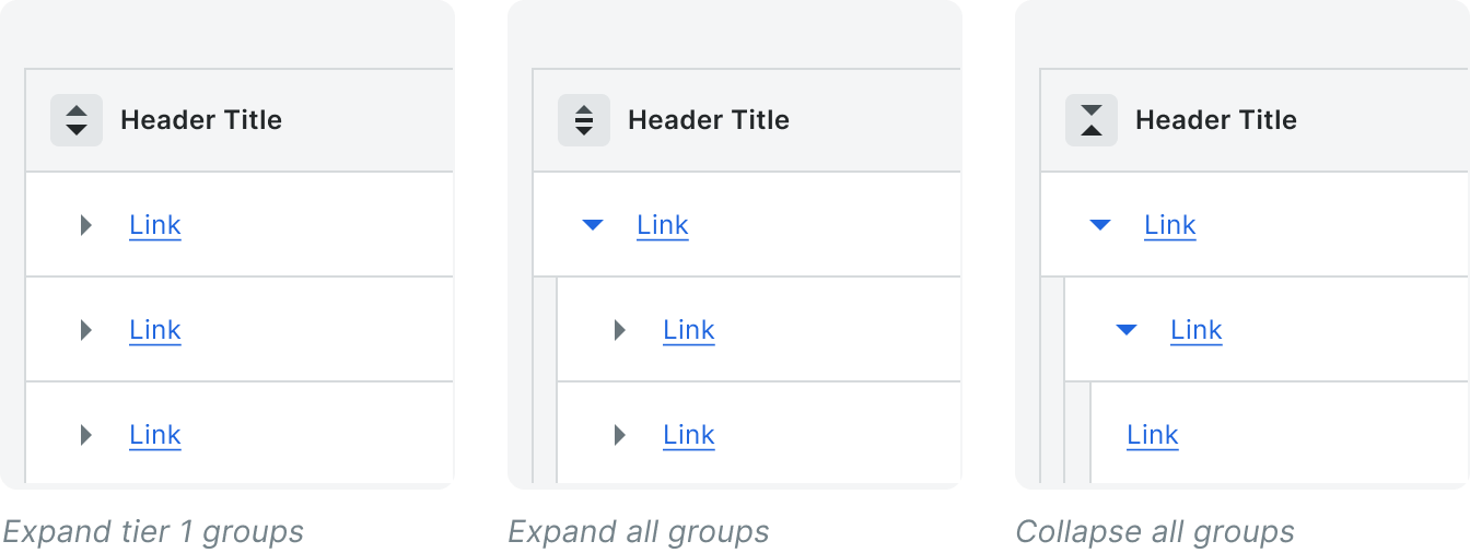
The expand/collapse button has a tooltip to help explain the behavior of the button as its function cycles from open first tier to open all tiers to close all tiers.
Nested Tables
Tables can be nested when there is a need to display a related table within a larger table. Nested tables should not have similar headers as the parent table.
Tables can be nested when there is a need to display a related table within a larger table. Nested tables should not have similar headers as the parent table.

Keyboard Accessibility
Pressing tab will start by going through actions in the content control bar and then move through the all the table headers. Using the arrow keys will allow users to move freely between cells.