


Tile
Tiles should be a concise subset of a larger list of data and is meant to showcase an item or small list of items. In some use cases the content can simply be contextual to the other content elements of the page. Tile layouts will grow and resize depending on content.
 Demo and Developer Guidelines
Anatomy
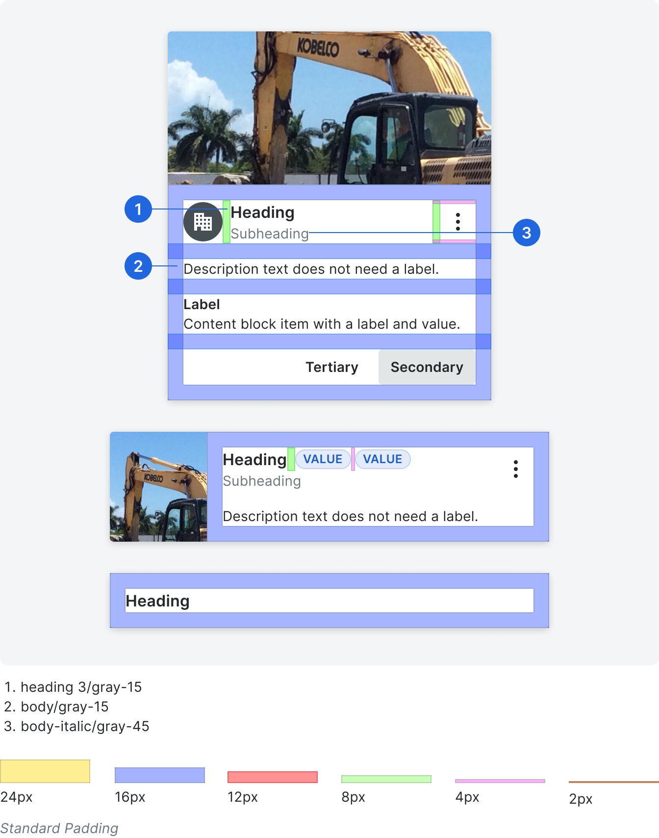
All tile layouts will be based on a single item tile component that contain all possible tile elements.
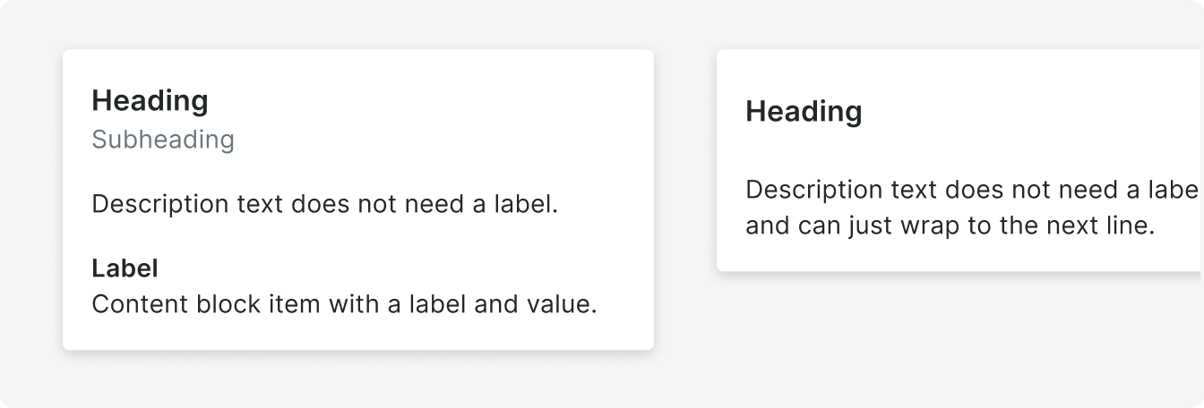
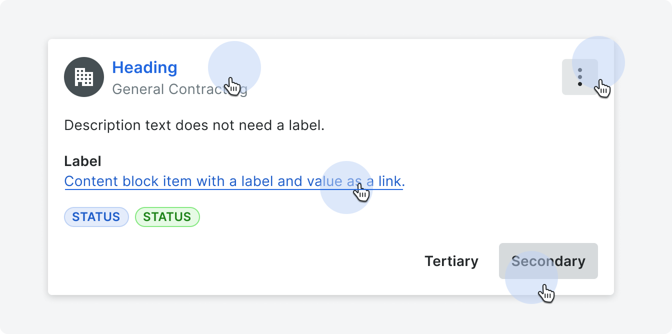
The single item tile is broken down into 4 segments – hero, title, content, and action. These segments will guide the placement of specific component types. For example, the title will always exist within the title segment and information like a assignee will be placed in the content segment. Title, content, and action segments cannot be rearranged within the tile.
The single item tile is broken down into 4 segments – hero, title, content, and action. These segments will guide the placement of specific component types. For example, the title will always exist within the title segment and information like a assignee will be placed in the content segment. Title, content, and action segments cannot be rearranged within the tile.

Hero
The hero segment is used to showcase related visualization, media, image, status or display text. This segment is optional since not all tiles will need content in this section. Clicking the hero when there is an image or video will trigger a modal or lightbox.
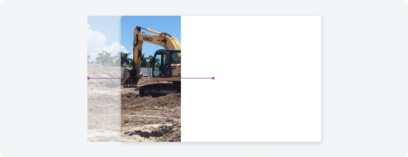
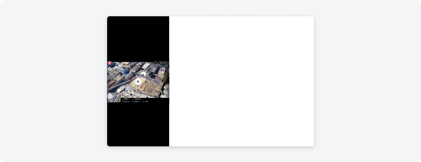
Example of images in the hero section in portrait and landscape.
Title
The title will contain any information related to the title of the tile. This includes the heading itself, subheading and avatar. It is possible to add an overflow button to the top right of the title, if actions are needed. A tile should always have a heading.
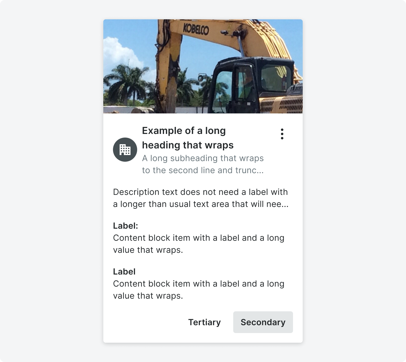
The heading and subheading can wrap to two lines before truncating. If truncation occurs a tool tip will appear upon hovering on the tile.
The heading and subheading can wrap to two lines before truncating. If truncation occurs a tool tip will appear upon hovering on the tile.
Title with a contact item component and plain text options.
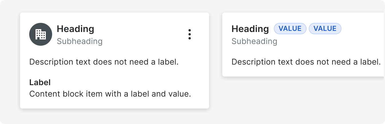
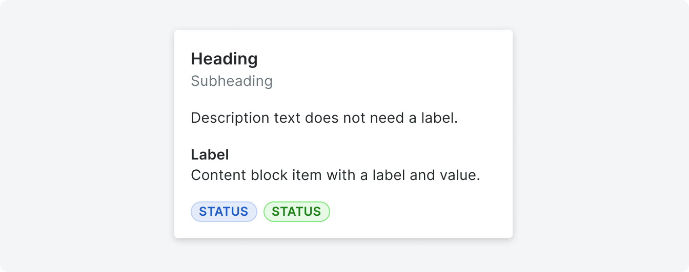
Content
This area is for any important content relating to the object referred to in the title. The type of content can vary between a string of text, label/value stack, pill, thumbnail etc (see Content Block). No actions can be placed in the content segment.
Content Block
Content blocks have varying content types that are used to give content to the card object. Some common content block types are:
• Text string (commonly used for descriptions)
• Label/Value stack
• Pill (status)
• Contact item
• Text string (commonly used for descriptions)
• Label/Value stack
• Pill (status)
• Contact item
Footer
This area will contain any actions that can be taken on the tile, depending on the use case. There can be a max of 2 buttons in this segment but if more than two actions are needed, the overflow button located along side the title.

Variations
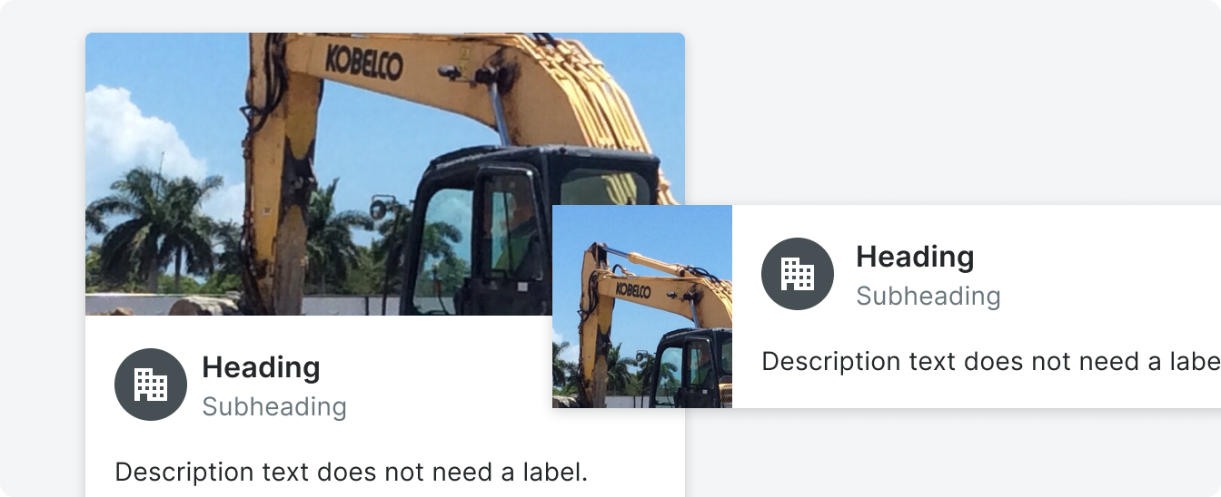
The placement of the hero segment determines the landscape or portrait tile variation.
Landscape
The hero segment is positioned to the left of the rest of the segments (title, content and action) in this tile variation.
An image or video can take up a max of 1/3 of the total width of the tile and expand the full height of the tile. When a pill or display text is used in the hero segment, the title, body and action segments will shift to fit the width of the element.
An image or video can take up a max of 1/3 of the total width of the tile and expand the full height of the tile. When a pill or display text is used in the hero segment, the title, body and action segments will shift to fit the width of the element.
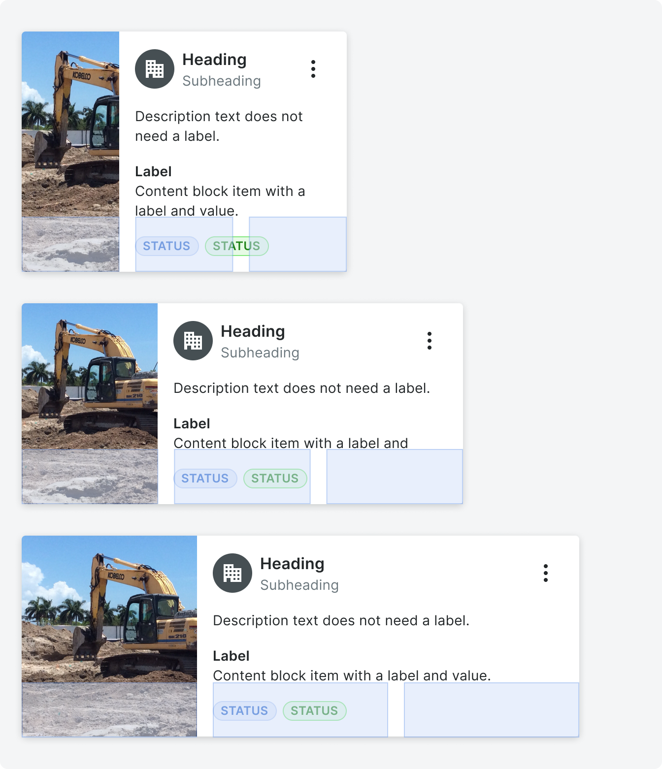
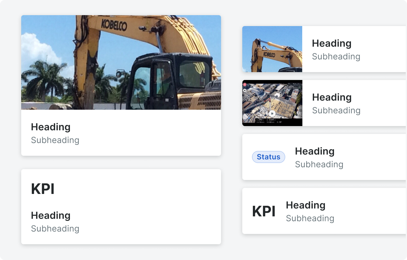
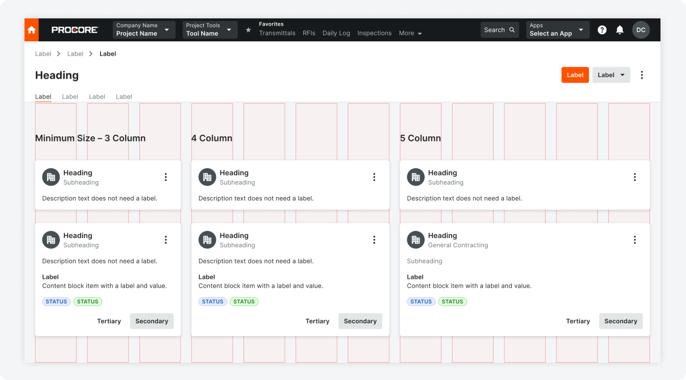
Example of how images and tiles scale at different column widths (3,4,5 columns respectively) using the landscape type.
Portrait
The hero segment is on top of the rest of the segments (title, content and action) in this tile variation.
In this type the hero segment will have a minimum height of 330px and a max of 567px. This minumum will be applied to all tile widths.
In this type the hero segment will have a minimum height of 330px and a max of 567px. This minumum will be applied to all tile widths.
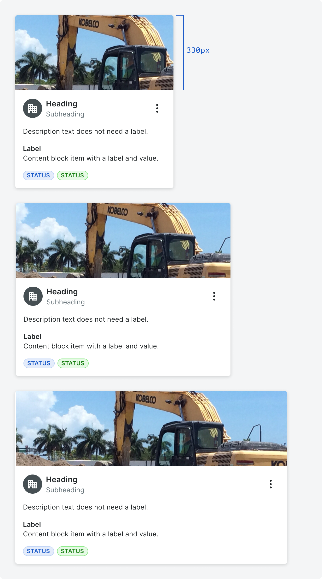
Example of how images and tiles scale at different column widths (3,4,5 columns respectively) using the portrait type.
Behavior
Width and Height
Tile widths can expand to 5 columns and take up a min of 2 columns. Heights will be determined by the visible content. The minimum amount of content in a card would display just a heading in a title segment. The tile itself would have a minimum height
of 56px.
Images in a Hero Segment
Images are horizontally and vertically centered within the hero segment. The image will take the full height or width of the image depending on the hero variant.
Visualization and Video in a Hero Segment
Images are horizontally and vertically centered within the hero segment. The image will take the full height or width of the image depending on the hero variant.
Truncation
The heading and subheading can wrap to two lines before truncating. If truncation occurs a tool tip will appear upon hovering on the tile.
We suggest content blocks should also limit wrapping to 2-3 lines in order to maintain the height of the card.
We suggest content blocks should also limit wrapping to 2-3 lines in order to maintain the height of the card.
Touch Areas
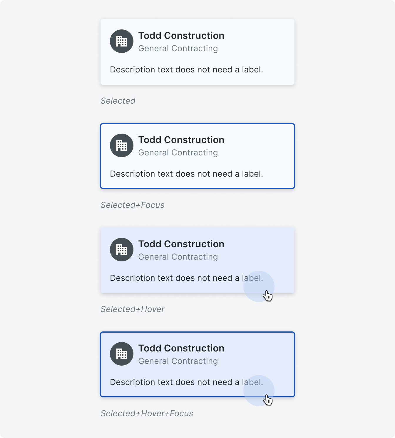
Tiles can be interactive (with multiple touch areas), or selectable, depending on the use case.
The heading in the title segment can be used to navigate to the item detail page the tile is referencing. Any link within the content area can also be used to navigate or trigger an element.
The heading in the title segment can be used to navigate to the item detail page the tile is referencing. Any link within the content area can also be used to navigate or trigger an element.
If a tile is used to link to an item, a hover state will be active.

A tile can also be selectable and have active state. Tiles cannot be both links and selectable.
Keyboard Controls
Interactive
Pressing tab will focus on the entire card. Pressing tab again will focus any interactive components – like a button, link or hero segment within the tile. Shift+tab will move
the focus to the previous item Pressing the down arrow will jump to the next card.
Pressing enter will trigger the interactive component.
Pressing tab again will go to the next focusable component.
Pressing enter will trigger the interactive component.
Pressing tab again will go to the next focusable component.
Linked and Selectable
The tab key will focus on the entire card. Hitting enter will navigate to a new page or select the tile depending on the us case.
Pressing tab again will go to the next card.
Pressing tab again will go to the next card.
Specifications
Styling