


Meet Procore’s New Empty States
And find out how they can help your team succeed

Although the concept of an empty state was necessitated in software design, a good empty state can be compared to a receptionist when you first check into a hotel. They’re there to get you the key to your room, point you in the direction of the ice machine, and give you some information specific to your experience there.
“But my users are coming from similar software and they know what they’re doing. I’ve done enough research around my designs that any extra prompting would mean that our designs aren’t intuitive.”
I’ve heard this argument before, and this is why I like the hotel reception desk metaphor so much.
When you check into a hotel, you know why you’re there -- you obviously purchased a room knowing what it was for, and you may even know how things work at hotels -- but you need a little bit more information on how to get to your specific room, and even though you’ve been in a hotel before, each hotel is probably a little bit different, so you’ll need some help getting around. Offering help in an empty state isn’t an insult to your product or your users’ knowledge, it’s a way to fast track them to where they want to go.

Now, imagine if every hotel lobby was empty, or even had a sign that said, “This building is where you’ll find your room,” without any further instructions. You’d probably let out an exasperated sigh and look around thinking, “Well duh! But where do I go from here?”
This is what users are thinking when they’re faced with a truly empty, empty state, or an empty state that isn’t helpful at all.
The perfect empty state contains carefully crafted content and images that guide the user to quickly and confidently get started using the page or feature they’re trying to use.
And that’s exactly the guidance we used to revamp Procore’s Empty States.
A Look at Our Previous Empty State
Let’s take a look at our old Procore Empty State before we dive into the changes we made, and the results we got.
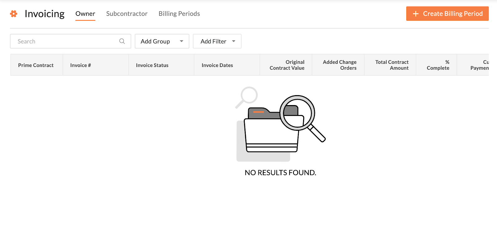

While this is one example, our Empty States do vary widely across Procore, depending on the tool, team, and area of the product our users are in.
We realized that this global inconsistency creates a poor user experience. Users were greeted with different copy, and one of more than 35 different illustrations.
In this example, you’ll notice the message simply reads: No Results Found. Without any additional information, our users -- especially newer Procore clients -- were forced to figure out how to use the tool on their own.
Another issue we noticed: The CTA for the tool was on the right hand side, making it less discoverable, especially for new users who were just finding their way through our product.
Based on the data we reviewed, almost all of our users ended up heading to Global Search or were unable to complete their task after seeing these empty states. Instead of guiding our users or helping them understand our product, we essentially left them at a dead end.
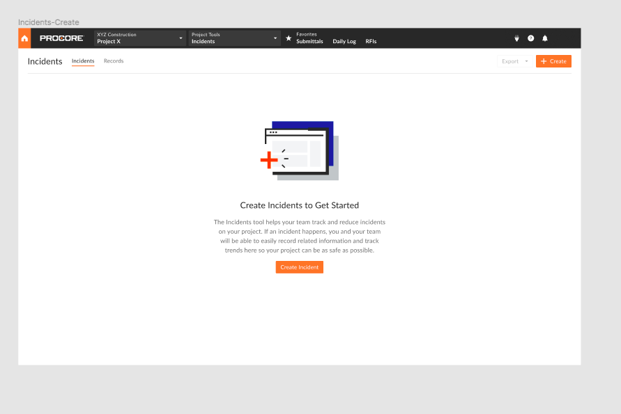
Introducing Our New Empty State
We knew we had to make a change.
So we worked across Content, Design Systems, and UI to create new empty states based on data and user behavior - empty states that would create a consistent, helpful experience.
The major changes include:
- Offering five illustrations to choose from, rather than 35
- Clarifying how header and body text should be written to guide users
- Adding CTAs to the body of the empty state, rather than as buttons on the right hand side
- Creating dynamic copy based on users’ permissions and capabilities within the product
Let’s take a look at the design first.
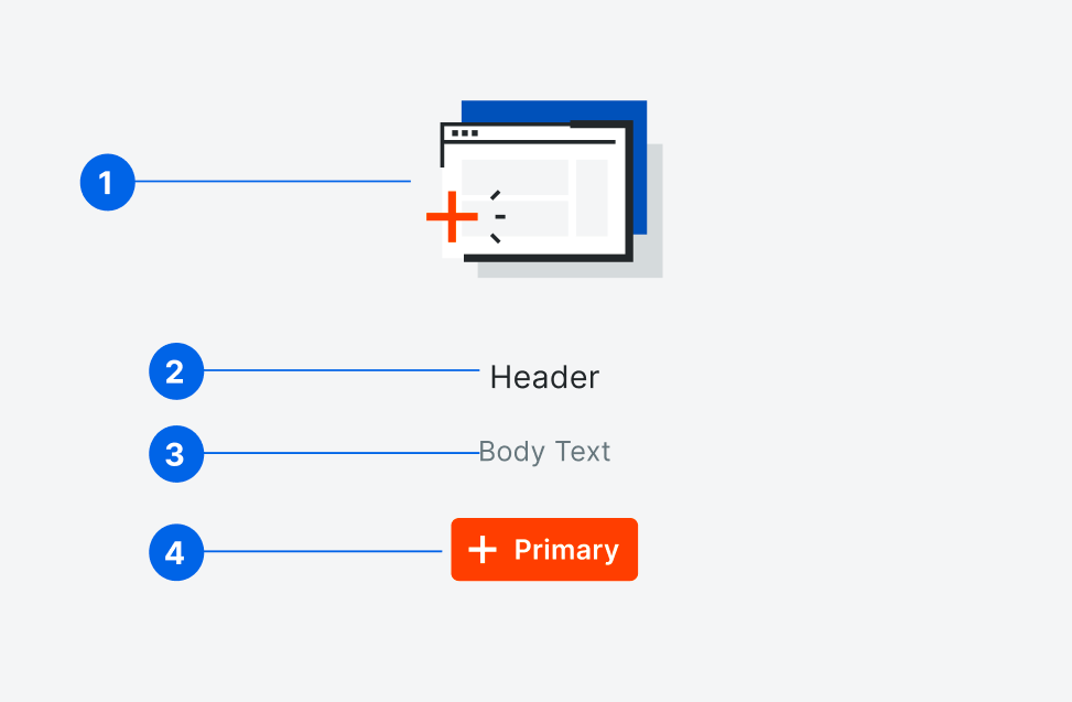
1. The Illustration
We always recommend adding an illustration to both draw attention to your instructions and to make an otherwise empty page more inviting. By reducing the number of illustrations to choose from for empty states, we also help ensure our users receive a consistent, but contextual experience.
2. The Header
Like a good header in any component, the copy here should be scannable, elevating the most important information. There’s a chance users will only read the header, so it’s got to catch their attention as well as offer a TL;DR of what the user needs to know.
3. The Body
While the header offers a short summary of what the user needs to know, the body copy supplies more detailed instructions and, most importantly, points the user toward the call to action.
When writing the main body of your empty state, consider the following three questions:
- Where is the user coming from? Then use that context to frame your content.
- What will they want to do next? Use the empty state to guide users to complete that action.
- What do they already know about this page? Most of the time, you should assume they know nothing, but use that context to omit or add information as needed.
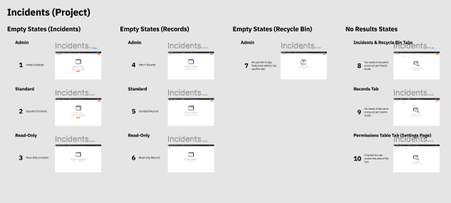
- What Permissions do they have? What our users can and will be able to do within any given tool is based on their permissions in Procore. That means our empty states must respond to them contextually. We recommend writing copy for three distinct empty states that respond to Admin, User, and Read-Only permissions for each empty state.
Once you understand those three factors, you can address most of what the user is wondering when they get to your empty state.
4. The Button
The button in your empty state should always initiate the action that will populate the page. If there are steps users need to take before this is possible, direct them to those actions first. Once those steps are done, your empty state should update to include the main create action of the page.
Empty States Case Study: The Results
Working with the Quality & Safety team, we created empty states for almost every user and permission type.
By responding directly to the top segments of our users, we drastically reduced the number of users who took an incorrect action after viewing the empty state.
Rather than turning to Global Search, a Support Site article, or just bouncing around, users were able to understand specific next steps and the Empty States guided their experience. Not bad, right?
Types of Empty States
Your product has more than one feature, and probably has more than one page. Just like a receptionist answers more than just questions about checking in, you’ll want to incorporate the power of the empty state whenever a user encounters a place where data hasn’t been added yet.
Landing Page for a Product or Feature Set
This empty state appears on the landing page for a product or feature set, and introduces users to the main features of the tool.
If your product has restrictions on create permissions, your empty states will need to change depending on the user. If you have a Read-Only user who can’t populate the page, describe how the user will be able to use the feature or page once it’s populated.

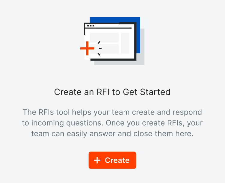

Two different empty states are shown to users in the RFIs tool depending on their permissions.
If there are multiple steps to get users started on the tool, pair your empty state with a guide or wizard to get the user started. Leave the empty state to focus on the main action of the page, though.
No Results After Searching
An empty state can also appear when a search results page is empty because the user’s query returns no matches.
Here, we recommend responding contextually to the user, and offering helpful next steps specific to their search action.
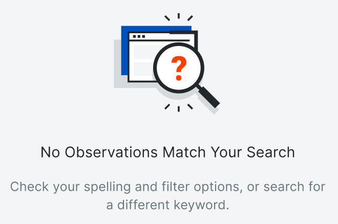
When a user searches in the Observation’s tool, this empty state guides the user to check their filters and search keywords, and try again.
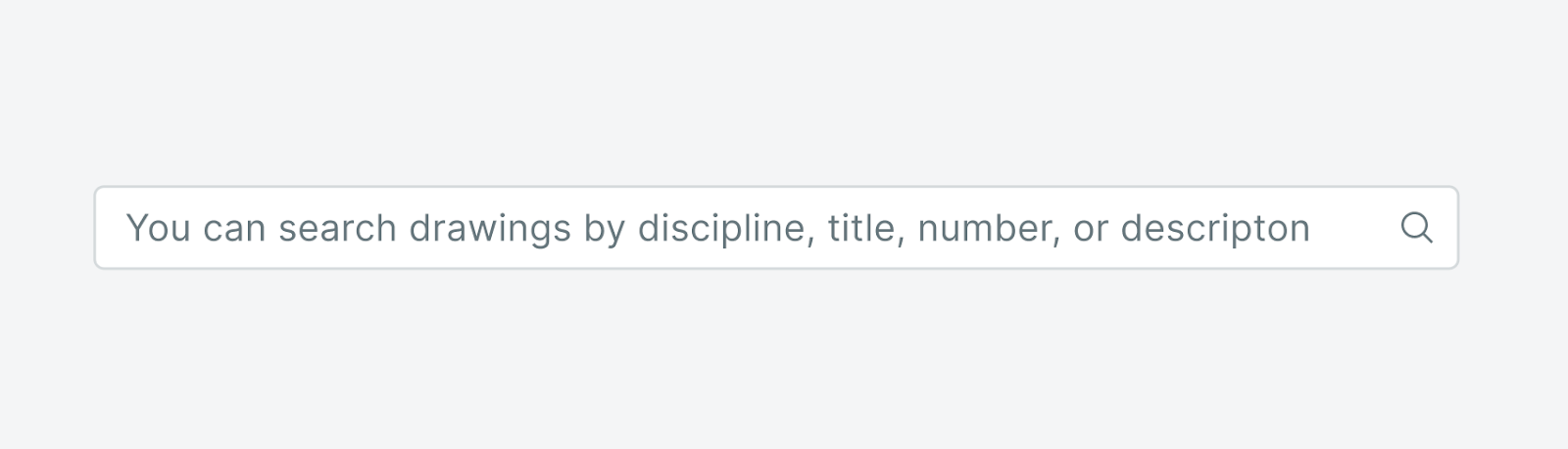
Placeholder Text
Empty states aren’t just full-page experiences; placeholder text also informs users of how to populate an element. The key to placeholder text is to be consistent and concise.
Placeholder text should be scannable. If you switch up the format of your placeholder text, users will get confused. Additionally, most placeholder text disappears once users start typing or selecting items, so it isn’t the place for complicated information.

This placeholder text lets the user know that they’re searching the whole drawings database as opposed to searching in our global search, or searching other items users can create in the Drawings tool, like markups.
This placeholder text has too much information for the user to remember.
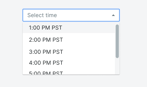
Even things as small as selects need placeholder text that guides the user how to interact with the element. Example from Procore’s Design Guidelines.
To wrap things up...
If not done effectively, empty states can be one of a product’s biggest culprits of dead ends, leaving users stranded and confused. When a user gets stuck in your product, it breaks their trust. As these dead ends pile up, users get more and more frustrated, and once that frustration has built up enough, users will associate that frustration with your product.
Obviously, this also translates into money lost on the business side, as a smooth app experience and high adoption rates means an easy sell and subsequent renewal. In addition, a more personalized and helpful user experience reduces reliance on Customer Support.
Bottom line: When we leave empty states empty, this is a missed opportunity to make a great first impression -- one that can leave our users feeling confident and relaxed, knowing exactly what they need to do next to start using the page. And that’s just what we’ve designed our new Procore empty states to do.