


Procore's Guide to Buttons
How we use buttons in our system

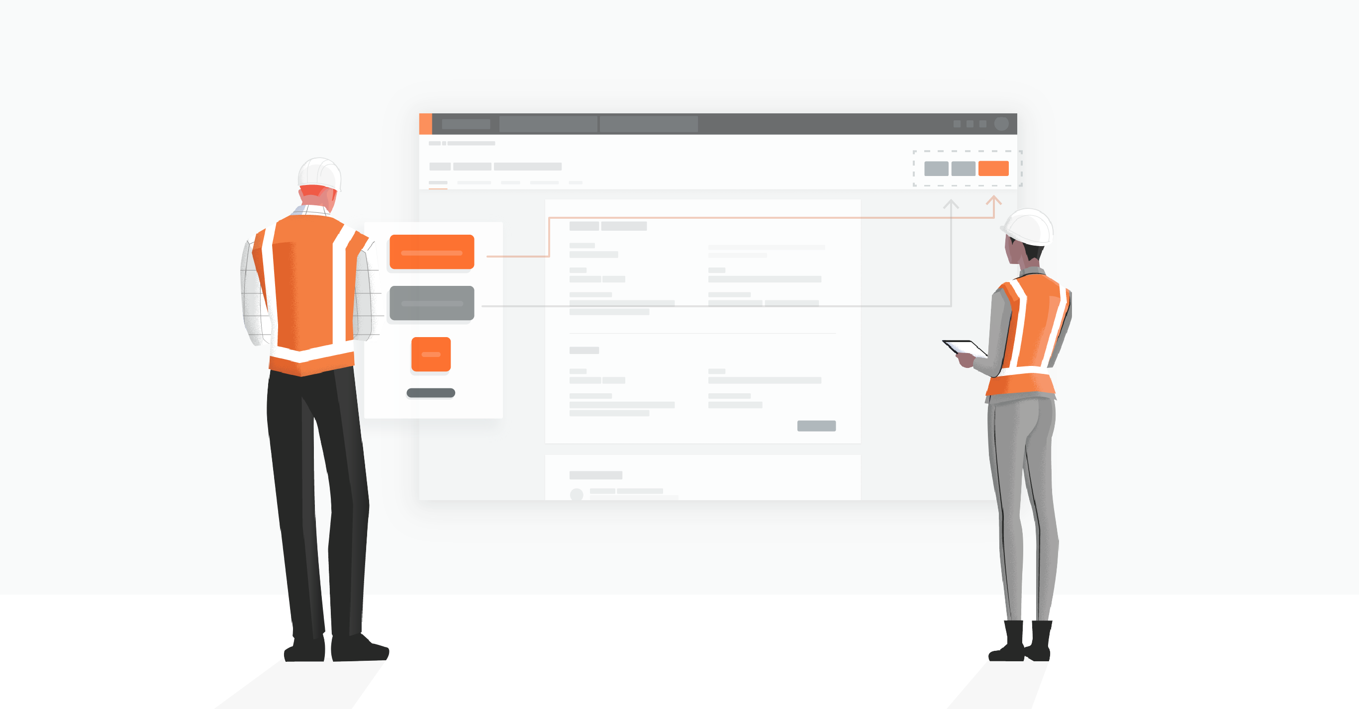
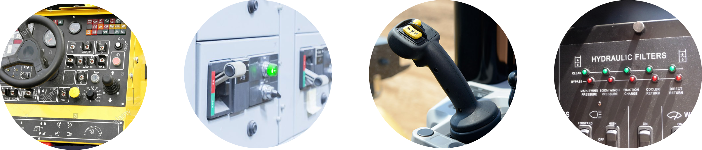
Construction is riddled with buttons, both physical and digital. With a press of a button, cranes release material, backhoes lift dirt, and power is turned on/off. With the use of desktops, tablets, and smart phones, digital buttons have become far more common. But the button’s origin stems from these physical actions.
Today, buttons are one of the most commonly used elements in product design, and it may seem simple to design.
However, there are a lot of details to consider when designing a button.
This document will cover how to use buttons, their hierarchy and placement, and additional best practices.
The Anatomy

Above is the basic anatomy of a button. While we should all know this as designers, Procore’s design system team handles ALL of this button anatomy out of the box. So all you should need to focus on is when and how to use it.
Our Types
Our updated system rally around contained buttons. Contained buttons create more emphasis due to the fill of color. The purpose, platform, and guidelines will determine what button type you use. It’s up to you and the user experience you are designing. Below are the different button types that Procore supports.
Hierarchy and Placement
Buttons are meant to direct users into taking the action you want them to take. That’s why button UX design should always be about recognition and clarity. We use buttons in a certain hierarchy to differentiate more important actions from less important ones. Our hierarchy of actions should guide the user when there are multitudes of choices.

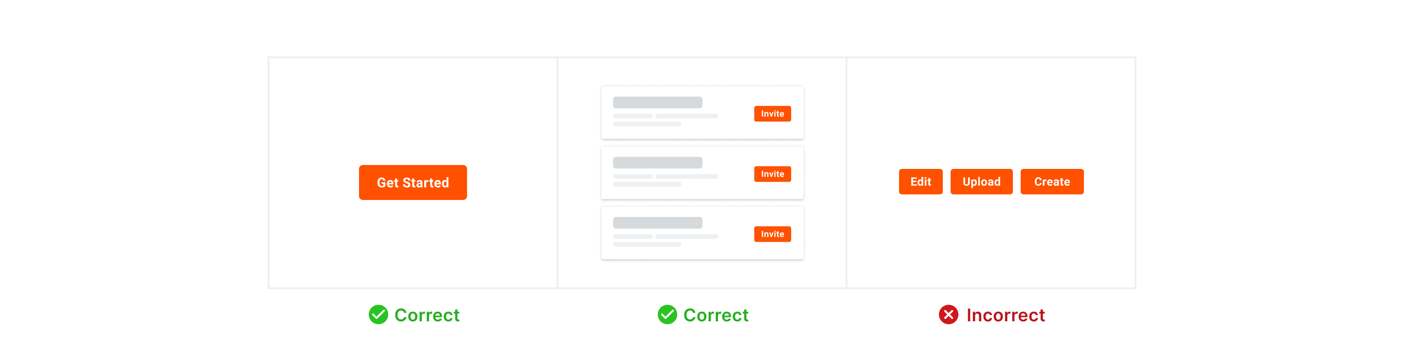
A layout should contain a single prominent button that makes it clear that other buttons have less importance in the hierarchy. More than one button is typically in a layout at a time, so a high-emphasis button can be accompanied by medium- and low-emphasis buttons that perform less important actions. When using multiple buttons, ensure the available state of one button doesn’t look like the disabled state of another.
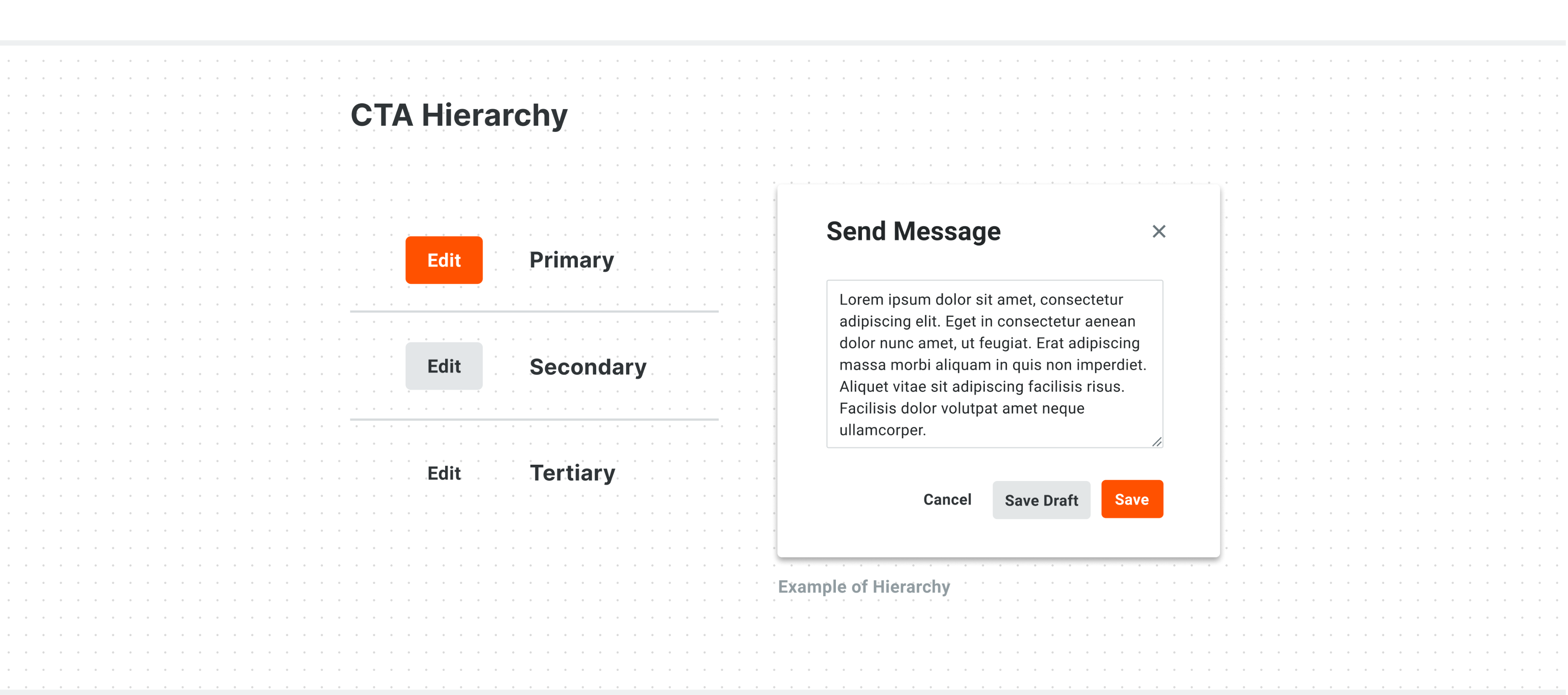
Best practice — Limit one primary action per page, unless repeating a primary action
Let users focus on the task at hand. Generally, we want to make the most commonly selected button the primary. This helps the majority of users finish their jobs faster and points them in the right direction.
You can have more actions on the page, but make sure there is typically one primary action per page. Users have expectations of what a single button on a page will do, based on the page they are on. In some cases, using repeating primary button is appropriate when you must choose from a parallel set of objects (like a stack of objects in search results), or a settings page layout presents categories of options in equivalent modular regions.
Sometimes, there might not be a primary action on the page. The exception is when all choices are equal, or action is particularly dangerous. In those cases, you want users to intentionally select the button rather than accidentally. These are the instances when you would use multiple secondary/tertiary actions.
Placement
We understand that our product and workflows will vary. Below are a few guidelines and best practices on action placement for our most common layouts in Procore — List, Detail, and Create/Update pages.
List Page
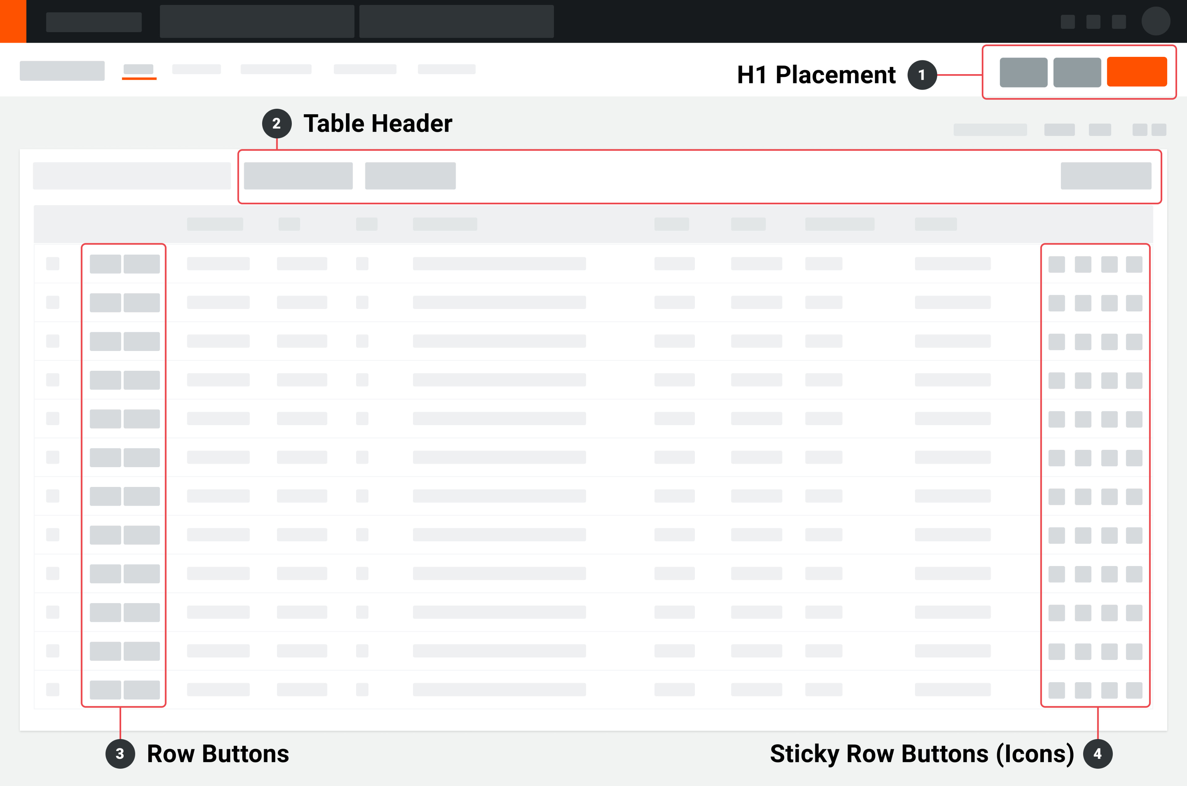
- H1 Placement
- Primary actions
- Secondary actions
- Exports, Reports, Email, and/or etc
- Overflow action (currently being usability tested)
- Table Header
- Table actions
- Search, Filters, Bulk Actions, Group by, etc
- Row Buttons (Optional)
- Historically, “Edit” and “View” action in table rows
- You can choose to continue this pattern or update it
- Sticky Row Buttons (typically icons)
- Sticky row actions
- Attachment, Private, Overflow, etc
- Typically supports icon-type buttons
Detail Page
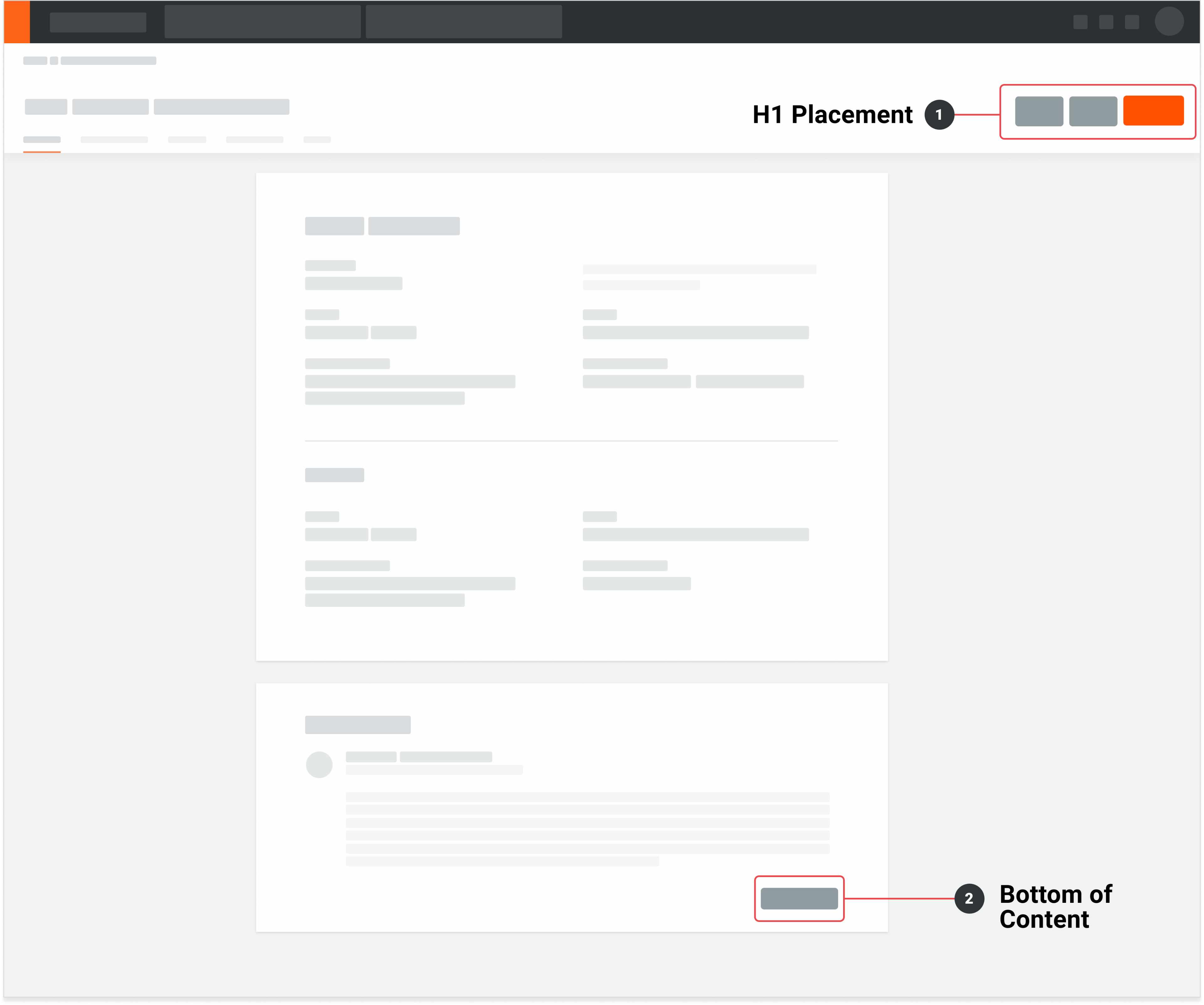
- H1 Placement
- Primary actions
- Secondary actions
- Additional actions like Export, Reports, and/or Email
- Bottom of Content (Optional)
- Optional button actions for specific sections
- Example (Line Item Adders, Activity feed, etc)
- Not recommended usage unless needed
Create / Update Pages
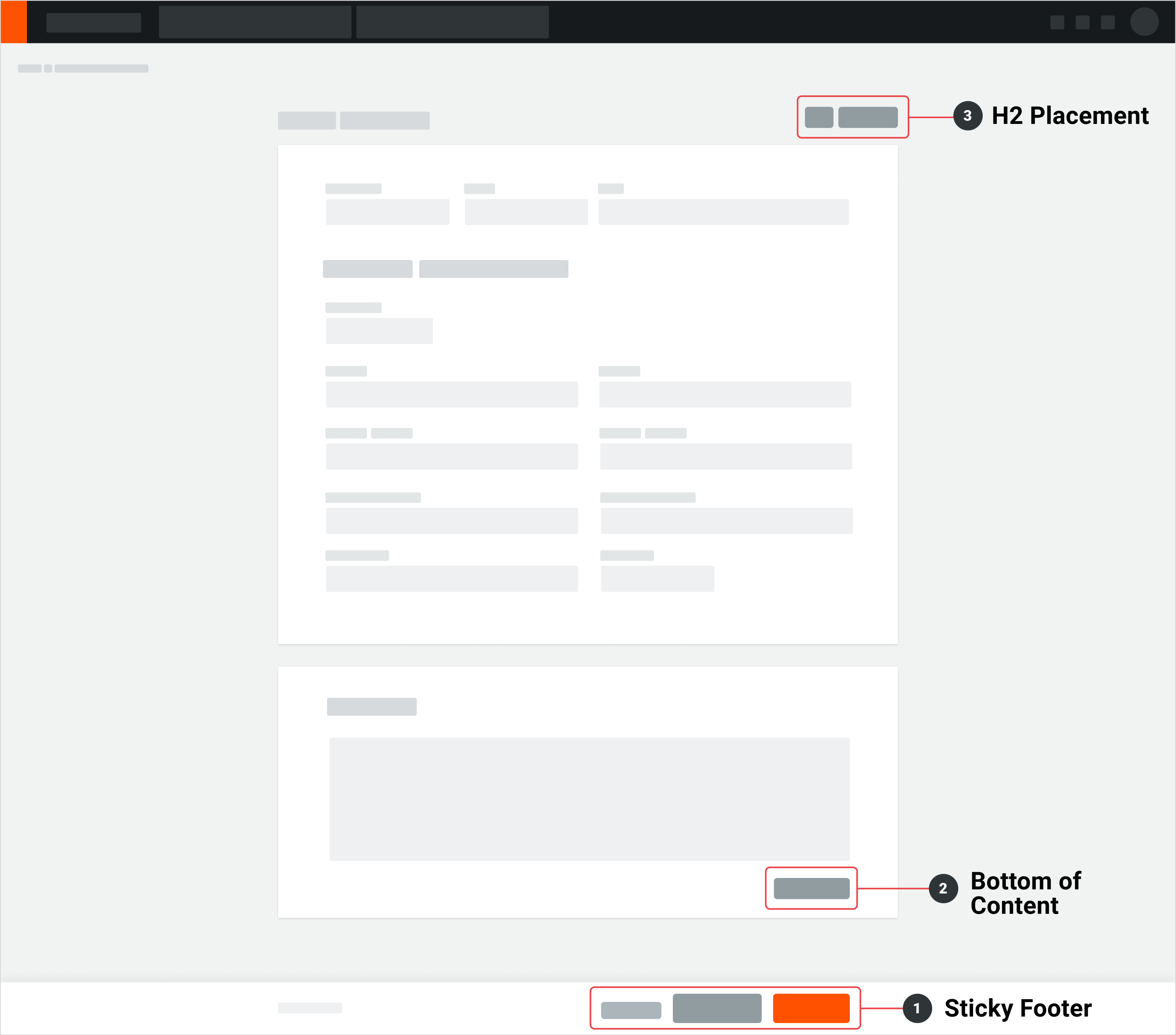
- Sticky Footer
- Primary action
- Secondary actions
- Tertiary actions
- “Cancel” or "Back"
- Bottom of Content (Optional)
Optional secondary actions for specific sections
Not recommended usage unless needed
- H1 or H2 Placement (Not recommended)
- Optional secondary for specific sections
- Example: Close Item, Previous/Next Buttons, Create New Item
- Not recommended usage unless needed
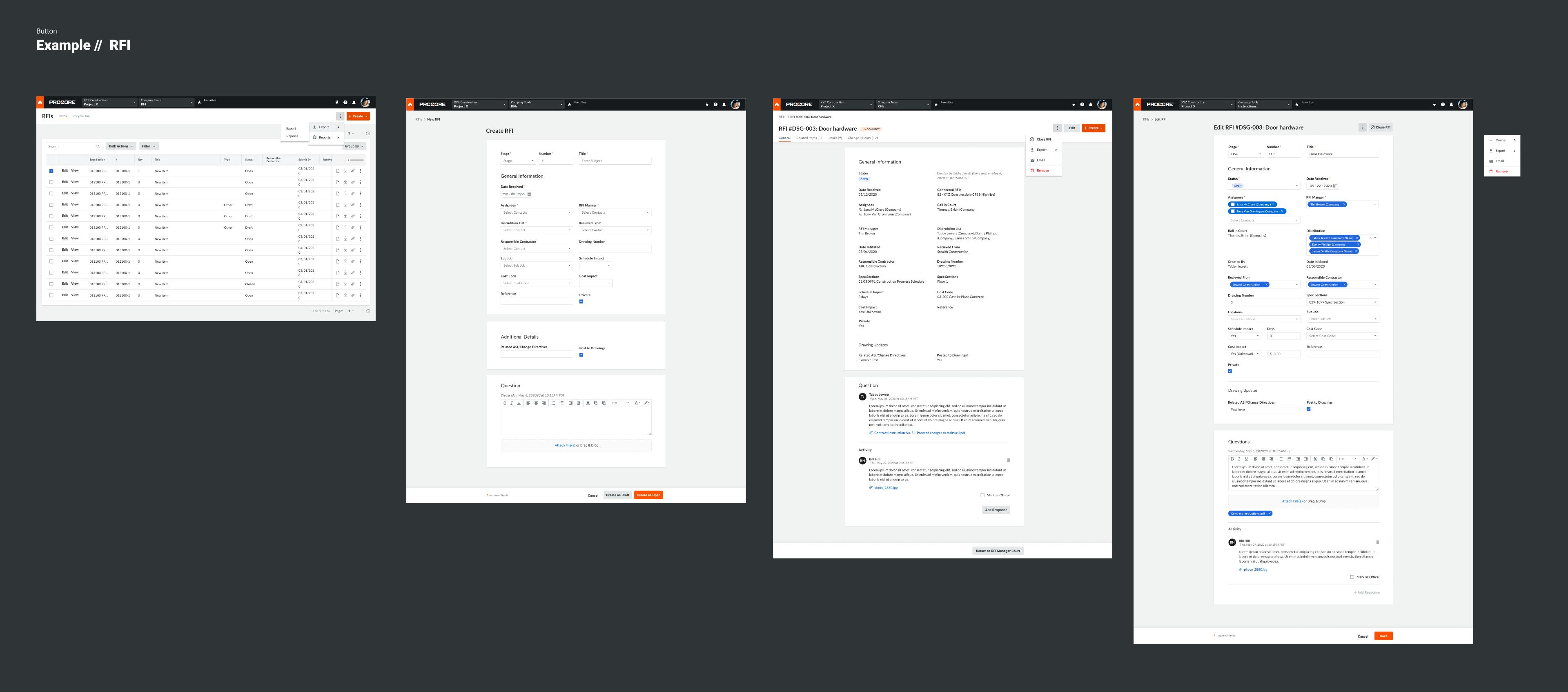
Example
Appendix & Research
Procore Button Research Audit - Figma