


Banners: Best Practices for Visibility

You’ve seen a banner before. They’re the flash-sale, farmers-market, college-football, highway-billboard-for-your-local-dentist, star-spangled banners that I’m sure you’ve seen at least a hundred times a day. And I haven’t even mentioned internet banners yet.
So here’s my question: how many do you remember?
What’s the difference between the ones you remember and the ones you don’t? Good question, and there are three answers.
- Familiarity
- Context
- Effectiveness of content
Let’s start with familiarity.
1. Familiarity
Our brains work in a way that optimizes making connections between what we experience presently and what we’ve experienced in our past. Therefore, it makes sense that if we see something that matches something in our long term memory, we’ll be more likely to remember it in the future.
An unfortunate side effect of this for banners specifically is a concept called banner blindness. This is a common tendency to ignore elements that users assume (correctly or incorrectly) to be advertisements.
So, as much as we can, we need to consistently prove the worth of our banners to users so they don’t just ignore them.
The first thing we can do is present similar information consistently throughout Procore. For example, a banner that alerts the user that an RFI requires their attention should look very similar to the banner that alerts the user to a submittal that requires their attention.
So, to that point, we’ve built a system to make each type of banner familiar to the user so they have a better chance of recognizing it and deeming it worthy of their attention the next time they see it.
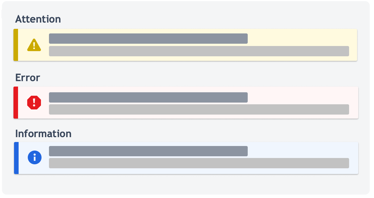
Here at Procore, we have 3 types of banners: Attention, Error, and Information banners.
- Error banners are used to explain why a process or action isn’t working as expected and what the user can do to resolve the issue.
- Attention banners are used to inform users that their attention is required on a page or feature.
- Info banners are used to give users supplemental information about an item or task before, during, or after a process.
Each container was designed to be used consistently to display information related to their subject.
We used colors that convey meaning and are consistent with how they are used in the rest of Procore:
- Yellow to convey caution or warning
- Red to convey error or actions that are destructive
- Blue to indicate information or announcements
We also specifically chose more muted colors so as to not distract users from the main content of the page. Information in banners is always supplementary; more on that later.
Presenting similar information in similar ways helps our brains make connections that say, “I’ve seen this yellow banner before! It meant I needed to do something that I need to pay attention to.”
Our banners are designed to be used consistently to show important information about the page or object they’re looking at.
Which brings me to Context.
2. Context
Information is best remembered when it is presented alongside relevant content. You are more likely to pay attention to a sale banner when it is displayed above the item that’s on sale, rather than if you saw it on the side of your favorite travel blogger’s website.
On the internet, a user is more likely to read a banner when it is speaking directly about the thing the user is doing, and on the page they’re doing it.
It also is important that the user who sees the banner is the person who can act on or use the information. It doesn’t help to show a user with Read only permissions information about something that only Admin users need to know. Similarly, it wouldn’t help to show an attention banner about some RFIs a user needs to respond to on the RFIs settings page.
That would just confuse them.
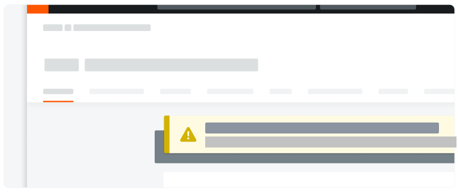
This is why context is key. We want to place banners within or above the object that the information pertains to.
This is so important that it’s actually one of our design principles: Proximity: The Gestalt principle of proximity says that elements that are closer together are perceived to be more related than elements that are farther apart.

In Procore, banners can live in three different locations on a page depending on the context.
- Tool-level banners display information that is relevant to the entire tool, and they sit in the tool header. This often persists across pages.
- Page-level banners display information that is relevant to the page the user is on, and it is placed above the card.
- Section-level banners display information that is only relevant to one section on the page, and they sit within the card above each section.
There are scenarios where all levels can be used at once, but to avoid overwhelming the user, we want to avoid this as much as possible.
In summary, we want to show banners to the right users in the right place at the right time.
And of course, we want to be using the most effective content.
3. Effectiveness of Content
How effective your content is is the last topic here because it is so contingent upon familiarity and context to have the most impact. You could have the most beautiful content in the world, but if it’s presented in a random place and in a way that looks really different than what the user is used to for that type of information, your beautifully crafted content has half the impact it could have.
Effective content also plays a key role in making the banner as familiar and contextual as possible.
We know that users scan for the information they are looking for, and we know that having similar information show up in objects that look similar helps with that, but we can take it a step further.
Once a user recognizes the type of banner and confirms that they need the information pertaining to it, they will want to consume the gist of the information as fast as possible.
“Tell me what I need to know so that I can get back to what I was doing.”
This is especially important for Procore users because your average superintendent doesn’t come into Procore to peruse the drawings for fun; all of our users from the jobsite to the office are here looking for information so they can get back to what they’re doing.
This is why we use content templates. Content templates help us write consistent messaging in similar components.
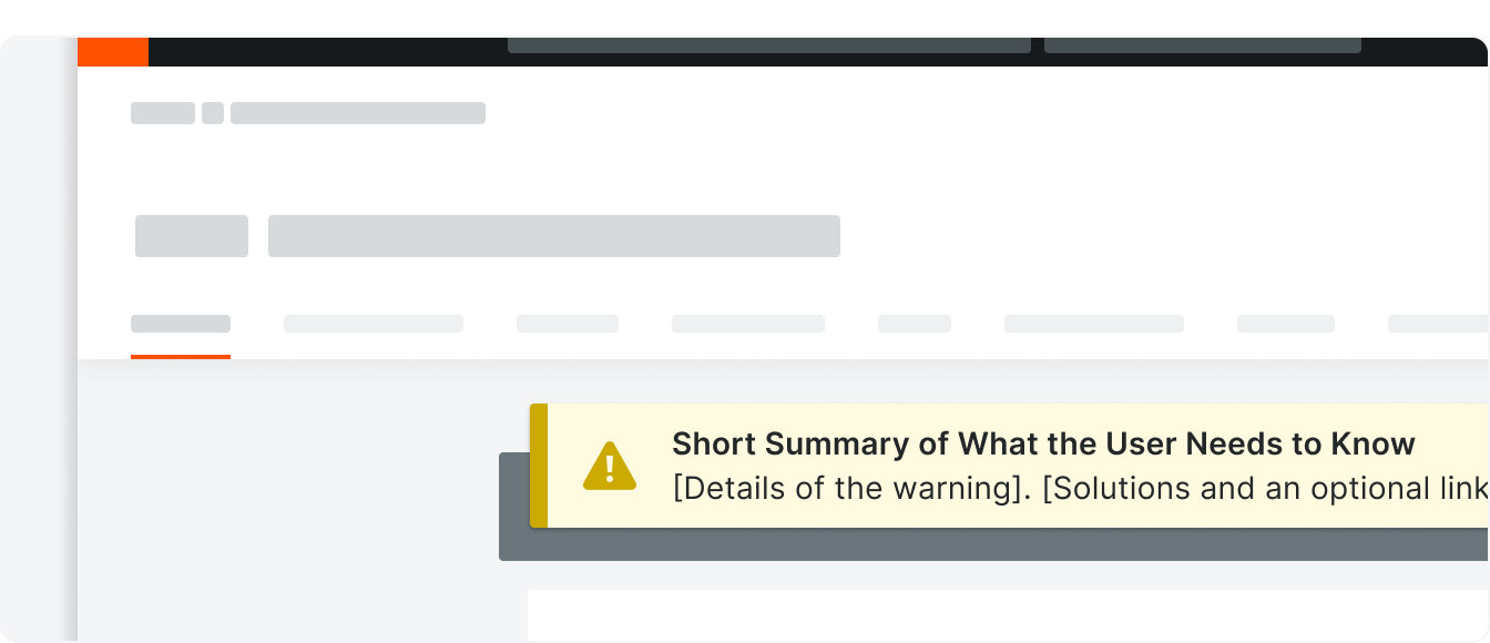
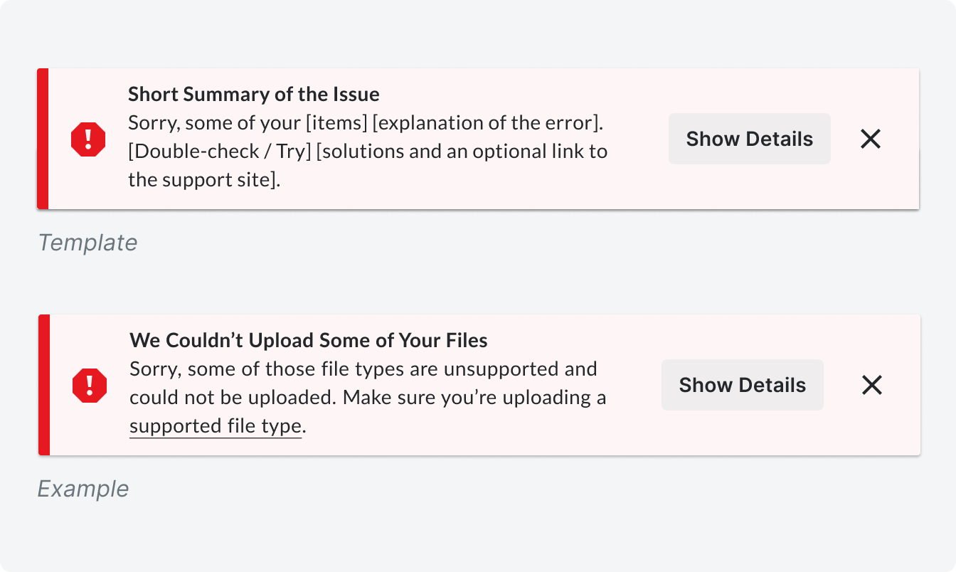
Error Banner

Users run into errors all day long, and there’s nothing more frustrating than running into an error that doesn’t describe what happened in a way the user can understand, or worse, doesn’t describe how to fix the error. Poorly written error banners are a huge source of dead ends in our app. They lead to user frustration, and, if they reach out to support, it directly impacts Procore’s operation costs.
That’s why this template was designed to make the errors as easy to consume as possible.
The boldest thing in the banner is a short summary of what happened. We chose to put the problem in the header because most of the time, the user is going to read only the header, and if we put the solution in the header, it wouldn’t mean much without an explanation of what happened. We put the solution in the body as supplemental information to the issue summary.
This format gives the user the opportunity to remember that error and solution the first time, and if they see the problem again, they won’t even need to read the solution again because they are familiar with the error and already know what to do.
Attention Banners
There are two types of attention banners, and they are grouped together because both warnings and actions require the attention of a user, and therefore should be given the same yellow “attention” color.
Action Required Banners
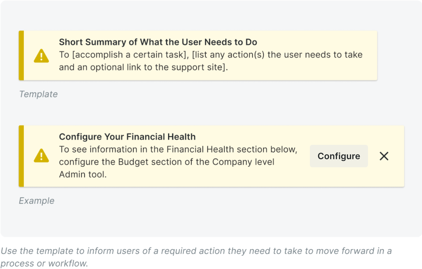
Action required banners inform users of a required action they need to take to move forward in a process or workflow.
Again, users will most likely only read the header, so we provided a one-stop-shop explanation of what the user needs to do in the header of this one, and supplementary information in the body.
These banners are action-focused, so they should always start with a verb.
If an action button needs to be included, it should match this verb from the header. This provides a continuation of the call to action, and it makes it clear that clicking the button is the next step to resolve the action in the banner.
Warning Banner
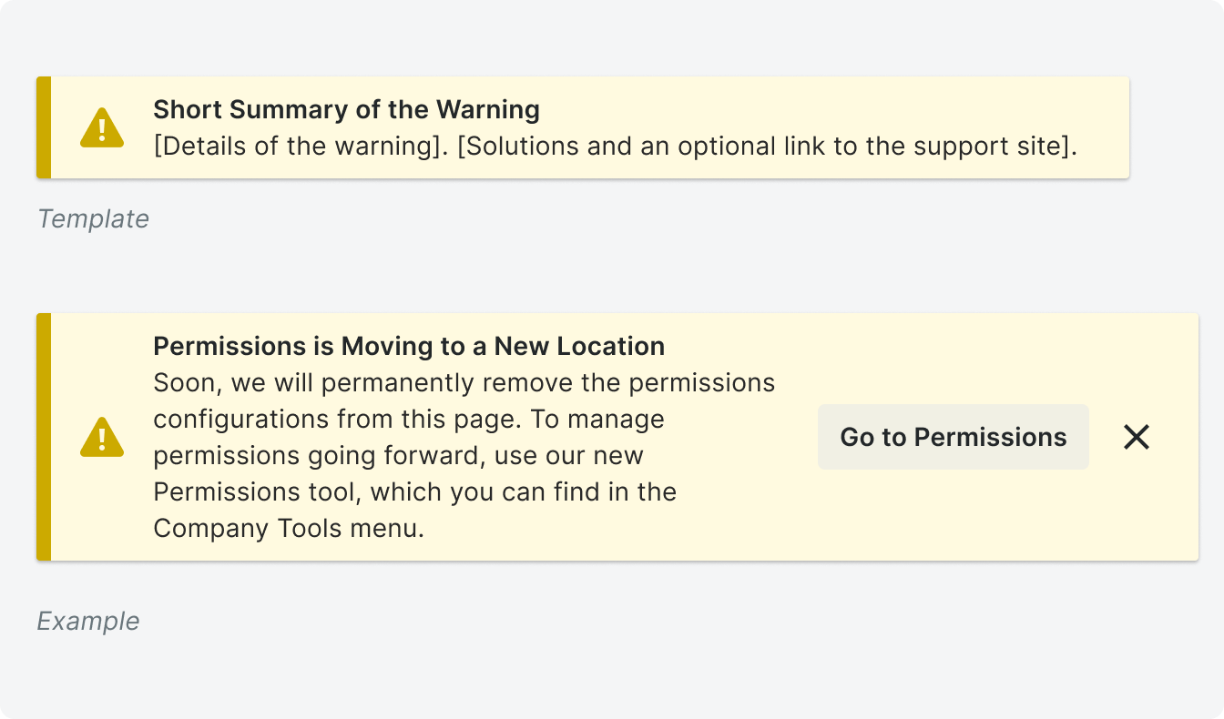
Warning banners preemptively warn users of a potential issue on a page.
These should not replace error banners because the key word here is “preemptive.” These assume that a user might run into an issue in the future, and we want to inform them of something before they get confused.
However, their template looks very similar to the error banner.
We give a short summary of the warning for scanning purposes, and below we give more information including a solution. Always look for ways to avoid dead ends.
The button in the example above takes them to the Permissions tool using the “Go to” button format that takes users to another place in Procore.
Info Banners
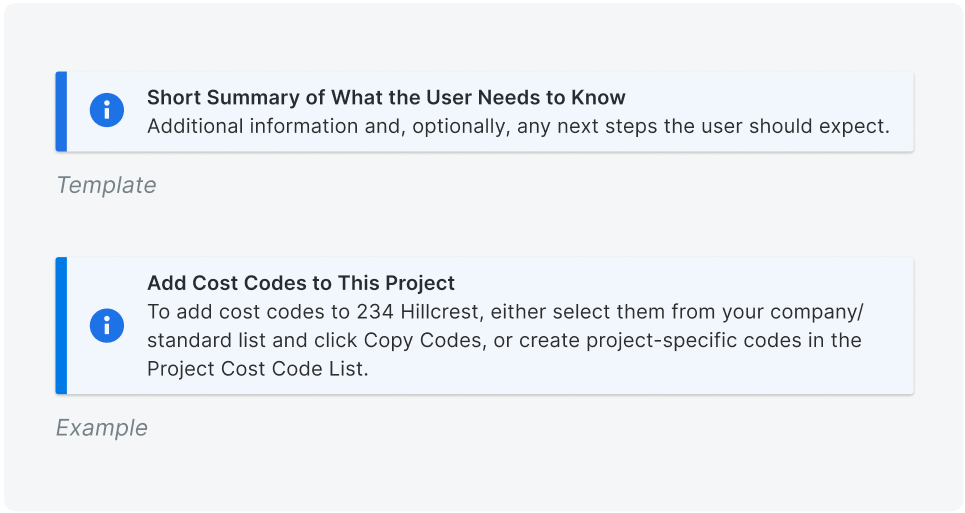
Info banners are used to give users supplemental information about an item or task before, during, or after a process.
Their template is focused on information sharing. Again, giving a TL;DR at the top in the header and expanding upon the information in the body text.
We don’t often include buttons in Info banners because they serve more as an FYI, and if it’s an FYI about a call to action, we should be using an attention banner. However, if we need a button, it’s often a “Learn More” button that takes the user to more information on Procore’s support site.
Variation: Expandable Banner
This isn’t really a banner type more than it’s a variation that can be applied to each type of banner above, but I think it’s important to touch on as an option.
To avoid information overload, we want to avoid stacking multiple banners on top of each other in the same place. (Again, on the same page is OK, but there should really be one banner per section / object).

But fear not! If you have multiple pieces of information to show pertaining to the same object, you can show it in an expandable banner.
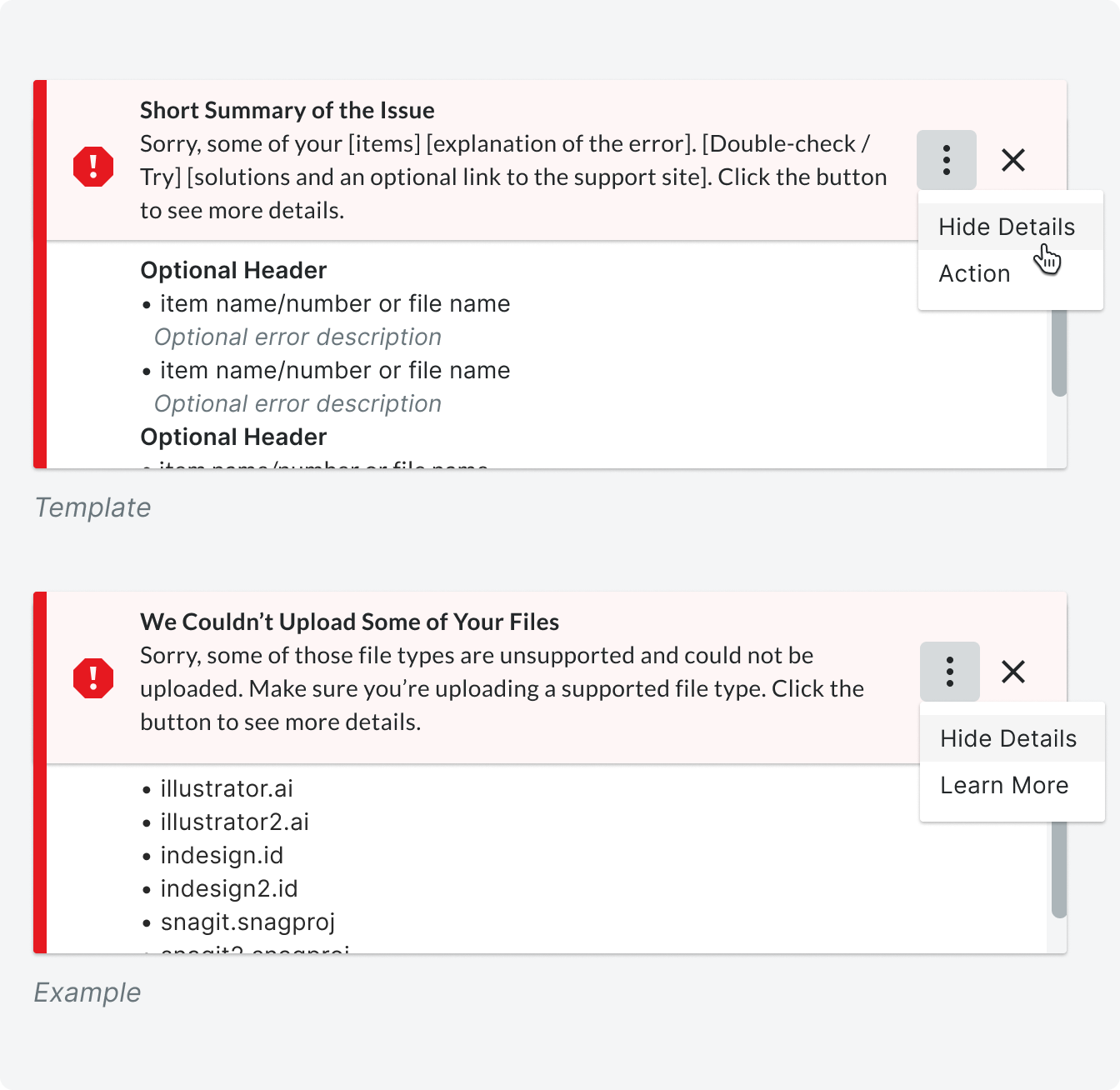
An expandable banner is most often used on error banners when there are multiple errors that occurred after a user takes an action.
The banner’s menu is collapsed by default, and when there are no additional actions that need to be taken from the banner, a Show Details / Hide Details button expands and collapses the menu, respectively.
If there is an action the user needs to take in the banner, replace the Show Details button with an overflow menu to house all the actions. Additionally, add a clarifying sentence to the end of the content telling users to, “Click the button to see details.”
Conclusion
Banner blindness affects us all, but as long as every banner we show is designed and presented to the right users, in the right place, at the right time, and it is written in a way that prioritizes their time and understanding over everything, our users will begin to associate Procore’s banners as valuable sources of information, and not something to be ignored.