


Button
We use buttons to link to other pages or to trigger an action. Buttons clearly define what happens when a user clicks it.
 Demo and Developer Guidelines
Types
If there are multiple items that can be acted upon with the same verb, create a Dropdown.
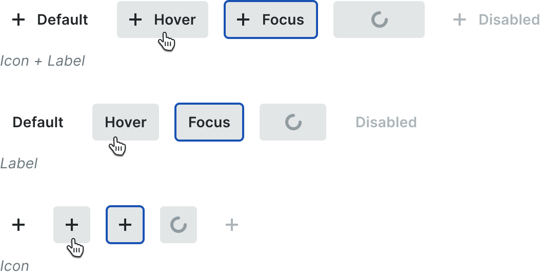
Icon
Icons buttons should only be used when the icon itself can successfully convey the intent of the action. They should also be used in the context in which it is absolutely clear that the icon itself is a button. A tooltip should be present on hover describing the intent of the button.
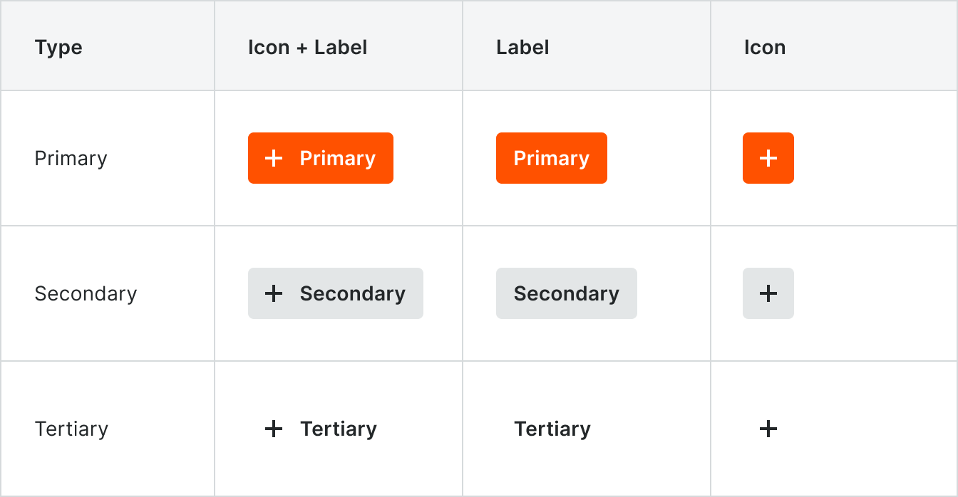
Primary
Primary Action buttons are used on forms and modals as the main action, often a submit action. There should be only one primary button per form or modal.
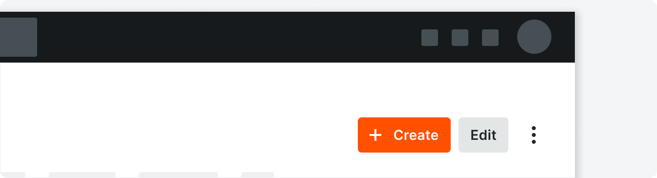
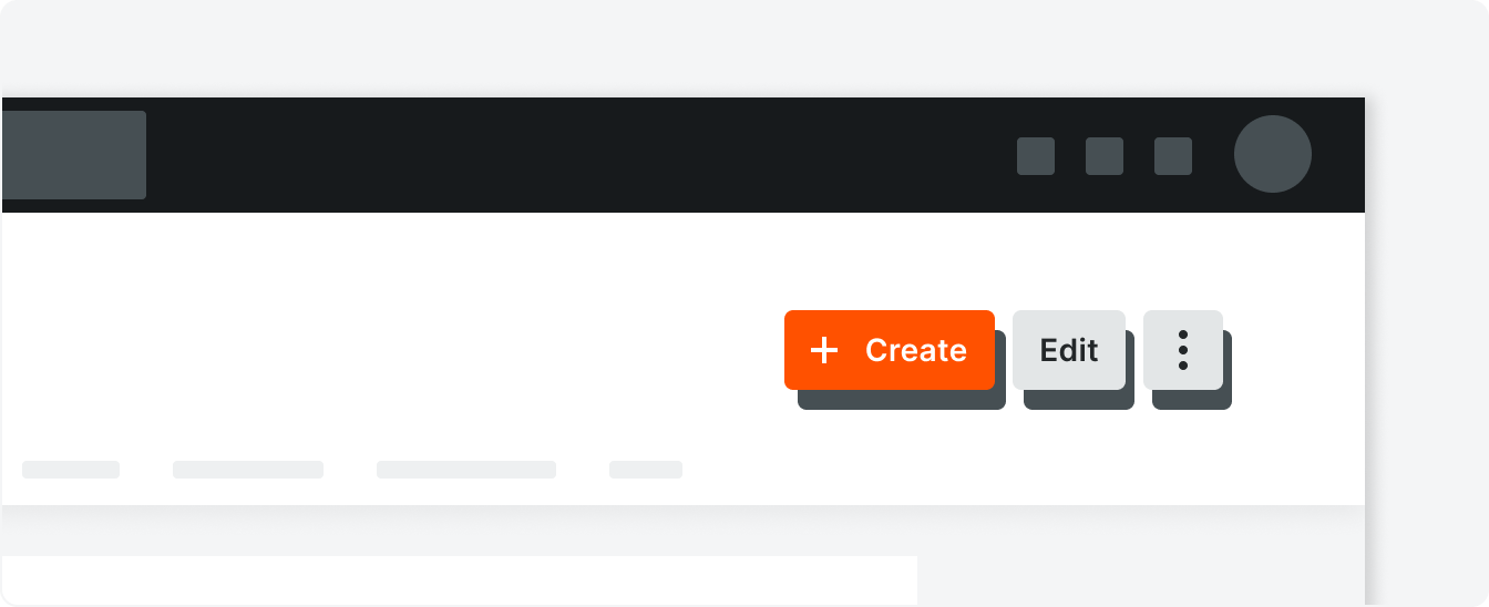
The Primary Action in the tool header is the left-most button.
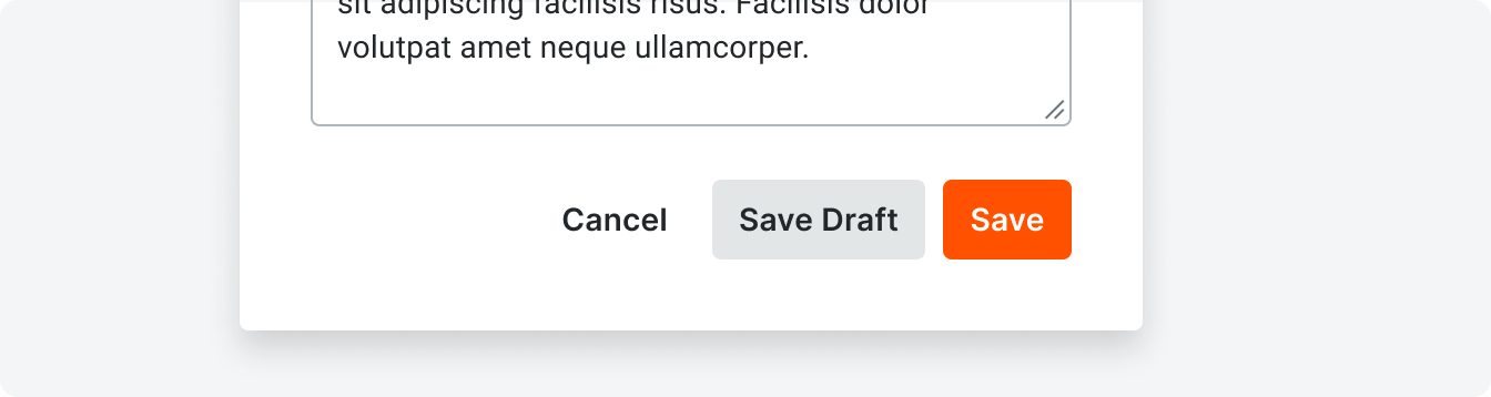
In a sticky footer or modal, the Primary Action button is the right-most button
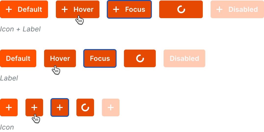
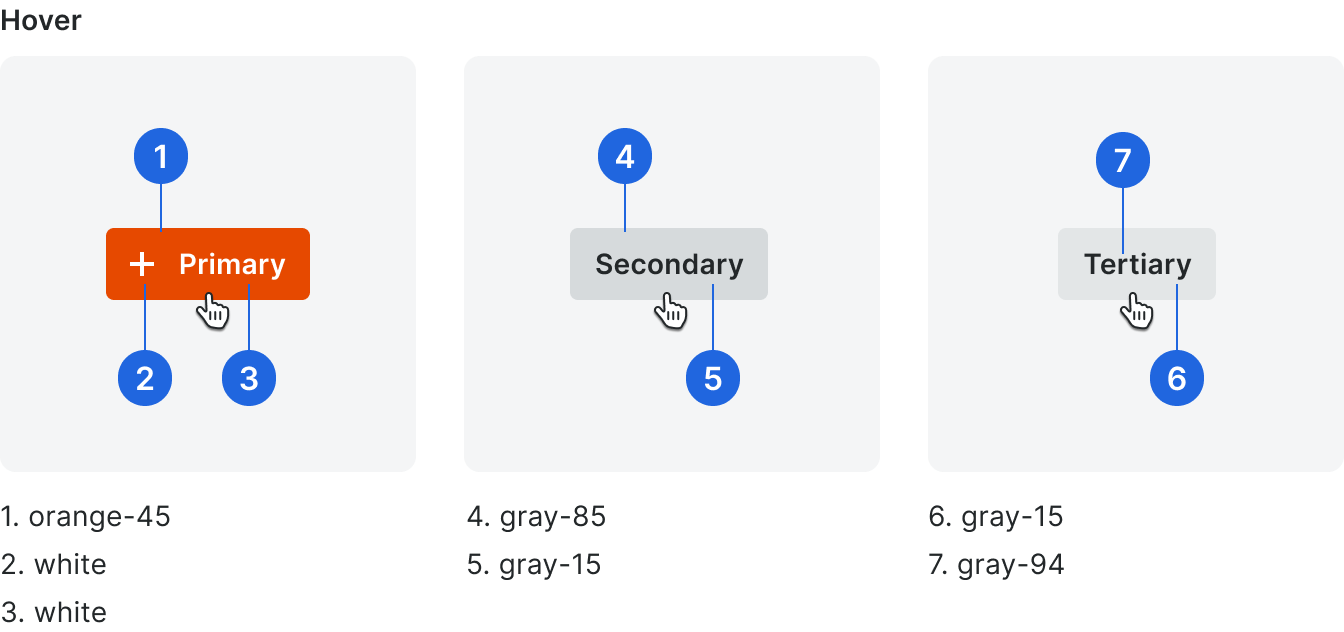
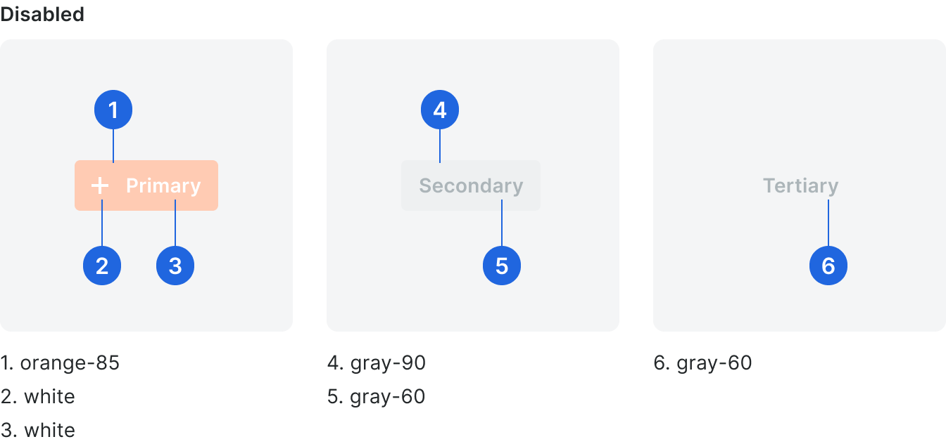
States
Secondary
Secondary Action Buttons can appear on any page in Procore and express any non-primary actions you can take.
Labels consist of one or two singular, present-tense verbs that appear in the Glossary.
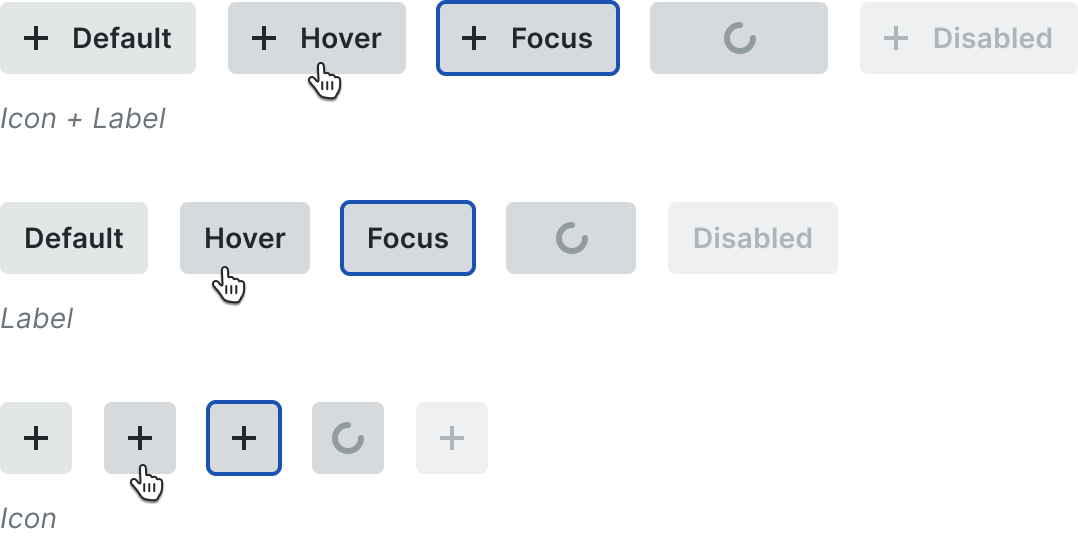
States
Tertiary
Tertiary Buttons are used as an exit or back button on forms and modals and are positioned next to the Primary Action button.
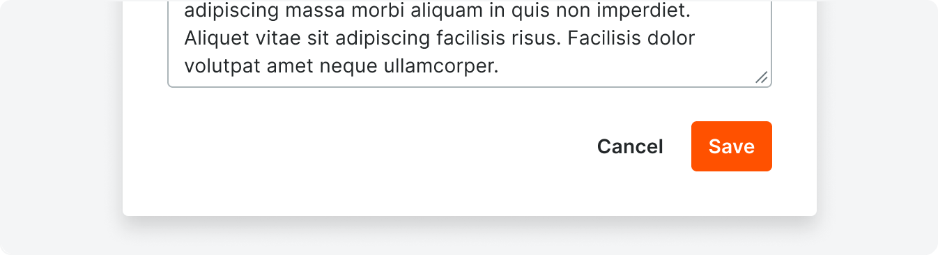
Common labels for this button are, Cancel, Skip, Back.
States
Best Practices
Button labels are consistent and title case without punctuation. They clearly define what happens when a user clicks a button with actionable, non-generic verbs.
If the character count exceeds the count limit, the text should truncate and a tooltip should be utilized on hover.
When there are 2 verbs in one button separate them with an ampersand (&).
If the character count exceeds the count limit, the text should truncate and a tooltip should be utilized on hover.
When there are 2 verbs in one button separate them with an ampersand (&).

Correct

Incorrect
When there are more than one button in a cluster, use only one Primary button. Other actions are secondary or tertiary buttons depending on the use case.

Correct

Incorrect
Parallel objects should not use a primary button. The primary action is based on the intent of the whole page, not a section of the page.

Correct

Incorrect
When a button is in a disabled state, it cannot also be focusable.
This will prevent tooltips or other actions from triggering on focus of the button, so other methods of informing the user why the button is disabled may need to be used.
This will prevent tooltips or other actions from triggering on focus of the button, so other methods of informing the user why the button is disabled may need to be used.
Specifications
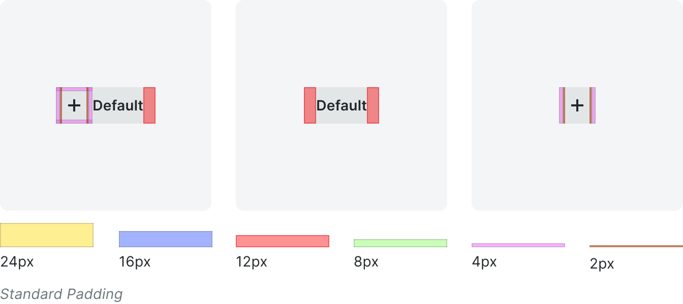
Padding
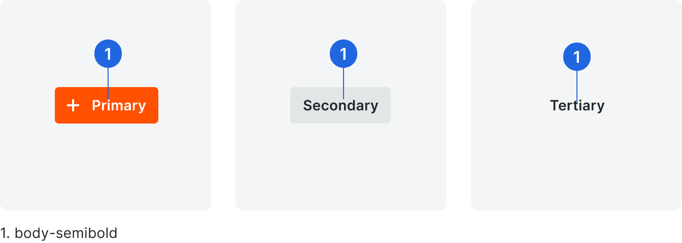
Typography
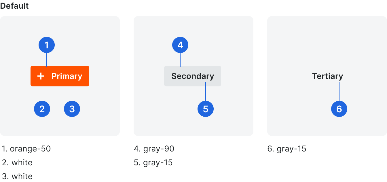
Color
Button Glossary
Button Label
Usage
Add
When referring to adding “sub items” to existing created items (e.g. markups, related items). Or, when referring to adding people or companies to the Directory.
When referring to setting the admin preferences for each tool, the project, or the whole account.
When referring to making a duplicate of an item or group of items.
When referring to creating new items in Procore.
When referring to deleting an item from Procore where a user cannot retrieve it (e.g. Drawings, Locations, Daily Log). Use Move to Recycle Bin when referring to moving an item to the tool’s Recycle Bin.
When referring to creating new items in Procore.
When referring to downloading an item or group of items to your device.
When referring to changing or updating information in Procore.
Use Bulk Edit to refer to editing multiple items at once.
Use Bulk Edit to refer to editing multiple items at once.
When referring to turning on a feature, tool, button, or item.
When referring to saving/exporting an item or group of items as a PDF/ CSV/BCF/etc file.
Fill out a fillable PDF.
When referring to finding information using the filter dropdown within specific pages in Procore.
When referring to the automatic creation of items from other items in Procore (e.g. generate submittals from specifications).
Use this verb only when it is an automatic function NOT when a user can create an item using another item's information (e.g. create a change event from an RFI).
Use this verb only when it is an automatic function NOT when a user can create an item using another item's information (e.g. create a change event from an RFI).
When referring to navigating to another place in the product.
This is most seen in button labels when it links to another page in the product (e.g. Go to Submittals).
This is most seen in button labels when it links to another page in the product (e.g. Go to Submittals).
When confirming that the user has acknowledged a piece of information presented within a non-permanent component on a page. Once the user clicks the “Got it” button, the component disappears.
This should be used only when the content presented is informational and there is no other call to action needed in the component.
This should be used only when the content presented is informational and there is no other call to action needed in the component.
When referring to setting or changing access levels of a user or users in Procore.
When referring to bulk adding items to Procore from an import template.
When referring to creating a backend connection between two objects.
(e.g. Linking a company in the Directory to its PCN counterpart).
(e.g. Linking a company in the Directory to its PCN counterpart).
When referring to adding markups to items such as submittals or drawings.
Note that mark up (two words) is a verb, and markup (one word) is a noun.
Note that mark up (two words) is a verb, and markup (one word) is a noun.
When referring to changing the location of an item in Procore to another location in Procore. (e.g. Moving a file to another folder or moving an item to the Recycle Bin).
When referring to replying to items in Procore.
When referring to taking an item from the Recycle Bin and putting it back in the tool’s list.
When referring to saving edits to an existing item.
When referring to finding information using the search within specific pages in Procore.
When referring to sending an email, sending feedback, or sending notifications.
When referring to refreshing a page to view new content or edits made by someone on another device or screen.
When referring to uploading an item from your computer to Procore.
When referring to seeing general information of an item.